Ink at the Heart of a Fountain Pen
|
|
|
|
|
|
|
|
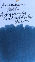
It has been awhile since I have reviewed a Birmingham Pen Co ink. I am still loking forward to their US based production of inks to become available. This ink is a blue-black which is not a colour I usually favour but it was what I selected when I got to choose a free ink to go with a pen I purchased. The Pennsylvania Railroad Company also known as the Pennsy was an American railroad established in 1846 and headquartered in Philadelphia. It was a class 1 railroad meaning it had operating revenues in excess of $250 million, in 2011 the average revenue for a class 1 railroad was >$400million. By the early 1980s the Pennsy was the largest railroad and largest transportation enterprise in the world. In fact it was the largest corporation in the world, with a budget second only to that of the US government. Over the years it acquired and merged with many other rail companies and lines to ultimately merge with its great rival the New York Central Railroad in 1968. It became known as the Penn Central Transportation Company and filed for bankruptcy in 1970.
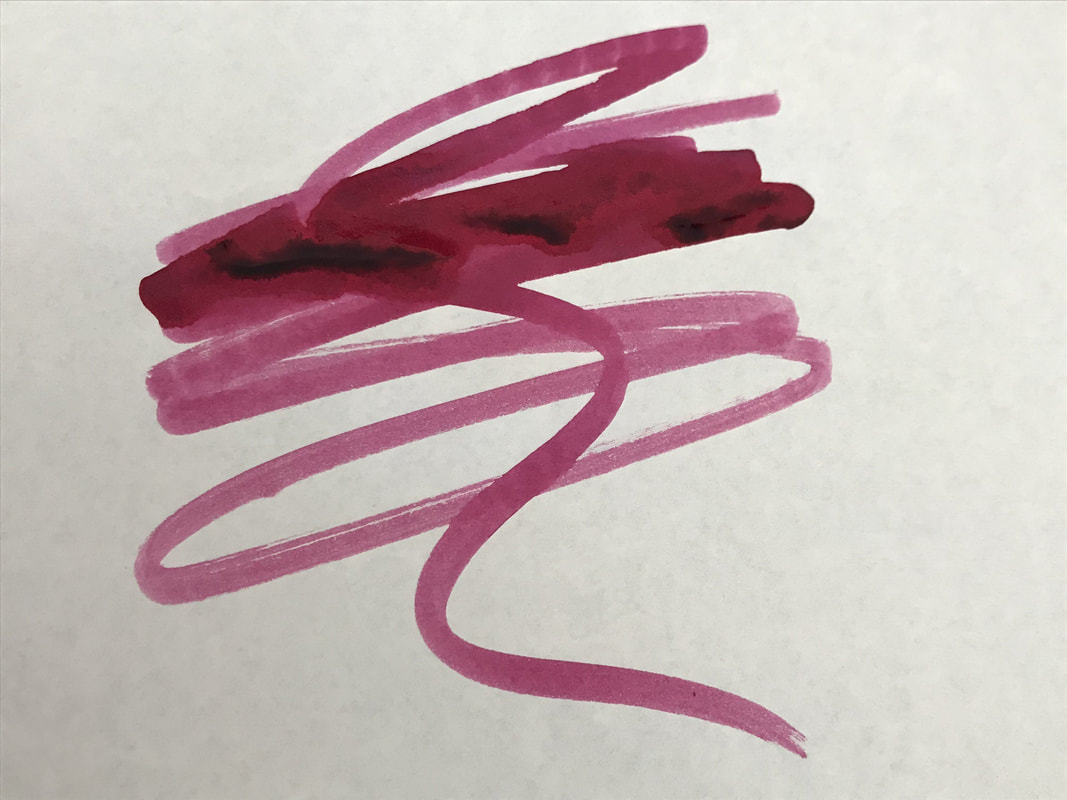
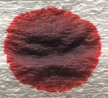
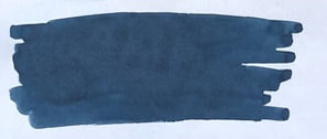
In my previous reviews of this company's inks I have described the packaging of the inks and nothing has changed - glass bottle with a simple paper label. On opening the bottle this is definitely a dark blue ink. 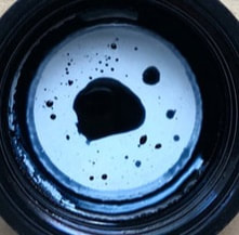 However, chromatography reveals a grey-blue ink – I would say a mix of petrol blue and grey ink. 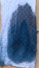
On cheap paper the ink is a rather lovely ‘shader’. Dark teal or petrol blue still come to mind for me. There was no feathering or show through but it is a little on the slow side for drying
On Midori it definitely dried to a grey-blue ink not blue-black. I thought it was drying quite quickly but the dry time test show it was slower here than on cheap paper in fact very slow. 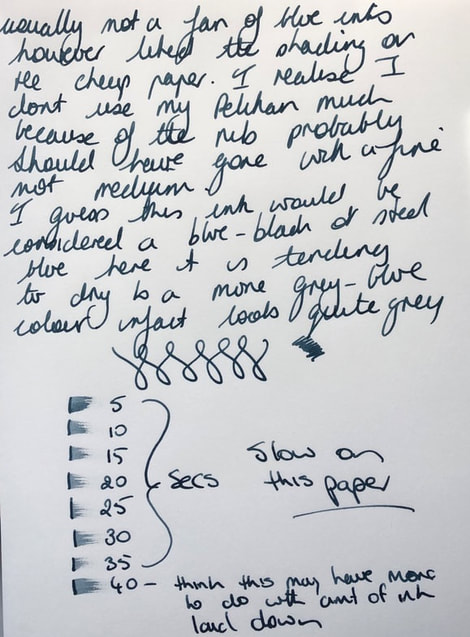 On Tomoe again some shading but the shading was much better on the cheap paper than here, also slow drying time but not as bad as on Midori. Not sure why the Tomoe paper always looks blue and if I use lights to stop this the colour of the ink just washed out - sigh.
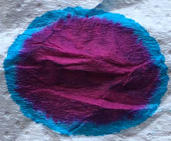
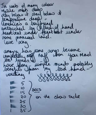
I did not buy this ink it was free. I chose this colour to get out of my rut of seeming to choose nothing but purple or green inks. The ink was much nicer than I expected and I like it better on the cheapest paper I used so it will be good for work. Birmingham Pen Co have moved ink production in house so there is not much on the web site at this time – but I am sure it will be worth the wait. In summary - Saturation – high Shading – yes and surprisingly better on cheaper paper Sheen – no Shimmer - no Flow – good Nib dry-out - none Nib creep - none Start-up – immediate Feathering - no Drying – slow Cleaning – easy Water resistance – amazing! 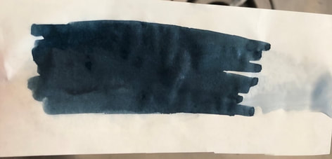
1 Comment
|
Ink Brands
All
|

 RSS Feed