Ink at the Heart of a Fountain Pen
|
|
|
|
|
|
|
|
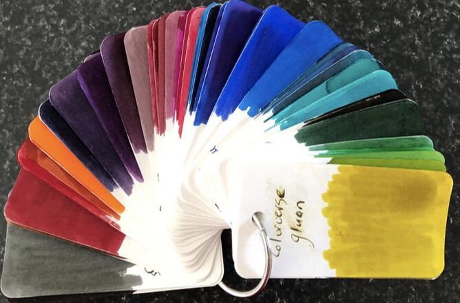
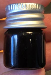
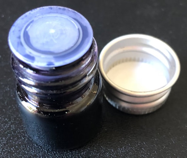
Birmingham inks are not available in my part of the world, consequently I had never heard of them until recently reading about them on another blog. When I visited the website I was impressed with the range of colours available (59 on my last count) and the price. The Birmingham Pen Co. sells other inks as well as their own, the proprietary inks retail at $US11.99 for 60ml, $US7.99 for 30ml and $US1.19 for a 5ml sample. Irrespective of the volume purchased they are very reasonably priced ranging from 20c/ml for the 60ml bottle to 24c/ml for the samples. The other thing to mention before I forget, postage was very reasonable and I had all my inks within a week (Pittsburgh to New Zealand). I have nothing but the highest praise for all my dealings with the Birmingham Pen Co. and their exemplary customer service. The packaging for the inks is quite simple and uses as little plastic as possible, which I really like. The 60 and 30ml bottles are glass and are similar in shape to Noodler’s ink bottles, they do have plastic lids. The labelling is also quite simple in black and white with the name of the ink on one side and a short history giving background to the name of the ink (that I also really like) on another side. The sample bottles are quite cute and are also made of glass with a metal cap and a plastic bung that fits snuggly into the neck of the bottle giving added security for shipping.
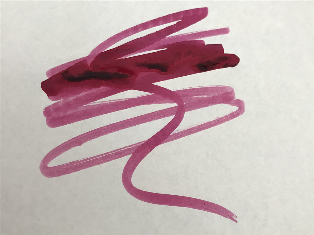
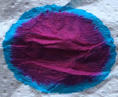
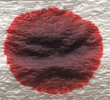
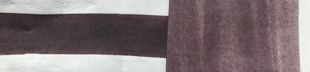
George Westinghouse Alternator Crimson (GWAC) is described by Birmingham pens as a “red ink hit with an alternating current of blues and purples”. Thus we get the alternator part of the inks name. The George Westinghouse I assume comes from the fact that Bimingham pens is based in Pittsburgh, which was also the base for George Westinghouse (1846-1914). 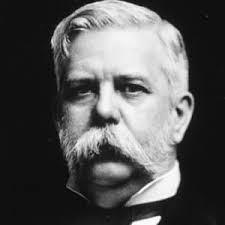 How are the two linked? An alternator is an electrical generator that converts mechanical energy into electrical energy in the form of alternating current. George Westinghouse saw the potential in alternating current as an electricity distribution system. Thomas Edison was marketing low voltage DC systems which had limited range, Westinghouse could see that AC had potential to achieve greater economies of scale and the rest is history. Westinghouse was clearly a very clever man – he had his first patent at 19 for inventing the rotary steam engine. Thus in summary the inks name - the ink is from Pittsburgh, George Westinghouse was from Pittsburgh, George Westinghouse worked on developing AC electricity systems, AC systems need alternators, the ink has alternating colours and voilà. Crimson, I’m not sure. Crimson is a deep shade of red inclining to purple, purple is made by mixing blue and red and yet blue and purple are said to be the alternating colours in this ink. I am not sure I entirely agree with the description of the inks colour as you can see from the ink spread on absorbent paper below there is definitely red. I am still trying to decide on the central colour as its sort of dusty black come dark grey but at the edges it does start to blend into blue to purple to the red. The blue/ purple component is dominated by the purple tones not the blue which is quite subtle. 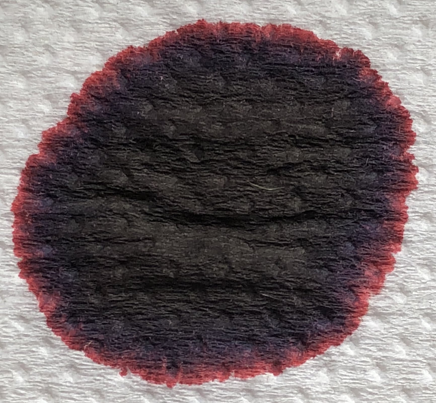 A swatch of the ink in my colo-o-ring test book gives a completely different impression of the ink
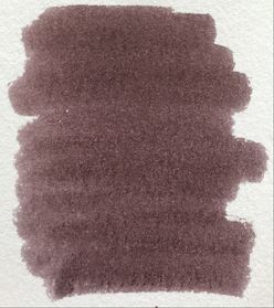
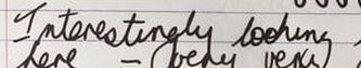
 Original swatch (left) up against today's swatch (right) - both swatches done with a cotton bud on tomoe river paper. I know it looks like two separate photos placed side by side, I promise you it is not. paper on right laid over paper on left then one photo taken. If someone had shown me only the swatch in the col-o-ring test book and asked what I thought I would not have been interested in this ink as I find the swatch fusty and somewhat uninspiring. However, that is not how the ink looks when it is actually put to work. I have found the colour when I write is quite different to the swatch – more saturated and at times almost bordering on black. My first test was on Rhodia paper. I was also testing a new pen which I discovered had feed problems. It wasn’t until after I had written what you see in the photo below that the pen stopped writing for the first time and I noticed that the ink had been laid down inconsistently. The most noticeable effect, I believe was on the drying times and not so much the colour of the ink though it did start to fade out. 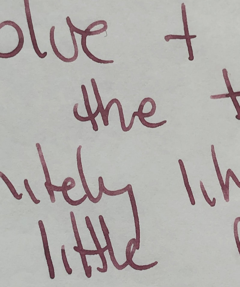
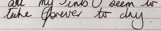
In the left hand photo as I started the lines are thicker and darker (almost black), on the right at the end of my writing the lines of ink are thinner and lighter, beginning to look more grey. Despite my pen problems I liked the colour, I couldn’t decide if it was black or dark grey I really didn’t see the crimson. While I was trying to sort out my pen problems I tried the ink on copy paper, I still liked the colour thinking it was quite good for work. I was impressed with the drying time on the cheaper paper and there was no bleed through or feathering. 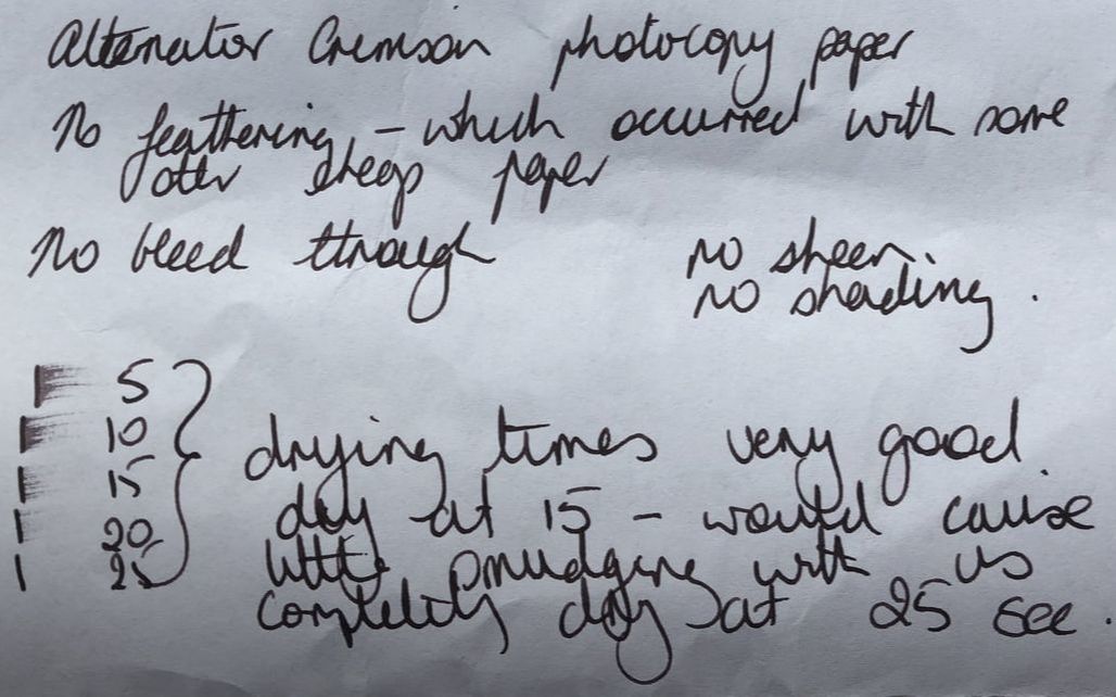 After I finally gave up with the problem pen I used a Nemosine singularity on Tomoe River paper. Again I was reminded as to why this paper is considered so fountain pen friendly – it really brings out all the attributes of any ink you use. The drying times went up a little but the crimson hints have started to show through and there is some shading, it’s not a lot but enough to make this a more interesting ink. The colour is also far more saturated. 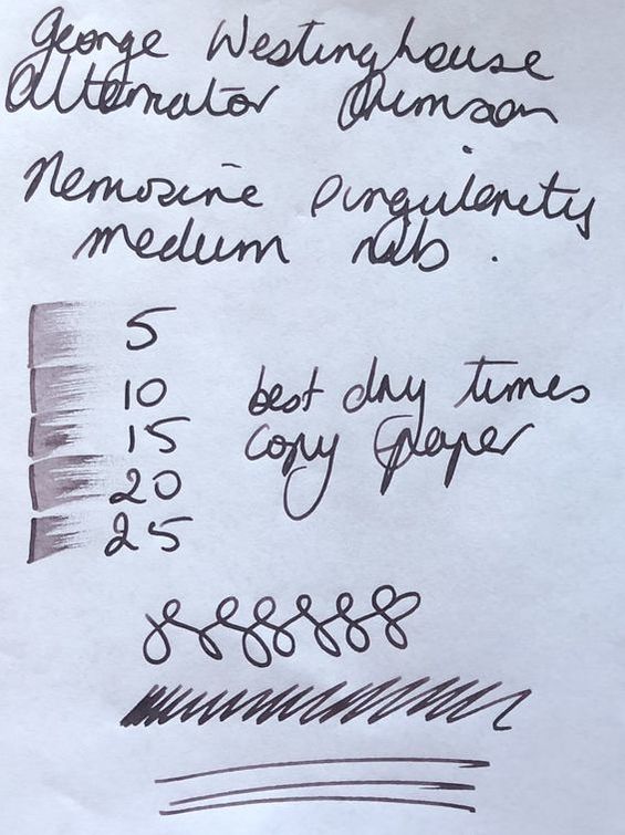 This ink is not the colour I thought it would be, the swatch in the col-o-ring test book does it no favours, I think it makes the colour look insipid which it’s not when you actually write with it. It is a well behaved saturated ink that though not exciting would be an excellent choice for work / more formal writing. The most impressive feature for me though was its water resistance. I always drop some water on a swatch of ink and swipe right, this usually leads to an obvious trail across the swatch where the colour has been washed out. I did this with alternator crimson and the only place colour was really lost was the area of the swatch were the drop of water was placed. Very little colour was lost as I wiped the drop to the right. I get the impression this ink would be quite colourfast unless completely soaked in water. 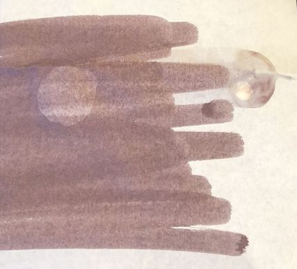 Lastly just to reiterate Birmingham pens: excellent service, good range of inks, not expensive, affordable postage.
0 Comments
Leave a Reply. |
Ink Brands
All
|
 RSS Feed