Ink at the Heart of a Fountain Pen
|
|
|
|
|
|
|
|
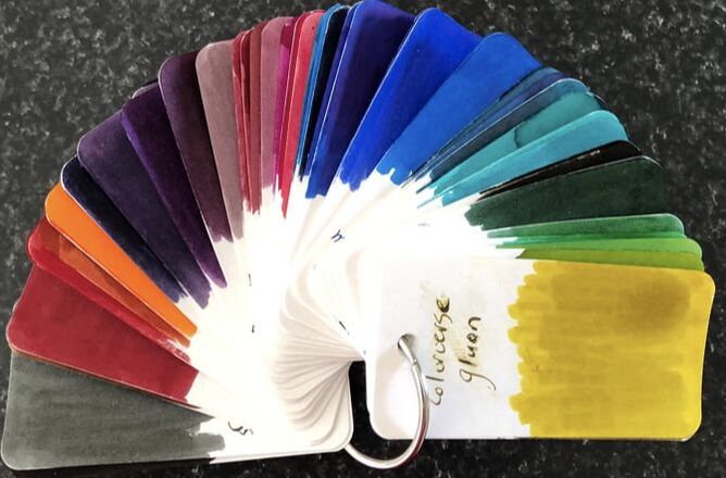
I am pleased to see that the Birmingham Pen Co have started to list some of their new in-house manufactured inks as I am so looking forward to trying them. Todays ink is from previous stock having been manufactured in Germany and bottled in the USA. The plan is to recreate all the inks in the USA. In previous reviews I have described the packaging and pricing, the new inks are priced at $US9 for 30ml and $US14 for 60ml. NB an update to this review was posted 10/04/2021
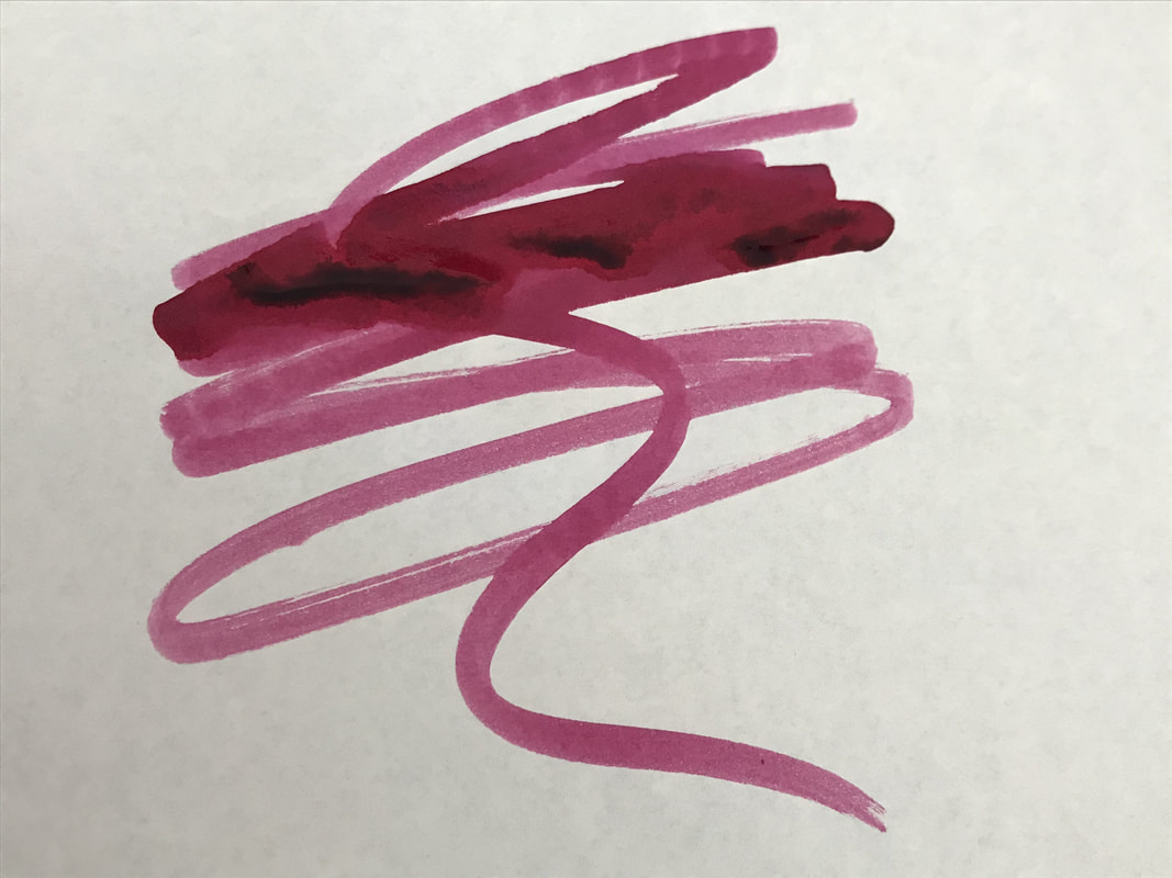
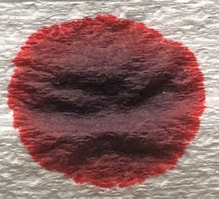
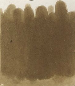
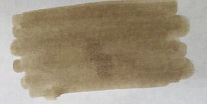
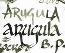
Arugula, I’m not sure why. Arugula, or rocket as it is called in my part of the world is a cruciferous vegetable like broccoli and kale. It is popular for its fresh peppery taste. As arugula is green I was expecting a green ink. 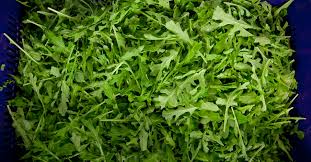 I will start by admitting for the first time I was disappointed with an ink from this company. You will soon see why. The ink in the bottle is a dirty brown colour – I wasn’t expecting that. 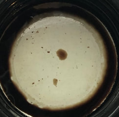 ink in the bottle cap Starting with chromatography – a blend of yellow, grey, reddish brown and possible a hint of green. Colours not quite as imagined from looking at the bottle. 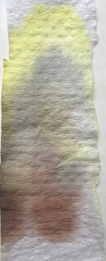 The col-o-ring and Tomoe swatches speak for themselves – it was very washed out on Tomoe.
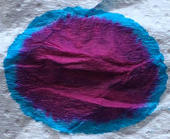
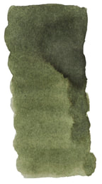
This is clearly not what the ink was supposed to be, here are a couple of pictures of this ink from the web.
Either something has gone off in the ink or this is a bad mix or a new formula or ?? I may not like the colour but others might so I still did the writing test. My disappointment is because the ink is not the colour expected not because it is a bad ink. For the writing I used a Laban pen with a medium nib. The cheap notepaper has a shiny texture, Midori and Tomoe both good papers. Cheap paper – slow to dry, no feathering, no show through, looks like a dirty olive but you do see more green. 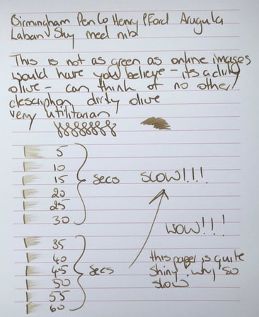 Midori slightly faster drying and I would call the colour of the ink khaki. 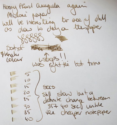 On Tomoe you see more hints of green and it is a shading ink, I think that redeems the colour.  I did not buy this ink it was free with a pen I purchased. I chose this colour because I like green inks but was very disappointed with the colour. It is a useable ink and it shades so it will be used. In summary - Saturation – low to medium Shading – yes Sheen – no Shimmer - no Flow – good Nib dry-out - none Nib creep - none Start-up – immediate Feathering - no Drying – crazy slow Cleaning – easy Water resistance – impressive, very little colour run when held under a tap. 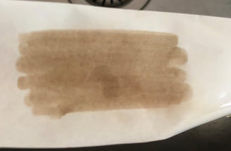
2 Comments
gdopiv
20/2/2022 10:10:50
I think this happens when the ink is either old or exposed to light. I purchased a bottle of this back in late 2019, it was the correct color when it arrived. Fast forward to today, the ink now looks like yours, but a bit more saturated. Leave a Reply. |
Ink Brands
All
|
 RSS Feed