Ink at the Heart of a Fountain Pen
|
|
|
|
|
|
|
|
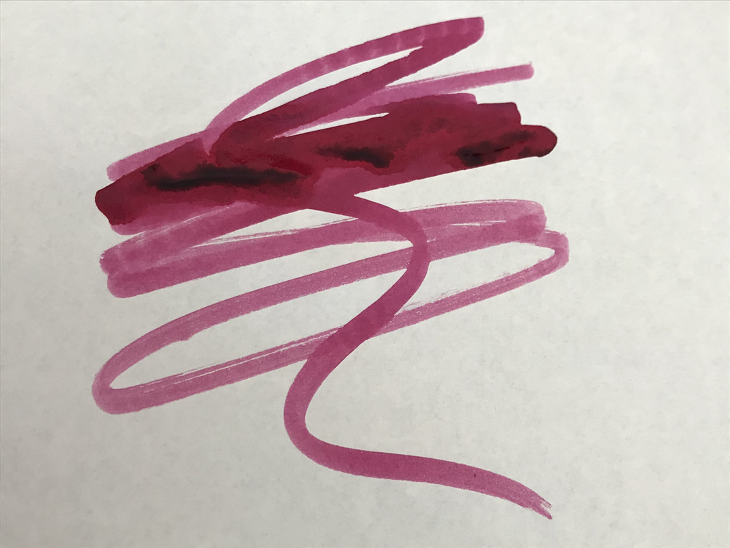
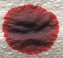
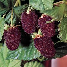
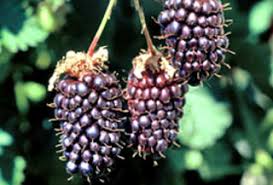
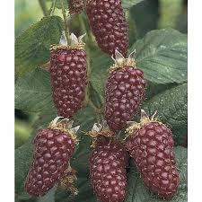
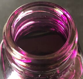
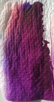
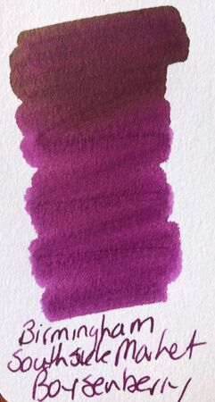
I am towards the end of the 30 inks in 30 days challenge and plan to review the inks I used but went and left some things I needed at work so in the meantime another great ink from the Birmingham Pen Co. Links to the company are in previous posts which can be accessed via the categories section of my blog. I purchased all my ink directly from the Birmingham Pen co and they currently cost (in US dollars) $5.99 for 30ml and $9.99 for 60ml. I made a bit of a mess today with the ink, trying to save time I poured some onto a piece of paper rather than carefully eye-droppering it. Upshot is ink all over my hands and the bottle so I couldn't read any of the information about the Southside Market on it. To those that have not seen Birmingham Ink Co. inks before, they are all named after a historic landmark / event or person from Pittsburgh and the bottles have a little background information on them. I could find very little on the web about the South Side Market. Southside is an area of Pittsburgh located along the Monongahela River. Most of it was originally the village of Birmingham but it was annexed to the city in 1872. The South side is divided into two neighbourhoods the South Side Flats and the South Side Slopes. The Southside Market is a historic market house at 12th and Bingham Street in the Southside Flats area. The market house that now stands is not the original, with the 1893 original being burnt in 1914 and rebuilt in 1915. It building has been repurposed to once again become the centre of community activity. 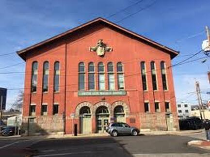 South Side Market building I don't believe there is any connection between this building and boysenberry just that the ink is boysenberry coloured. The boysenberry is a cross between a European raspberry, European blackberry, American dewberry and loganberry, this probably explains why pictures never show one consistent colour. It is described as being a deep maroon colour, with respect to the ink I would say a little more grape in colour.
 This is the closet to the ink colour The bottle are the same as the inks in previous posts and now it is covered in ink there is no value in showing you as it just looks a mess.
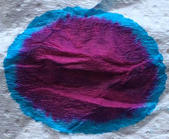
I have learnt that my version of chromatography was probably not doing some of the inks I have reviewed any favours as I needed to get the ink to spread more than it did, problem has now been solved and people who have read previous posts will note a change in technique.
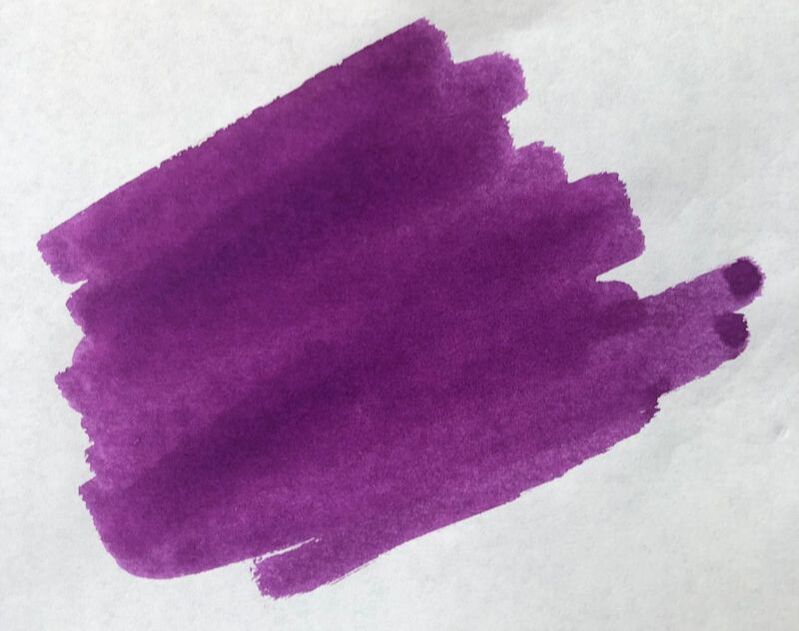
Next was swatches on Tomoe river and my col-o-ring. Tomoe is supposed to be the paper that brings out the best in any ink but surprisingly I thought this was much nicer on the col-o-ring and there was a hint of sheen.
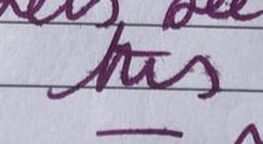
I love purple inks but have not got everything I own on a swatch yet, so the closest I could find out of those I have was Sailor ink studio 935 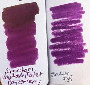 When it came to writing the ink behaved as impeccably as all Birmingham inks do but I was disappointed that the hint of sheen from my swatches didn't pan out and shading was more miss than hit. 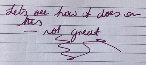
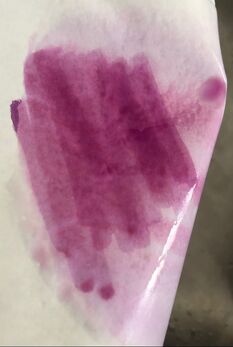
Next was Tomoe river and I wanted more. Its a nice purple shade but not particularly exciting to look at and not very quick drying. 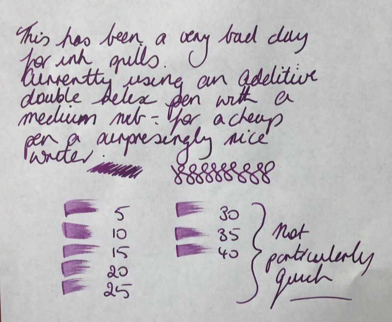 I bought some Midori paper recently and have been having mixed results with it. Some good quality inks have not enjoyed the experience with a lot of feathering and recently a J Herbin ink that didn't just show through but bled through the top three pages on the pad. Despite that I am still giving it the benefit of the doubt and used it here. 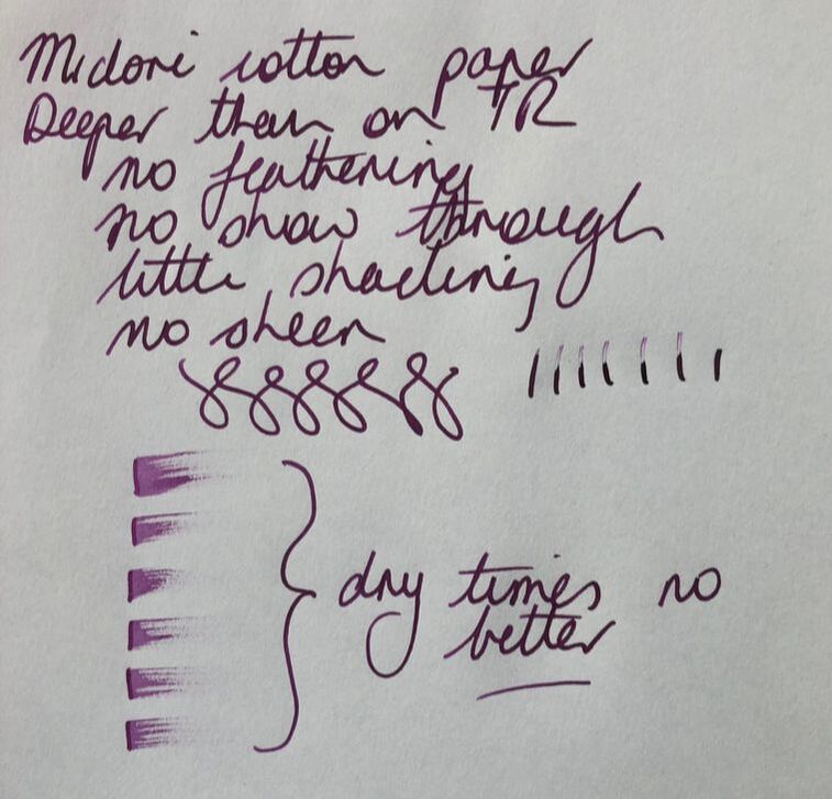 In summary Saturation - high Shading - nil Sheen - nil Flow - excellent Drying - slow Waterfast - poor (cf other inks from this company I have reviewed)
0 Comments
Leave a Reply. |
Ink Brands
All
|
 RSS Feed