Ink at the Heart of a Fountain Pen
|
|
|
|
|
|
|
|
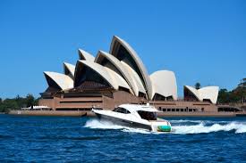
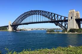
When non Sydney-siders think about Sydney Harbour they usually assume the term refers to the part of the waterway where one can see the Sydney harbour Bridge and the Opera House. It is so much more. The natural harbour of Sydney is Port Jackson which is comprised of the waters of Sydney Harbour, Middle Harbour, North harbour, Darling Harbour and the Lane Cove and Parramatta rivers. The harbour is an inlet of the Tasman sea and the location of the first European settlement on the mainland. Port Jackson is 19km long and has an area of 55sqkm. The coastline of the harbour is formed into many bays with those on the South being wide and round and the North generally narrow inlets. As you can imagine there are a lot of events based around the harbour and tourists flock there to see the Opera House and the Bridge. 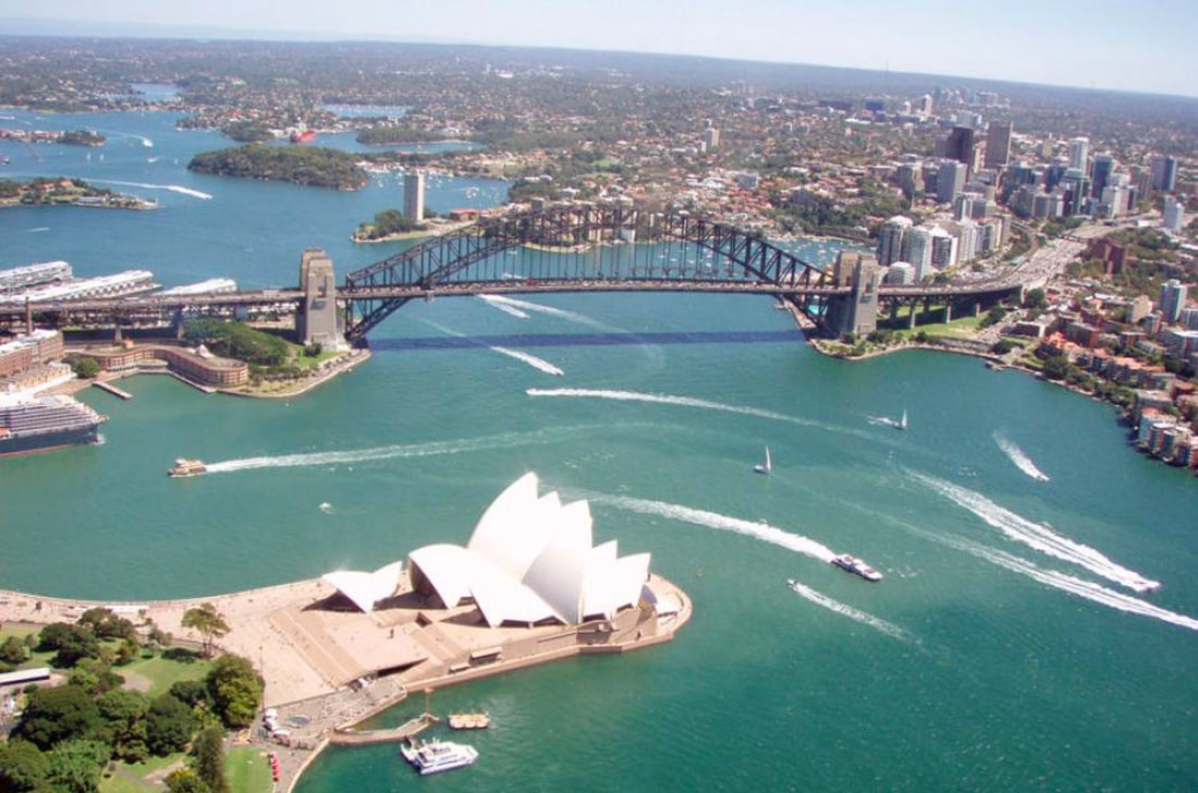
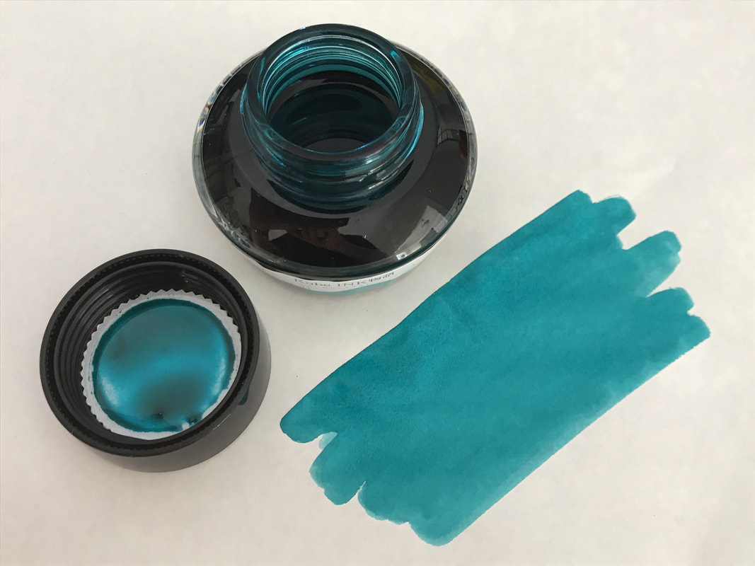
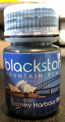
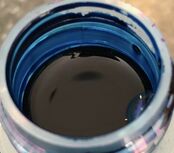
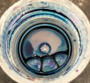
The New Years Eve celebrations are huge and if you can get tickets or access to a good location to see the fireworks it is truly worth it. A good way to see the harbour is to take the ferry from Circular Quay (Downtown) over to Manly (North Head). The trip takes about 30 minutes and depending on the time of day costs anywhere from $AUD4.50 – 7.50. You will see just as much as on an expensive boat trip all that is missing is the running commentary  Boats getting into position for the 9pm fireworks Dec 31st 2012  Midnight fireworks around the city  The bridge exploding with fireworks - the best part of the night Clearly this ink was named because the colour is reminiscent of Sydney harbour – I for one have never seen Sydney Harbour this colour but both the ink and the harbour are a beautiful blue colour. I previously reviewed Blackstone blue gum ink that review has info about where to purchase the inks. As I have written before the bottles are polypropylene which is great because they are reusable and 100% recyclable. Labeling is fairly simple with the obvious choice of a picture of the Sydney Harbour Bridge and Opera House on the front.
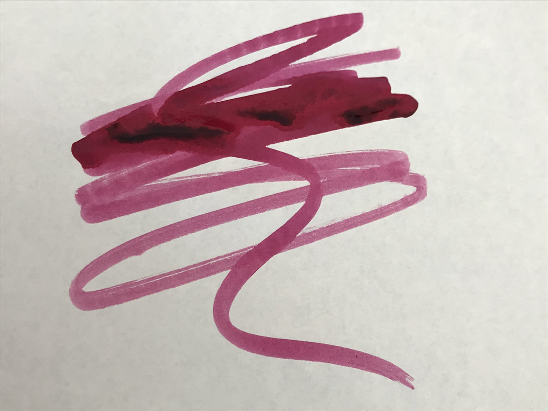
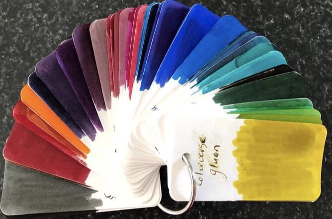
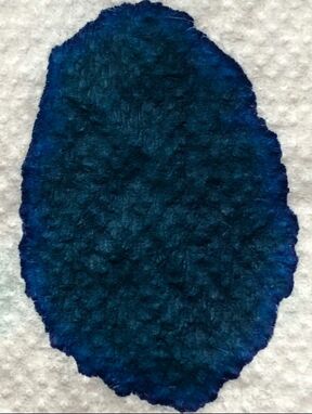
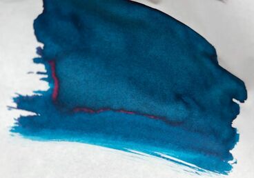
It is not marketed as a sheening ink but on a good paper such as Tomoe River a lovely red colour is apparent. It was quite surprising as I started with a swatch on absorbent paper and it would appear to be nothing but a blue ink and it performed similarly on my col-o-ring.
I then swatched onto Tomoe and was not that impressed at first but when it was completely dry it became a bit more wow! 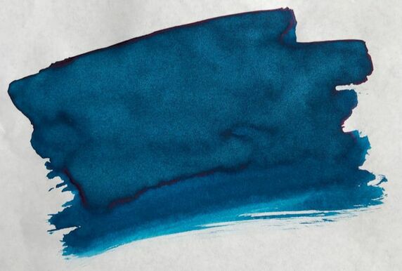 There is a bit of a hint of what is to come especially at the right edge
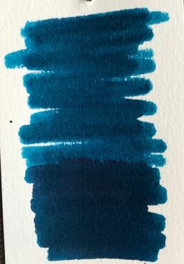
I did my usual of testing an ink on a variety of papers. I used a Regal Elizabeth pen with a medium nib. I got the pen through Massdrop in 2015. It was not an expensive pen and has become one of my favourites. I wrote on Clairfontaine paper and Tomoe River. The drying times were very good but I was so disappointed to not see any of the sheen that had become apparent in my Tomoe swatch. 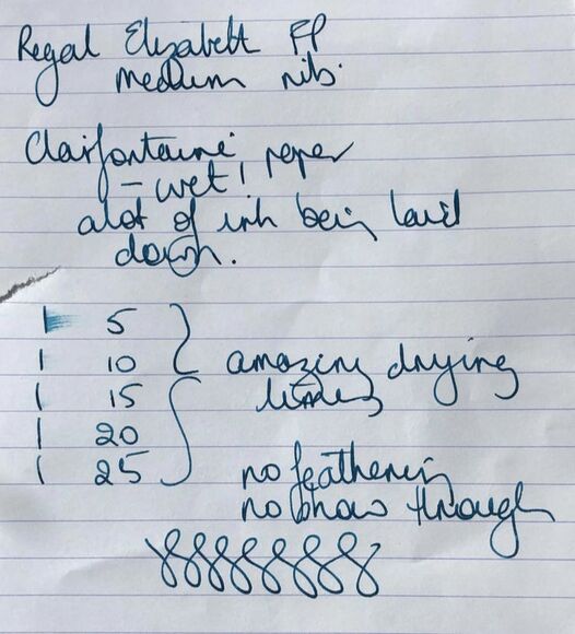 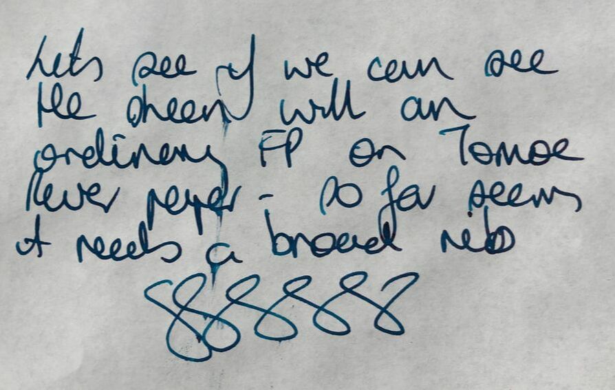 I thought the problem might be the nib i.e. a broader nib would lay down more ink and it would be come more than just blue. I used a Pilot parallel pen with a 2.4 mm nib when I tried the ink on copy paper and still no sheen just a deep blue. I was impressed with the fact that despite a 2.4mm nib and cheap paper there was no feathering and no show through. 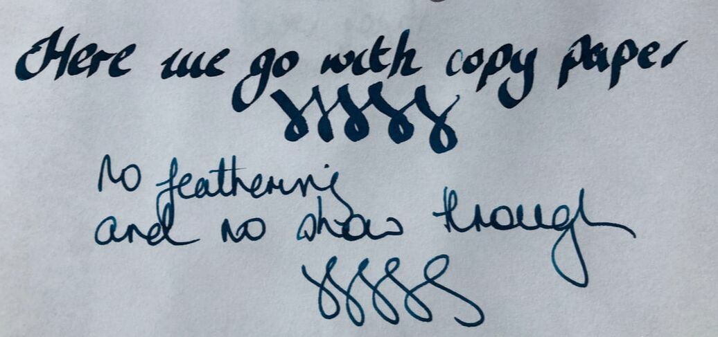 I then used the pilot pen on Tomoe River as that was the only paper were sheen was seen in the swatch and yes it performed as wanted 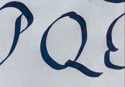
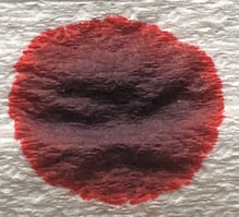
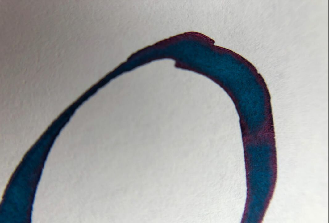
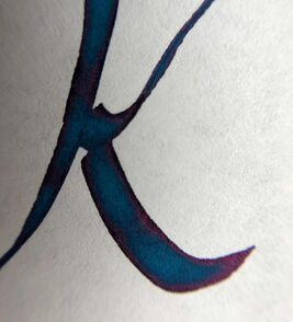
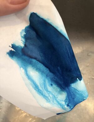
At this point I had a nice blue ink but I am not a great fan of blue so it may not get much use. The drying times were excellent the ink performance was excellent but its best qualities only seemed to be apparent on good quality paper and using a broad nib and then I used it at work. I can’t bear to waste ink so once a pen has some I use the pen until it is empty. I took the Regal Elizabeth to work. During some downtime I wrote a list of fountain pen brands I would like to look at, the list was in my Hobonichi cousin and it looked pretty. When I went to close my Hobonichi the sheen was suddenly apparent. Interesting that I could not see it when I wrote on Tomoe paper for this review but in my Hobonichi that has the same paper the sheen screams at me. 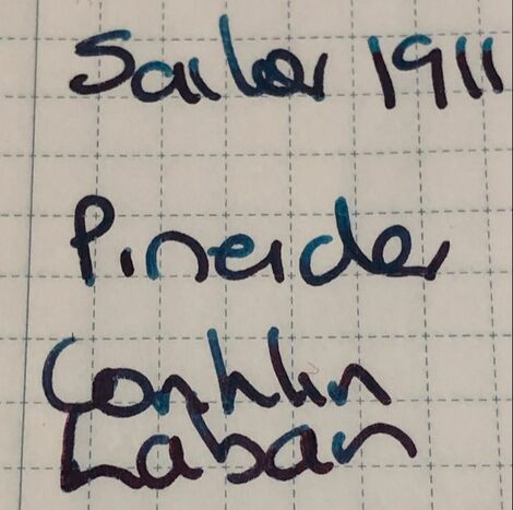 Not the greatest quality photo because of where it was taken however you can still see a lot of the red colour coming out along with the blue The ink also holds up well under water – you can see a lot of run off but there is still a lot of ink on the paper.
0 Comments
Leave a Reply. |
Ink Brands
All
|

 RSS Feed