Ink at the Heart of a Fountain Pen
|
|
|
|
|
|
|
|
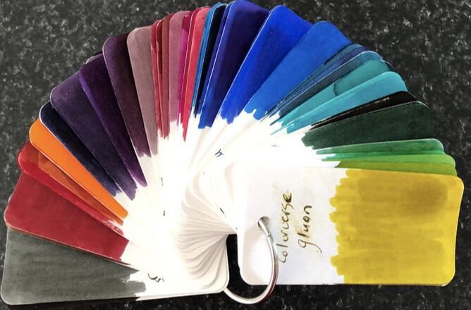
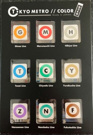
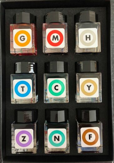
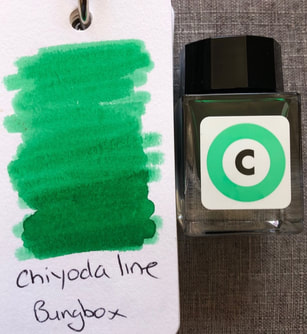
BUNGU BOX is a fountain pen store located in Hamamatsu, Shizuoka (half way between Tokyo and Osaka). As well as pens Bungubox has established a name for its inks better known as Bungbox inks. The inks are influenced by the climate, natural features ad seasons of the Hamamatsu region. Irrespective of this they are made by Sailor so many will be similar in colour to Sailor inks. Originally the inks were hard to buy outside of Japan but a number of American retailers sell them most notably Vanness Pen shop in Little Rock. All the Bungbox inks I have purchased I have bought through Massdrop. Massdrop is a community-driven commerce platform. If enough people request something e.g. bungbox ink they will go and see what price they can negotiate for the community wanting the ink then offer it, usually there is a minimum number of people required to commit to the drop in order to guarantee the price. This set cost $USD99 which seems a lot but not when you think its is for 180ml of ink (9x20ml). That equates to 55cents per ml, there are other inks around that are more expensive and it was cheaper than sourcing them from japan. I think I was more disappointed by the colours than the price when I received them, anyway on with the review. The other part of the story is the Tokyo Metro.  The Tokyo Metro is a rapid transit system and one of two in Tokyo. It came into being in 2004 when it replaced the TRTA. The Metro is extremely punctual which is probably of no surprise for Japan but it does not run 24 hours a day. It is surprisingly easy to use as the Japanese have made it very user friendly for non-Japanese speakers especially those that speak English, Chinese (Mandarin) and Korean. These following are said to be simple maps of the metro and they don't look any better when enlarged. I know they look highly confusing but its really not that difficult, larger maps of various sections help and there is a phone app that can be used. 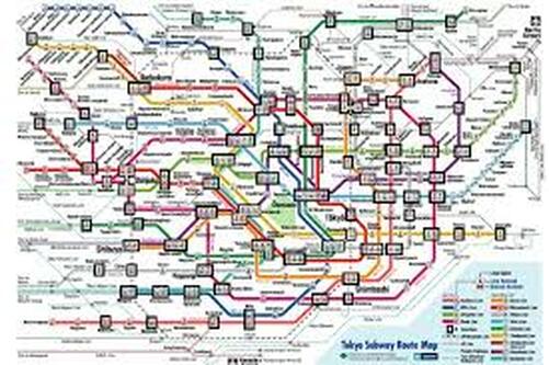  Originally the metro lines did not have colour but the use of colour and the numbering of stations is partly why it has become so much easier for the non-Japanese to use the metro. After the signing of a Memorandum of understanding and consultation each line obtained its colour in 1996. There are nine lines so nine inks to review but not all at once. The packaging was quite simple, a rather black box with nine bottles of ink. The bottles themselves are small, square, glass and have the coloured symbol for each line on the front.
Underneath the bottles of ink was some information briefly outlining how each line got its colour and a beautiful Edo metro map printed on bamboo paper. The Edo map was just as confusing as the so called simple maps above but still lovely to look at and as with the ink names I needed more information. There is some information supplied but it suffers from brevity and not the best translation into English. 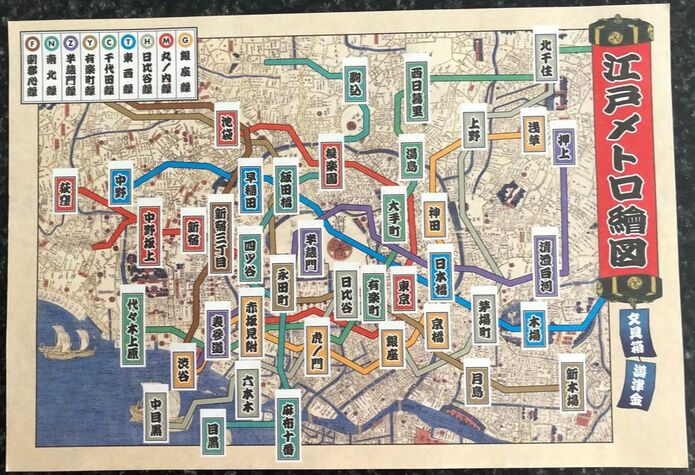 In order to understand the map you need to know:
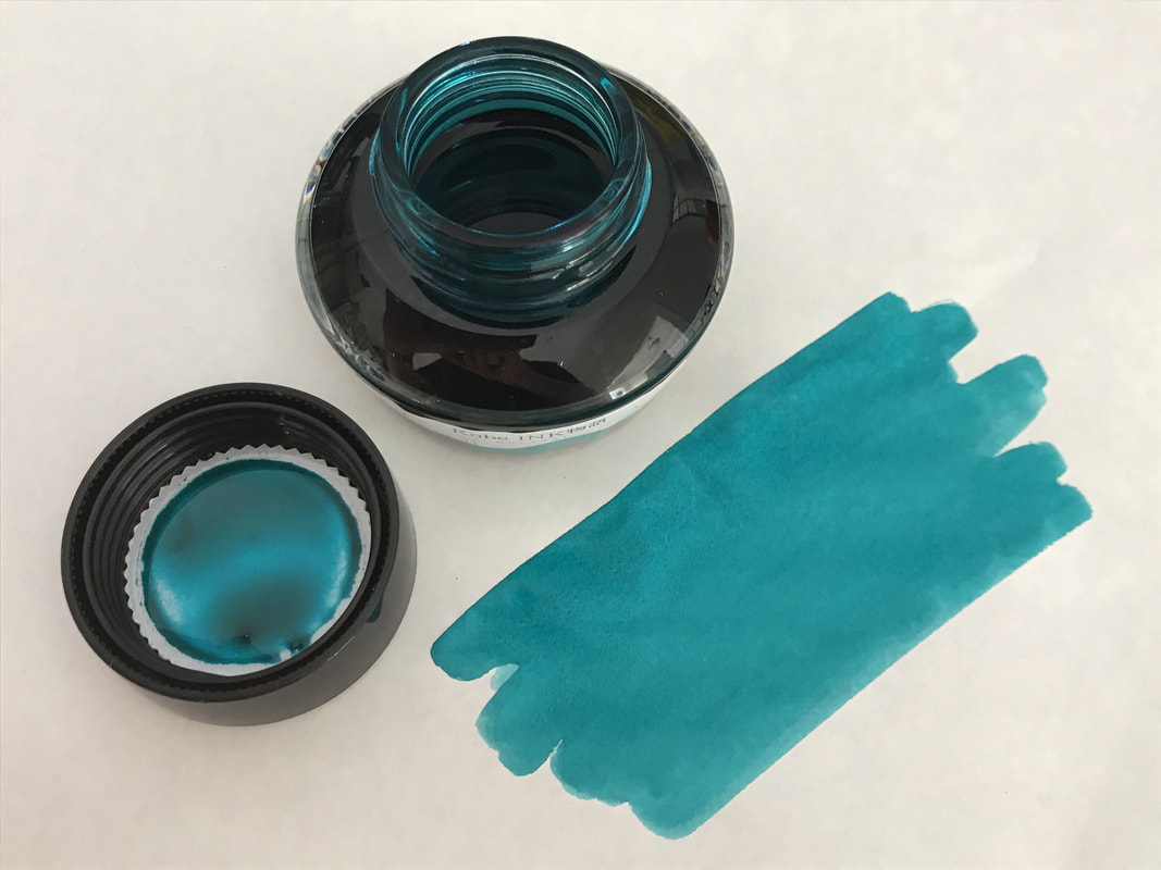
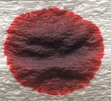
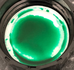
The rest of what is included with the inks made no sense to me as it references places that no longer exist and talks about fresh produce markets and the Tsukiji fish market. Based on the first paragraph what I think it all means is that the map has been drawn in the Ukiyo-e style, it shows Tokyo when it was still Edo and has been printed on bamboo paper in memory of the Kyobashi bamboo trade as depicted in Hiroshige’s painting (hence the Ukiyo-e style). I’m not its relevant to the map but Kyobashi was also the name of a famous bridge in the Edo era, removed in 1959 when the river it spanned was filled in. Such is progress – sigh. And finally the nine inks in all their glory. 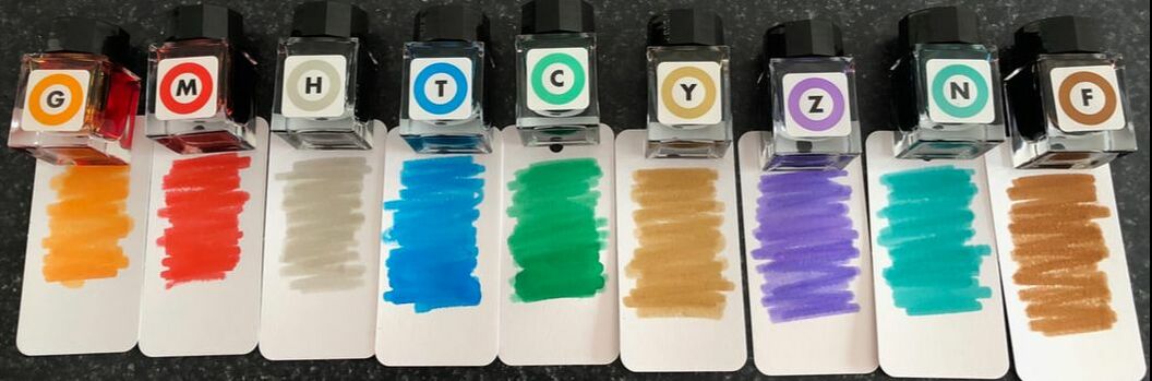 To get things started I will start with Chiyoda Line (green). I recently received a TWSBI emerald 580 and wanted a nice ink to match or at least compliment the pen hence starting with green. According to the Tokyo Metro Bureau of Transportation the Chiyoda line is the second most crowded line in the metro. It was part of the 1995 Aum sarin gas attack and in 2006 introduced women only carriages during rush hour. The green colour was chosen for the line from the concepts of elegance and grace and ‘a Japanese garden’ because the line runs by the Emperor's Palace and also because green was already being used by the Joban Line (a railway line) which was going to go through to the Chiyoda line. On opening the bottle it is green, I would call this an emerald or Kelly green. Interestingly the colour for the Nanboku line is supposed to be emerald green but looks more teal to me.
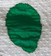
As did the swatch on col-o-ring.
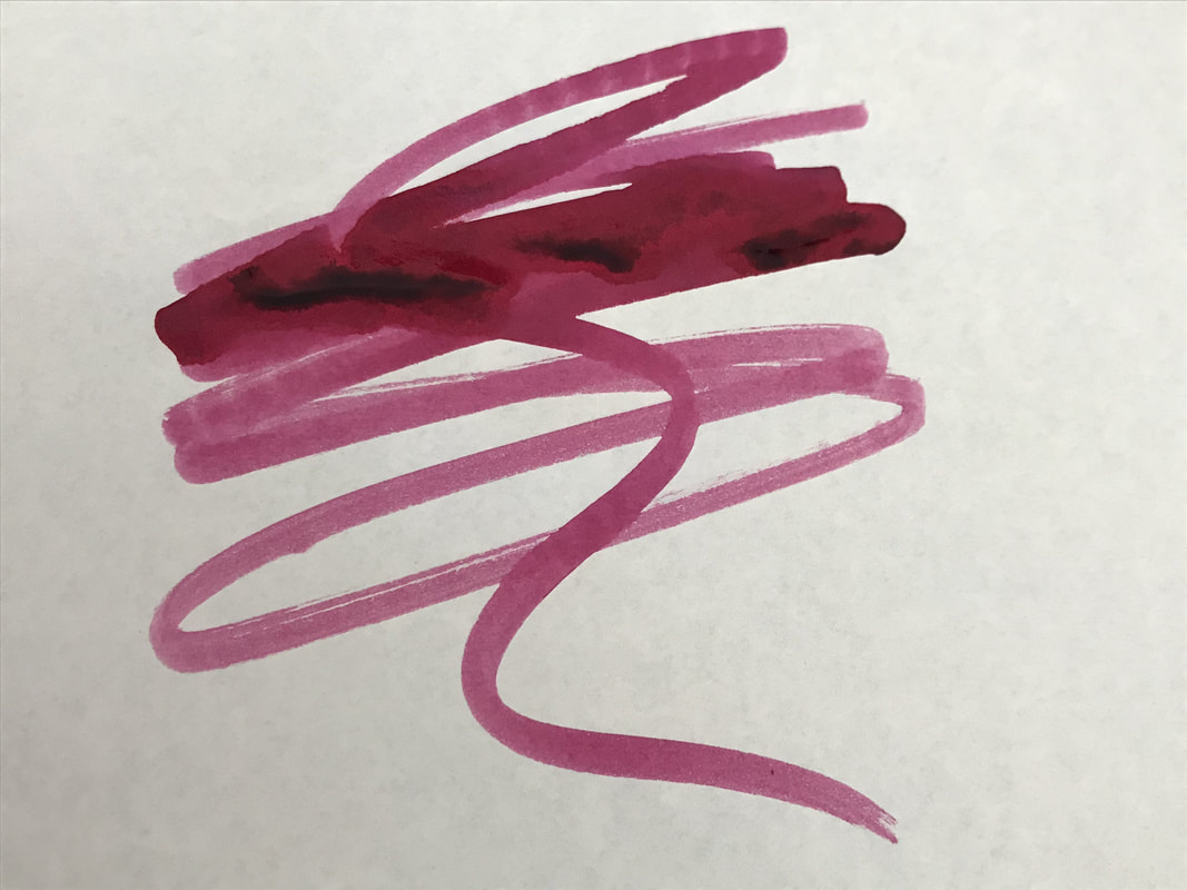
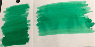
The writing experience wasn’t surprising as I had expected it to behave well – its Japanese and from Sailor so I would have been surprised if it didn’t. The examples here are on Clairfontaine paper, Tomoe River 52gm and a cheap notebook page. 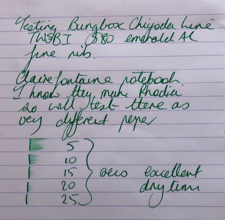 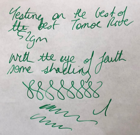 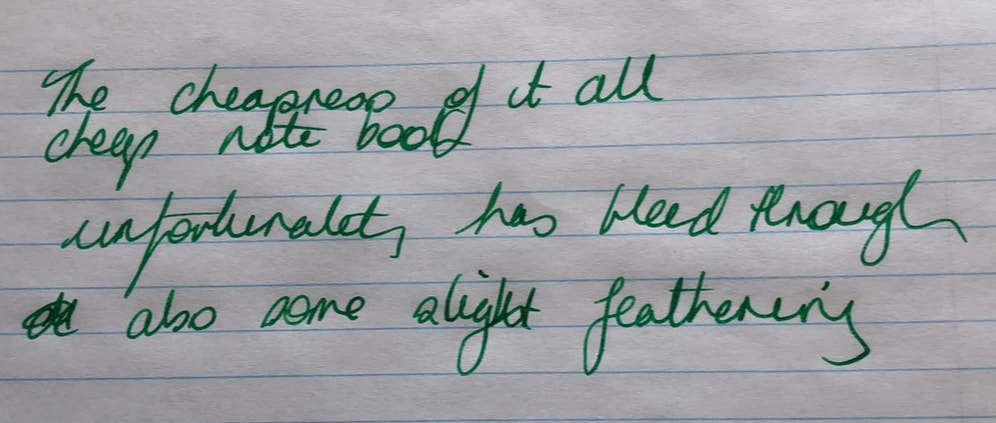 It’s a green ink with no shading or sheen. If you like green inks you may like this, for me its ok because it is a nice ink to use but the colour lacks any ‘wow’ factor. Finally the water test – these are not marketed as waterproof but this ink did quite well. 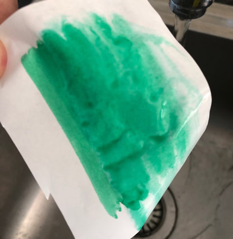
1 Comment
|
Ink Brands
All
|
 RSS Feed