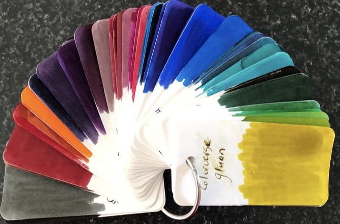
Ink at the Heart of a Fountain Pen
|
|
|
|
|
|
|
|
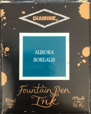
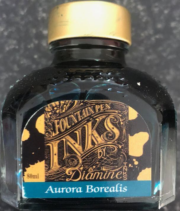
An aurora is sometimes known as Polar lights, they are natural light displays best seen in high-latitude regions hence around the Arctic and Antarctic. Aurora Borealis for which this ink is named are the Northern lights seen around the Arctic. The Aurora Borealis were named in 1619 by Galileo, from the Roman goddess of the dawn and the Greek name for the north wind. The Southern lights are known as Aurora Australis. Auroras area result solar wind induced disturbances in the magnetosphere. The magnetosphere is the region around earth in which charged particles are affected by the earth magnetic field. The solar wind disturbances can be strong enough to alter the trajectory of the charged particles i.e. electrons and protons sending them into the upper atmosphere resulting in them emitting light of varying colour. The form of the aurora created is also dependent on the acceleration imparted to the particles. 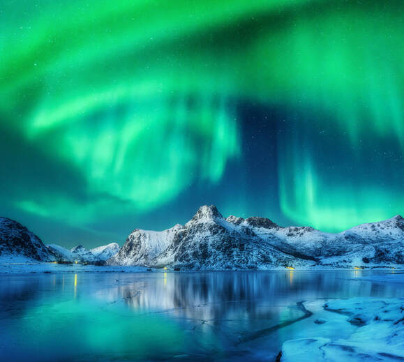 Lofoten Islands Norway 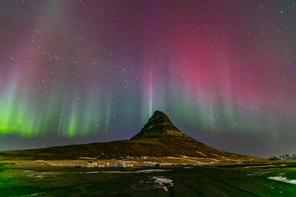 Kirkjufell, Iceland Diamines Aurora Borealis is an ink chosen by the reddit group of fountain pen enthusiasts and is the second ink created for them. There is nothing special about the packaging, the ink comes in the standard Diamine packaging and bottle.
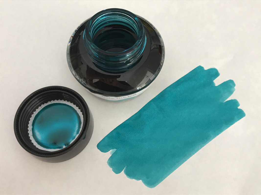
The only difference is a sticker on the inside of the box informing you of the origins of the inks  The ink is said to be teal but from the colour on the box and the bottle you would be forgiven for thinking it is a steel blue. To be honest my first impressions was this is just a repackaged Diamine steel blue but they are actually quite different.
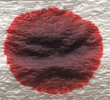
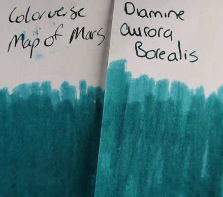
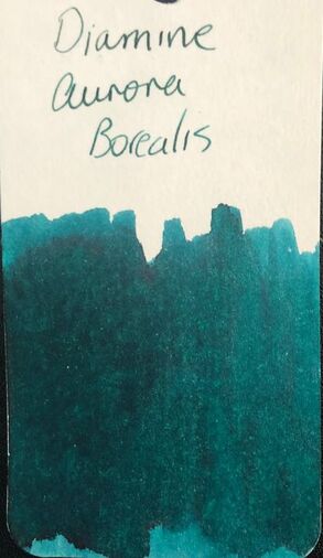
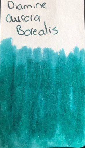
I swatched twice on my col-o-ring, the first straight out of the bottle (to the left) the second a little drier (to the right) to get the base ink without much of the sheen. The first swatch you can see it is a teal ink with a hint of a red sheen, the second swatch shows the base colour which is a match for Colorverse map of mars. I have to admit so far I was a bit disappointed with the ink it has looked so much more exciting in IG photos and other reviews.
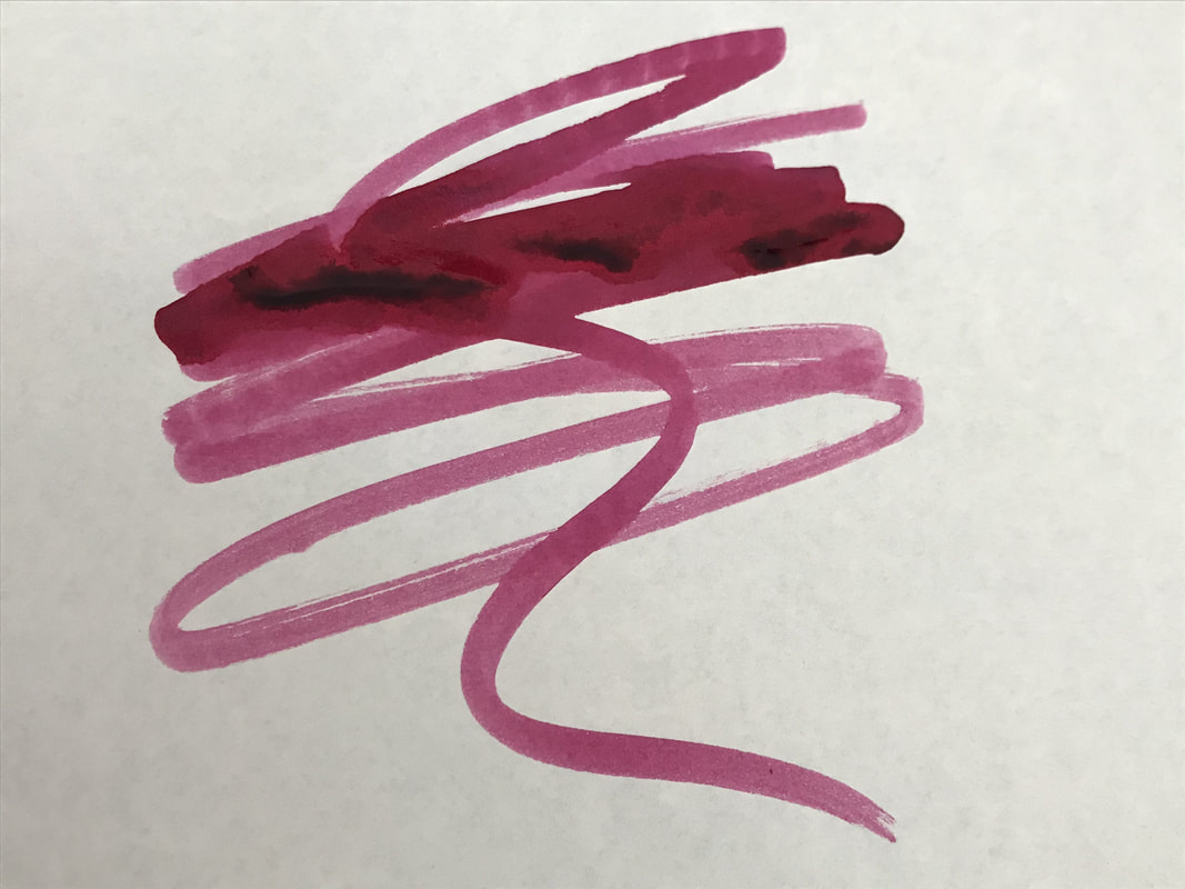
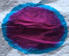
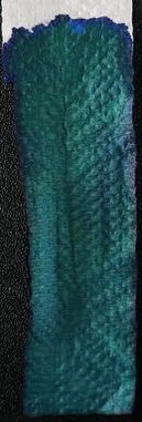
 The swatch on Tomoe river paper surprised me as this paper is supposed to bring out the best in an ink and it was a non-shading without sheen teal ink. 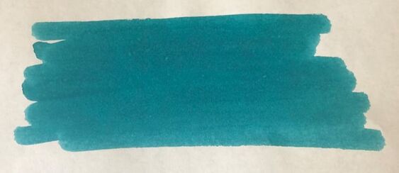 I started the writing won Rhodia and tried three nibs – medium, fine and an Conklin omniflex. 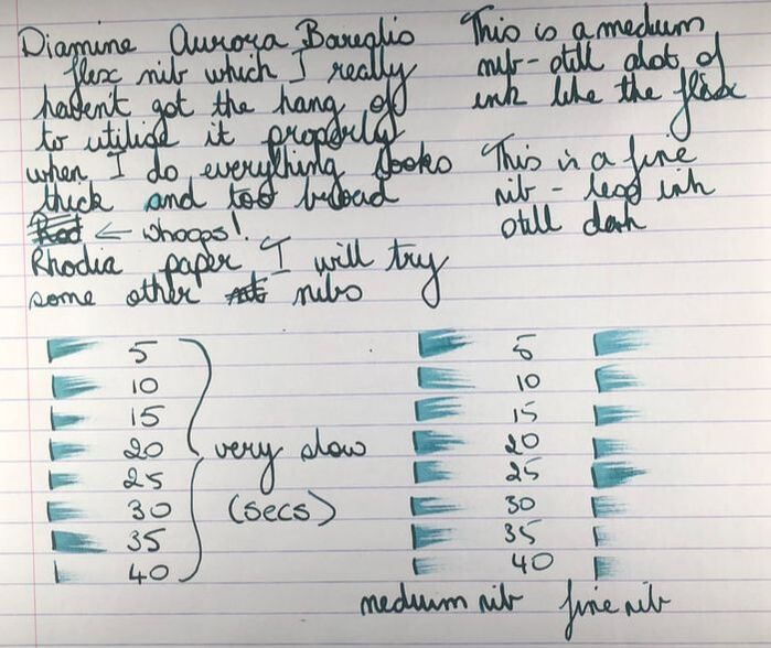 It just looks dark green, is very slow drying and the nib used didn’t seem to make any difference. Next was Tomoe river. 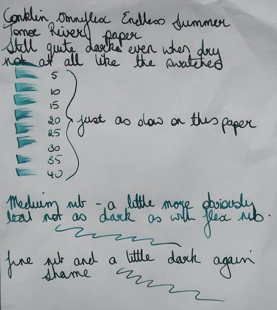 Again just dark though with the medium nib it looked more teal than dark green. Dry time just as long as on Rhodia. Others have reviewed this ink and shown lovely swatches of a teal ink with a red sheen but I do not seem to be able to manage to demonstrate any sheen. I did however realise the reason the ink looks so dark is the sheen, unfortunately it doesn’t show up as sheen i.e. doesn’t seem red against the base ink. It just makes the ink look dark. To demonstrate the sheen I had to use a macro lens and even then what you see is very dependent on the light and the angle at which you look. 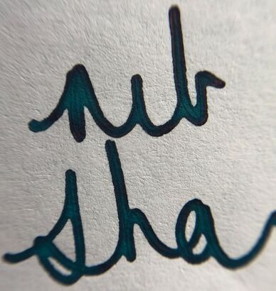 Teal with a hint of red 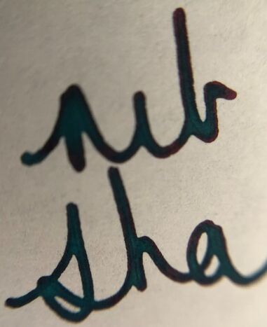 Here the writing is slightly more out of focus but the sheen is more obviously red. As the photos show it is just not apparent there is sheen with the naked eye the sheen just makes the ink look very dark. Last but not least on cheap paper and my oh my, not good. Even if there was no show through the feathering is bad. 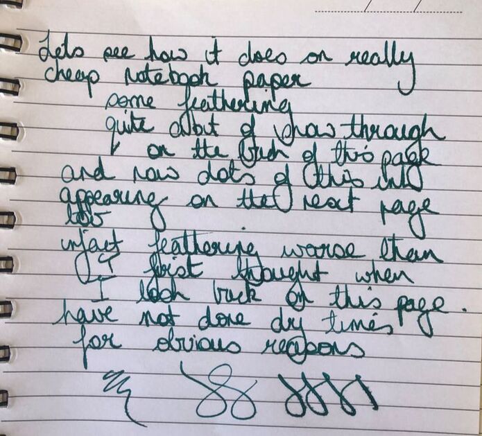 I think my disdain for this ink has come out in the brief review. I was really disappointed with it, I expected a lot more from the colour. I think there are better and prettier teal inks out there and am not sure I would encourage anyone to rush out and buy this (Diamine inks are available everywhere however I have found the cheapest option is to buy directly from Diamine). Other teal inks to consider if you are in the market for one: Hypercolors - niobium 3 Oysters – marine green Colorverse – pale blue dot or map of mars Pilot Iroshizuku – syo-ro KWZ – green #1 All are much more vibrant. In summary – Saturation – high Shading – no Sheen – yes and no – yes its there but no you don’t see it as sheen just a dark ink Flow - good Nib dry-out – none Nib creep – none Start-up – good Feathering – very bad on cheap paper Drying – slowest ink I have reviewed Cleaning – good Water resistance – not sold as waterproof because it really isn’t 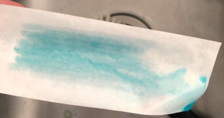
3 Comments
21/7/2023 15:25:56
The charged particles for example electrons and protons sending them into the upper environment bringing about them transmitting light of shifting tone. The type of the aurora made is additionally subject to the speed increase granted to the particles. 11/8/2023 13:55:28
The first swatch you can see it is a teal ink with a hint of a red sheen, the second swatch shows the base colour which is a match for colorverse map of mars. Thank you, amazing post! Leave a Reply. |
Ink Brands
All
|
 RSS Feed