Ink at the Heart of a Fountain Pen
|
|
|
|
|
|
|
|
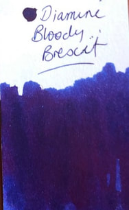
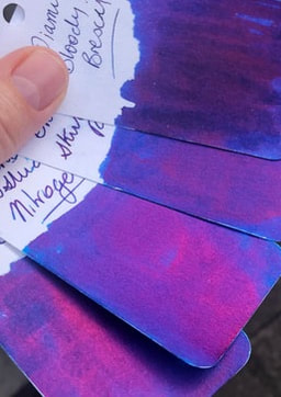
Another Diamine exclusive from Seitz-Kreuznach in Germany. They carry a number of Diamine German exclusive inks of which many are available elsewhere such as the guitar inks. They have however, two inks exclusive to them Bloody Absinth and this, Bloody Brexit. Quick note – Seitz-Kreuznach carry many inks including their own brand and any purchase over 25euro = free international shipping.
November 1979 Margaret Thatcher demands a rebate on Britain’s contribution she demands ‘her money back’, in 1984 she gets it. February 1992 The Maastricht treaty is signed allowing for more political and economic integration. The EEC becomes the EU. Britain however, opts out of a few of its provisions such as the single currency July 1993 John Major survives a no-confidence vote – there is in-fighting about European integration 23 June 2016 Britain votes by 52% to 48% to leave the EU 31 January 2020 after much delay Britain leaves the EU Every review I have read about this ink states it is a super sheener which it is. However, many just show swatches and no examples of writing which for me is where the problem lies with this ink. Packaging is the standard Diamine 80ml bottle in a standard Diamine box. The colours on the box are indicative of the ink (blue tending to teal with a red sheen).
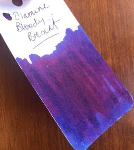
On col-o-ring it was a lighter blue and very heavy on the sheen.
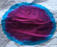
In fact it is very similar to my other blue with red sheen inks. 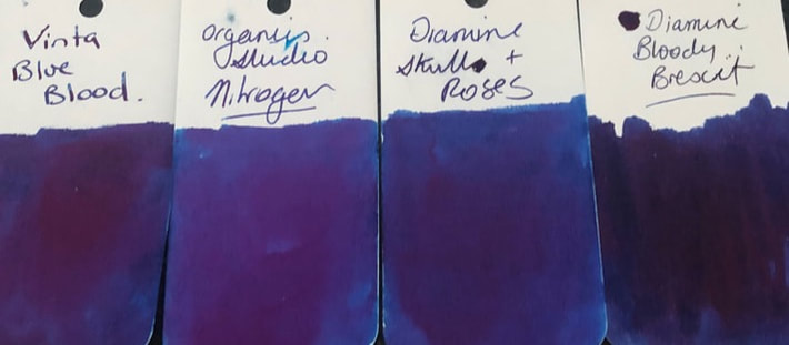 However, when you look at the sheen that of the other three inks is pink compared to bloody Brexit definitely red. Also the others have a metallic looking sheen even on col-o-ring whereas that of bloody Brexit looks matte.
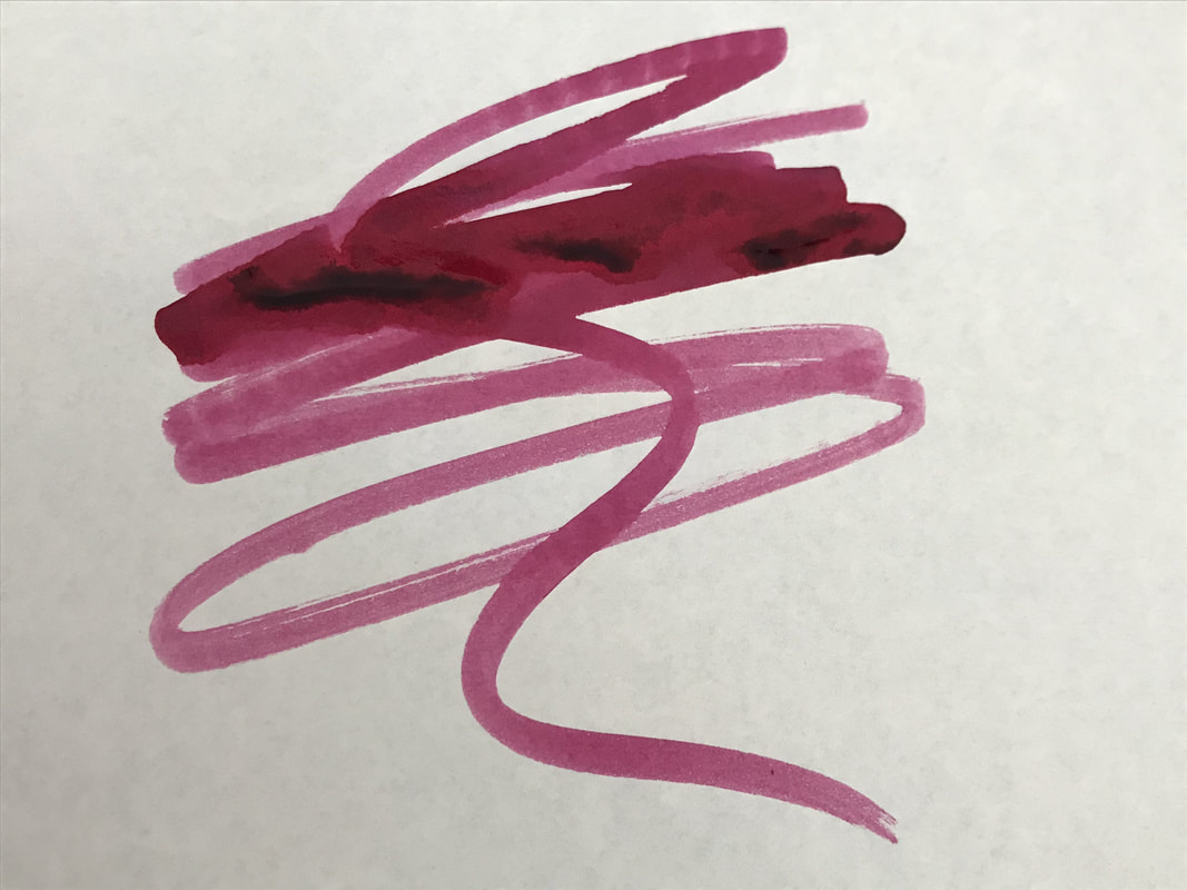
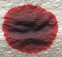
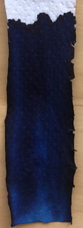
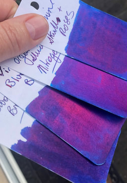
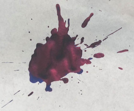
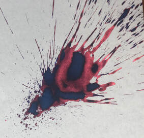
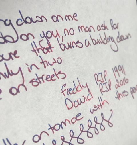
As you can see from the photos I changed the order I put them in just to confirm the colour difference in the sheen wasn’t because one swatch got more sun than another. Swatching on Tomoe was somewhat difficult as the sheen just dominated. So instead of dropping ink on paper I did a good splash. Unfortunately due to the sheen it is hard to accurately represent the blue because in the flesh it was more teal than the photo would suggest. Though it does write more dark blue as you will soon see.
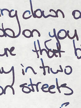
I started with a pen with a broad nib – the pen tends to be a wet writer and sheening inks tend to be on the drier side so I thought, as it turned out erroneously, the two would compliment each other. On Rhodia it was just a dark blue due to the sheen but no matter how I looked at the writing or under what light I could not get the sheen to look like sheen – it just made the ink look dark blue and disappointing. 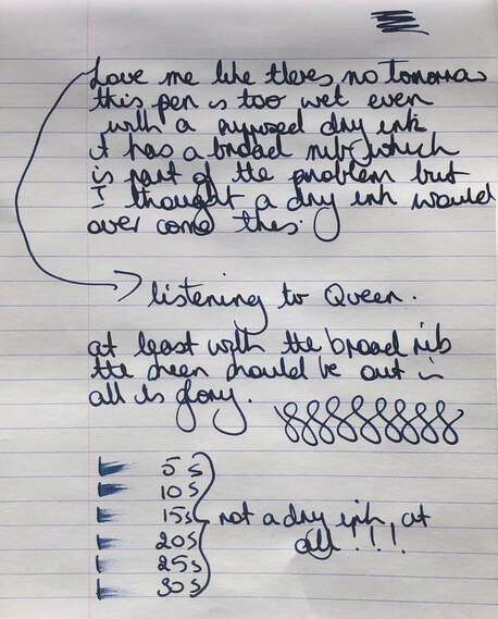 Similar results on Tomoe river but at least here by moving the paper you can see the sheen. 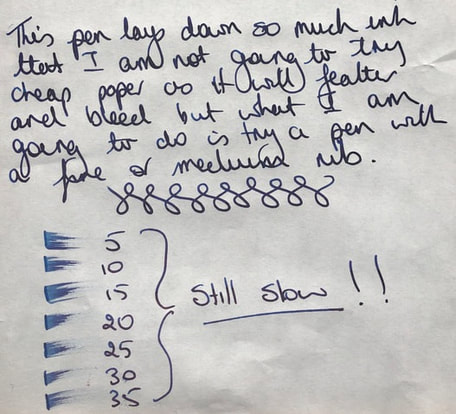 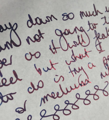 I changed pens to use something with a finer nib so not as much ink was laid down. 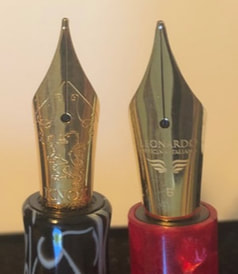 Medium Knox on left, broad Leonardo on the right Despite a finer nib results were similar on Rhodia though the ink looks more blue and isn’t as swamped by the sheen. I still couldn’t see the sheen even when moving the paper around. 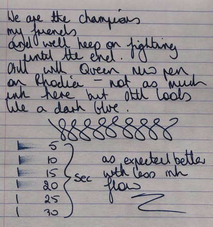 I tried Midori with similar results.  Lastly Tomoe again. Again dark blue but when you get close it looks like a shading ink and when you move the paper around or change the angle at which you look at your writing you can see the sheen. 
I have absolutely no idea why I bought this ink as I have other sheening inks and they are usually very difficult to clean out of pens. This ink is disappointing in that swatches and splashes / drops etc make it look lovely and a great sheener but the writing experience is different. Unlike most sheening inks this is a wet ink. The sheen dominates so that on any paper other than Tomoe it is a waste of the sheen as you can’t see it, the ink looks dark and uninteresting. One positive for this ink is that though I haven’t shown photos I went back and tried it on copy paper. Surprisingly though wet it didn’t feather or bleed through but it was just a dark blue ink. In summary - Saturation - high Shading - no Sheen – yes but need good paper to really bring this out, unfortunately sheen dominates on less than Tomoe quality and makes the ink appear just ‘dark blue’. Shimmer - no Flow – good – wet ink Nib dry-out - none Nib creep - none Start-up – had to prime both pens Feathering - no Drying – slow for a sheening ink Cleaning – Water resistance – did not test but not sold as water resistant
1 Comment
|
Ink Brands
All
|

 RSS Feed