Ink at the Heart of a Fountain Pen
|
|
|
|
|
|
|
|
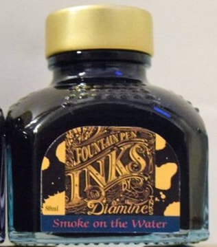
Smoke on the water is a Diamine German exclusive and a very famous Deep Purple track. Calling this ink exclusive is a misnomer. The German Diamine inks were commissioned by SC Lucht the German distributor, they are exclusive to this company but any German retailer they supply can sell the inks anywhere they like. Hence many have purchased the the ‘German exclusive’ inks from German online retailers as I did. There is a story behind Smoke on the Water and if you know the lyrics you know it is telling the story. Montreaux in Switzerland was always known for its music (going back to 60s and 70s here). The story goes that on the 4th Dec 1972 Frank Zappa and the Mothers were playing at the casino when a fire started. Depending on who you believe the fire started because either an over-excited fan fired a flare gun into the air or according to an attendee (Peter Schneider) writing in a 2009 blog post it was a young man flicking lighted matches into the low ceiling. Either way the fire spread quickly. Deep Purple was in Montreaux to record new tracks using a mobile recording studio belonging to the Rolling Stones They were forced out of their rooms by the fire but memories of the smoke billowing across Lake Geneva gave them the song title. Smoke on the Water reached no 3 in the USA in 1973. Deep Purple disbanded in 1976 and reformed in 1984. Frank Zappa died of Prostate cancer on the 22nd anniversary of the fire, 4th Dec 1993.
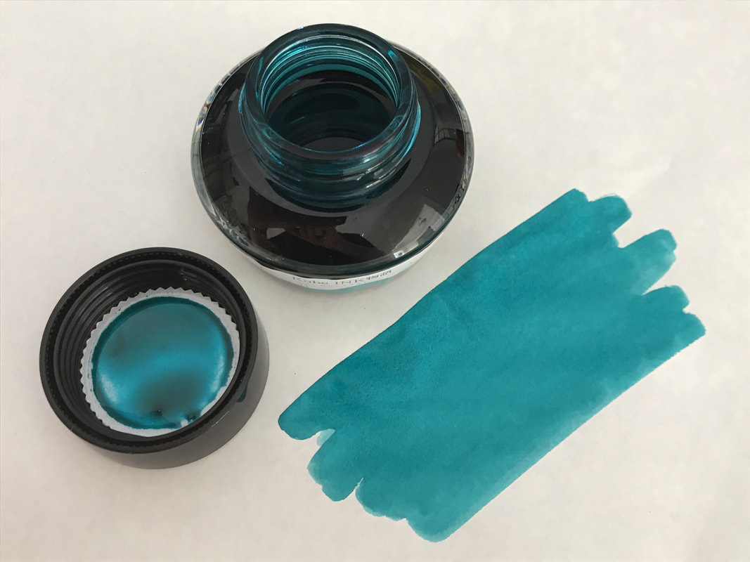
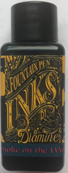
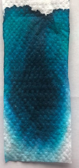
The ink comes in the usual squat glass Diamine 80 ml bottle or black plastic 30ml bottle. On both the colour of the base ink is incorrect as it looks dark / petrol blue when in fact the base is a lovely green -teal. The writing of the inks name indicates the colour of the sheen.
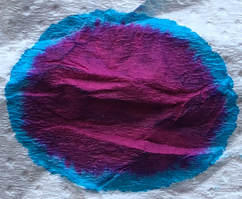
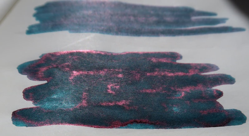
On col-o-ring it looks like a dark teal with little sheen until you change the angle from which you look at it and the sheen is more obvious.
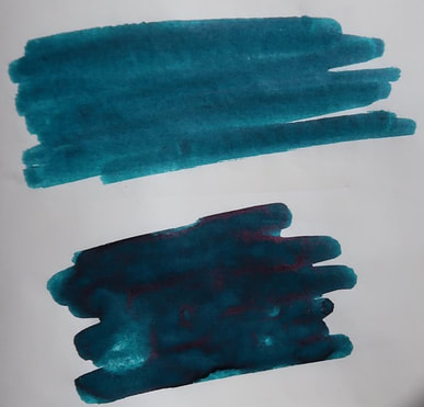
I thought this ink was a lot like another of Diamines German exclusives – Bloody Absinthe but when together you can see one is much more green than the other though they both have red sheen. 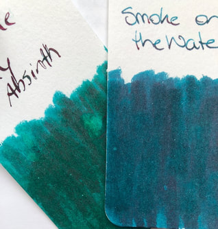 I was so disappointed with my first swatch on Tomoe as there was absolutely no sheen, not even when the ink was dry. I thought I might have done too dry a swatch so repeated it and left a lot of ink on the paper. The wets swatch took awhile to dry but there was the sheen. As with the col-o-ring it is more impressive when you look from a different angle rather that straight on, you can even see there is a hint of sheen in the original unremarkable swatch.
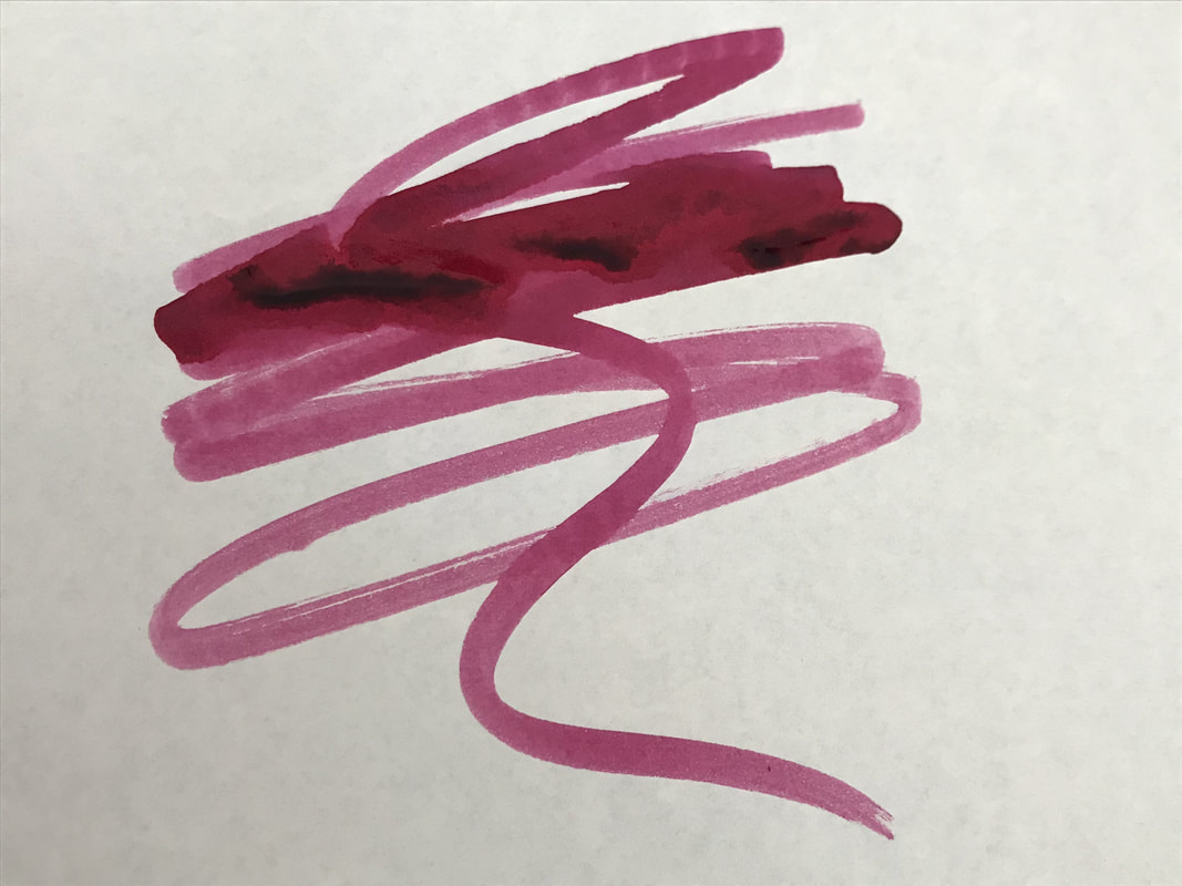
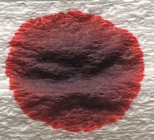
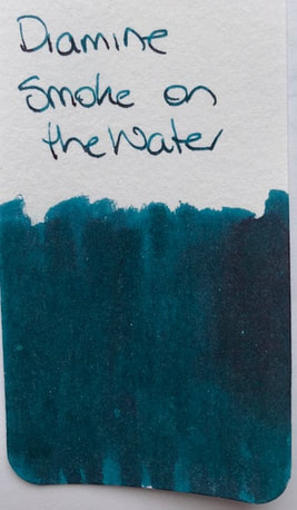
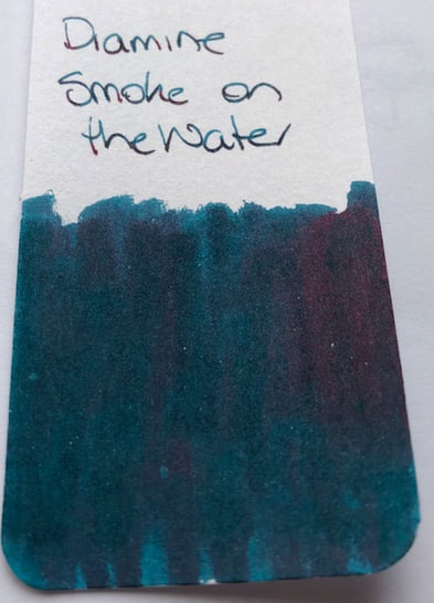
Writing I used a Lamy Al-star with a medium nib. I don’t like to use strongly sheening inks in my better pens because of the work required to clean them – I can take a part a Lamy much more easily than some expensive pens. The papers were Rhodia, Tomoe and copy paper. On Rhodia it looks like a shading dark teal ink. No sheen could be seen no matter what light I used or angle I looked at it. Surprisingly for a sheening ink it wasn’t that quick drying. 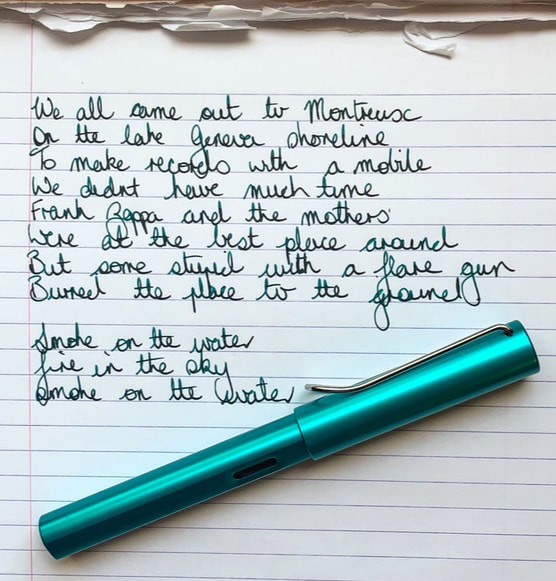 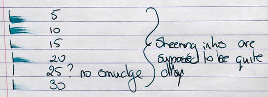 Tomoe came next as as expected the paper brought out the best in the ink. In the direct facing photo you can see the sheen is there but it looks much better when you look across the ink rather than straight at it. 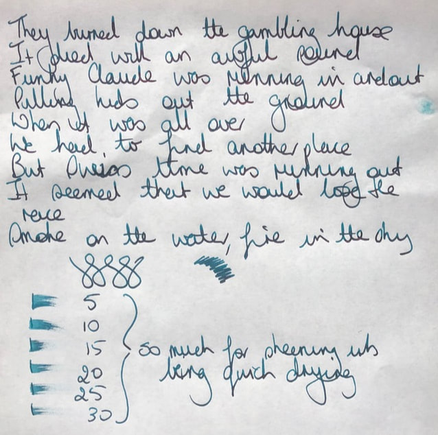 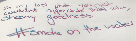  There had been no sheen on Rhodia but I thought I would still give copy paper a try. Nah! 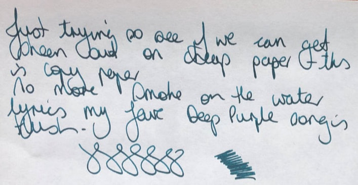 I do like a good sheening ink and Diamine inks are always good. The disappointment is that there are so many out there especially blue with red sheen and it is impossible to tell one brands ink apart from another. The teal of this ink make it somewhat unique in the sheening world however I suspect it is very similar to Organics Studio Henry David Thoreau Walden Pond. Other similar inks without sheen ie have similar base teal colour of you are not into the sheen are 3Oysters marine green and Herbins Emerald de Chivor In summary - Saturation - high Shading - no Sheen – yes but need good paper to really bring this out Shimmer - no Flow - good Nib dry-out - none Nib creep - none Start-up – Excellent Feathering - no Drying – slow for a sheening ink Cleaning – Easy! I was very surprised about this as sheening inks usually require flushing, flushing and yet more flushing – this no Water resistance - not sold as waterproof because it really isn't. 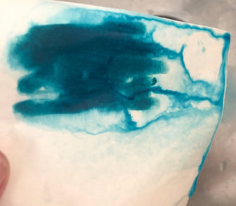
0 Comments
Leave a Reply. |
Ink Brands
All
|


 RSS Feed