Ink at the Heart of a Fountain Pen
|
|
|
|
|
|
|
|
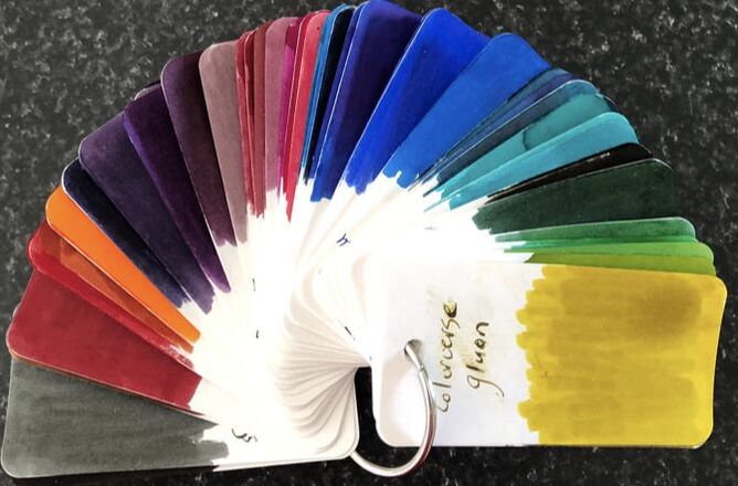
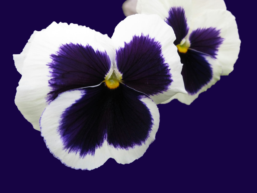
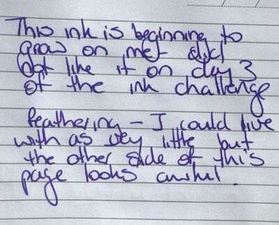
Day 3 (3rd June) of the recent ink challenge was the day I tried this ink. I have reviewed another Kobe Ink and in that review there is more information about Kobe Ink Story inks. However, briefly the Kobe inks are made by Sailor for the Nagasawa department store in Kobe. In Japan they are known as monogatari – so if you go internet hunting for them you will find them under: Kobe Story, Nagasawa -Penstyle and Monogatari. Sannimoya is a district of Kobe, it is the biggest downtown area of the city taking its name from the Sannomoya shrine. The Sannomoya shrine is part of the Ikuta shrone which is one of the oldest in Japan. In the early 1900s Sannimoya was on the edge of the city but then in 1933 the Sogo department store moved from Motomachi to just in front of the Sannimoya station leading to rapid development of the area.   As explained in my previous review the inks are inspired by the colours of the city. We have the location in Kobe city i.e. Sannimoya but why pansy? I could not find anything to explain this. The Vanness penshop website states the Pansy if the official flower of Kobe. However, I can not find anything to support this only lots of evidence that in May 1970 Hydranga (not Pansy) became the official city flower. The garden pansy is a hybrid plant 5-8 centimetres in diameter. They always have two overlapping upper petals, two side petals and a single bottom petal. The petals can be many colours, commonly white, yellow, purple or blue. This ink does remind me of pansies.
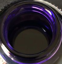
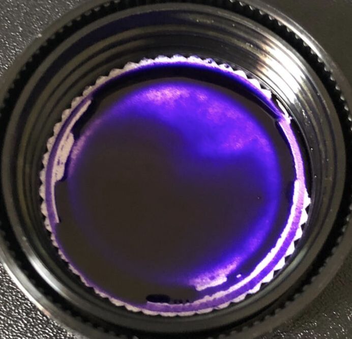
The ink comes in the same bottles Sailor ink used to come in but obviously with a different label. 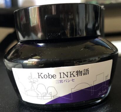
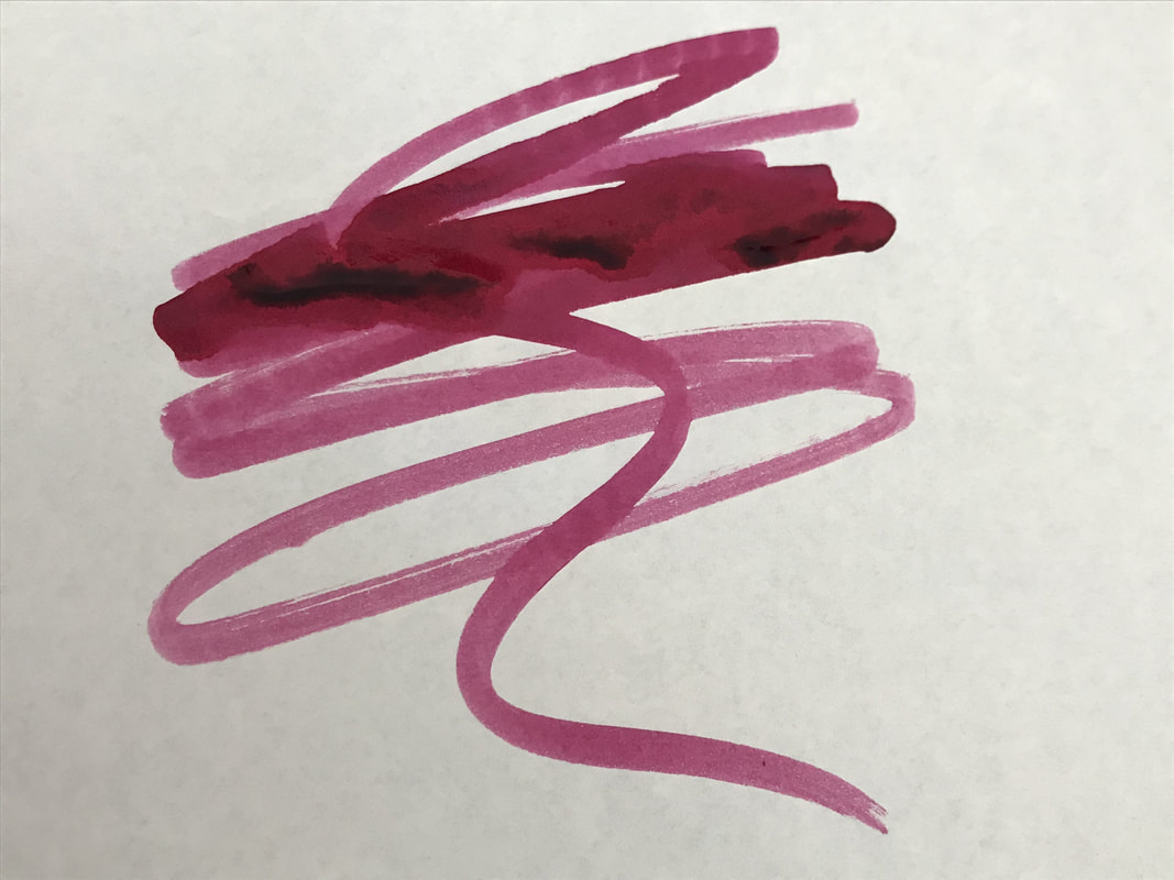
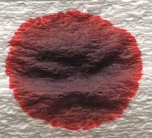
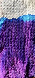
On the col-o-ring it seemed to be a fairly uniform purple colur but as you can see by the writing at the bottom there is some shading in this ink. 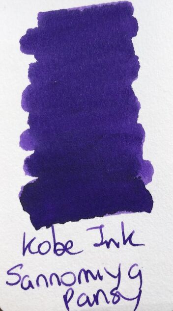 For once there was not much to choose between the swatch on the col-o-ring and Tomoe river paper. 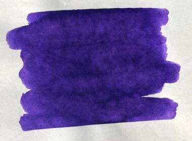 I have been playing around with ways to swatch the ink and it does remind me how different an ink can appear depending on the paper. 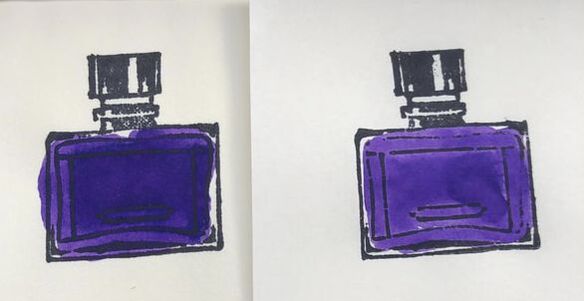 Midori cotton on the left, Tomoe river on the right I used this ink on day three of the #30days3inks challenge in a Kaweco sport which I did not like. To some that is a sacrilegious thing to say as many people love and collect Kaweco pens. This was my first (and only) Kaweco sport and as it’s a smaller pen I let myself be talked in to a buying it with a fine nib – I should have known better as I do not like fine nibs or at least German fine nibs. I have one Lamy with a fine nib, I never use it, I did not not not like the nib on this pen, I also struggled with the converter I was given to go with it. So, when I came to do this review I inked up another pen, my Opus 88 demonstrator, and then discovered I had used exactly the same pen for my previous Kobe ink review. The ink was much nicer in a wetter pen and I am really enjoying using it. Usually I start the writing samples with cheap paper but today it was Tomoe river. It is a saturated purple with no sheen but some nice shading. It did however take some time to dry on the paper. 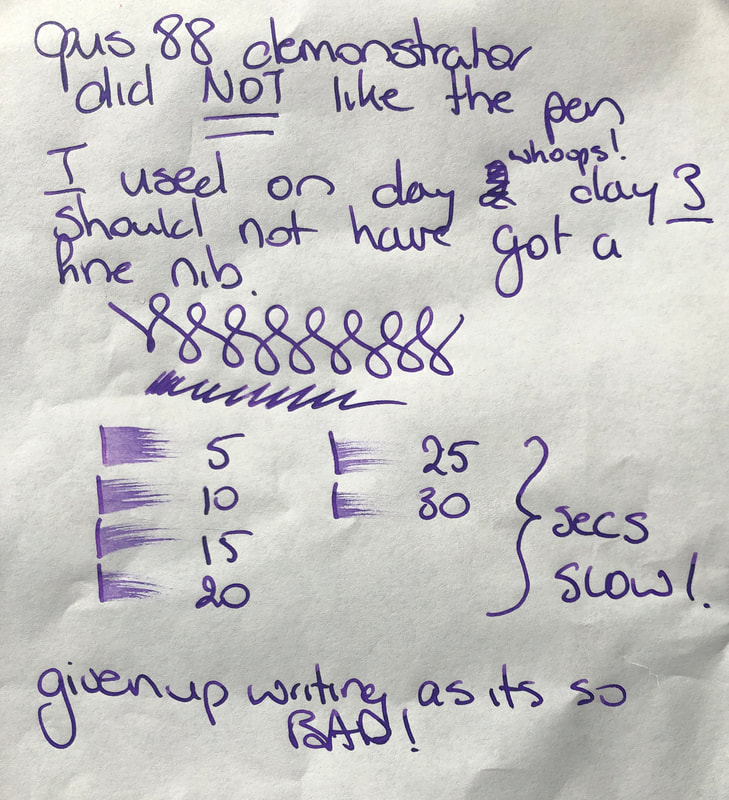 Tomoe followed by paper in a cheap notebook. It was ok, a nice colour but the shading was lost and it feathers just like every other ink I have tried on this paper.
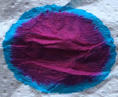
For the first time in a while I tried the ink on copy paper. I did this because I started to realise the cheap notebook was making every ink look bad, the problem was the paper not the inks. 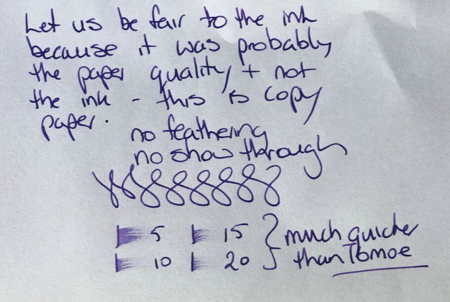 And finally Midori cotton paper. On this paper it was a darker ink but it dried a lot quicker than on Tomoe river paper. 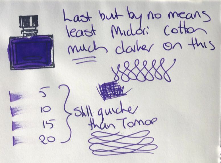 I really like this ink , admittedly because it is purple. I was so disappointed on June 3 when I tried it in the Kaweco with the fine nib but the Opus 88 has made me fall in love with the ink. Its not the cheapest of inks though even if they are 50ml bottles. Since I did the last review another retailer has started stocking the inks. The Deskbandit in Australia has them at $42 (NZ $44) plus postage. You can still get the ink from Milligram in Melbourne where it is $34.95 (NZ $36.50), you can also buy online from Milligram. The other option is to buy them directly from the Nagasawa department store through the Global Rakuten web site as its only NZ $27 a bottle if you buy from there. The only issues with Rakuten are the website and the postage. The website is very clunky and has poor search features but if you are patient you can find many inks and even pens not available in this part of the world. With the postage you never really have any idea what it will be until you place your order. It is not cheap! I have learned it is better to buy a few things to make it value for money. My last purchase was 4 inks made by Sailor but marketed under another name, even with postage it was the equivalent of buying two and half of the same inks here and I purchased colours I cannot buy here so I was still happy. In summary, Sannomiya Pansy - Saturation – high Shading – moderate Sheen - nil Flow – excellent, consistent delivery to the nib no skipping Drying – slow on the best quality paper, wet ink Waterfast – not sold as waterproof and interesting result when I put it to my usual test. Usually I place the Tomoe river swatch under a running tap and see what washes off. 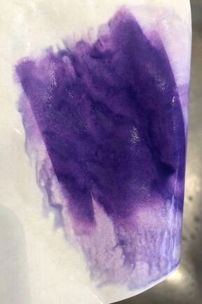 My initial thoughts were this is not too bad. However, usually when I take the swatch away from the water what remains on the paper just dries as is. This ink just kept leaching out of the paper, behaving on the Tomoe as if it was on a very absorbent paper such as a kitchen towel. That however, won't stop me from using it. 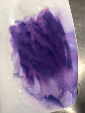
0 Comments
Leave a Reply. |
Ink Brands
All
|

 RSS Feed