|
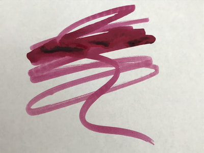
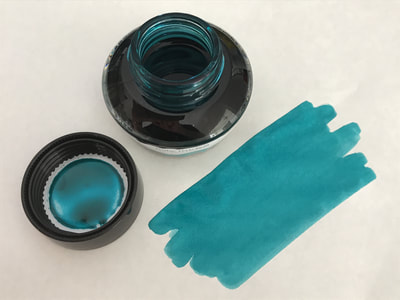
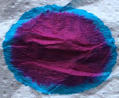
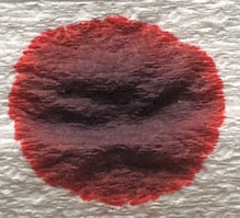
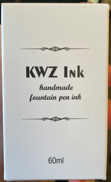
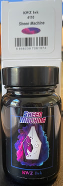
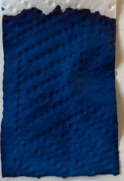
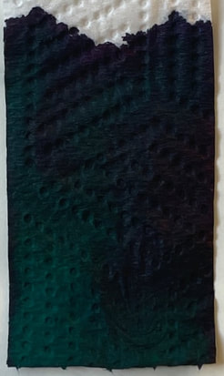
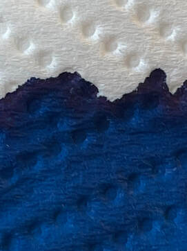
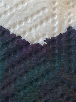
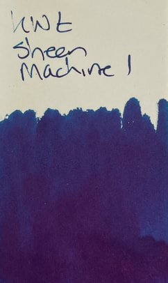
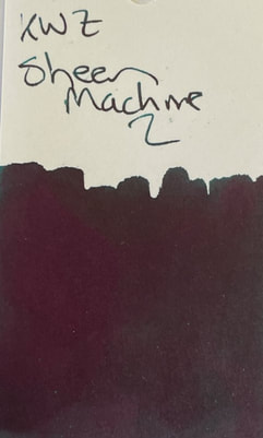
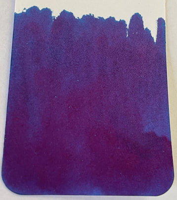
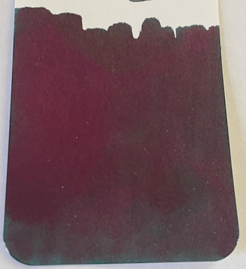
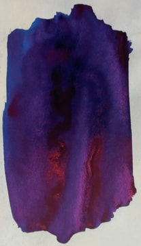
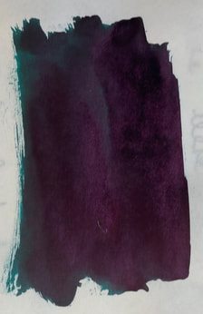
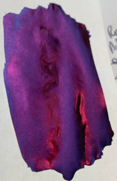
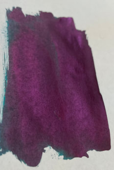
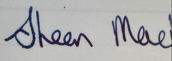
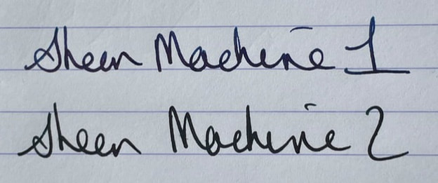
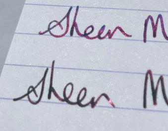
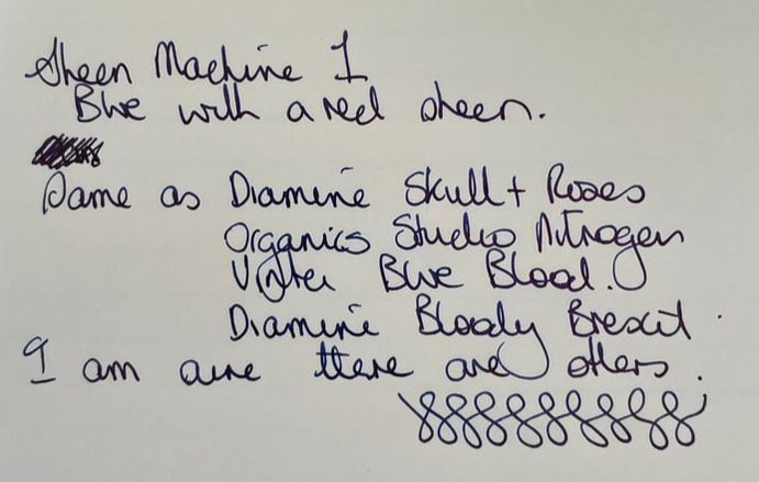
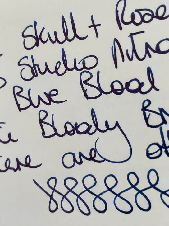
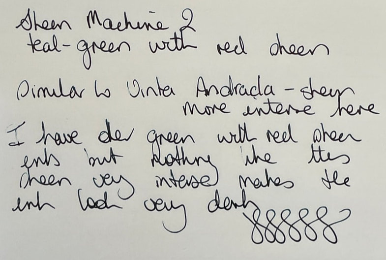
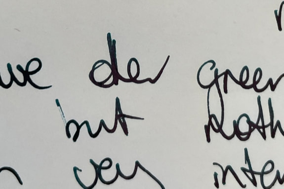
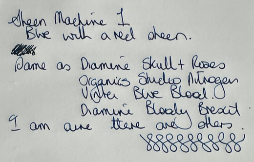
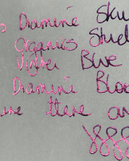
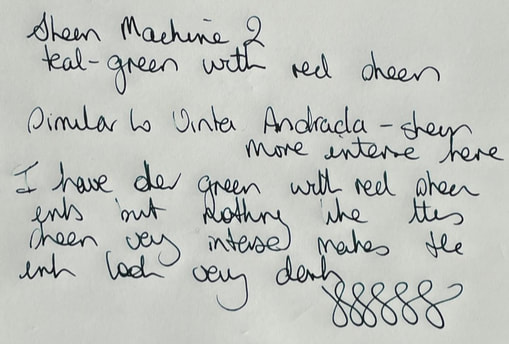
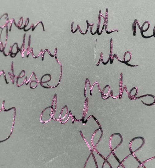
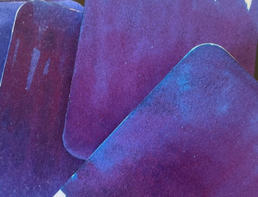
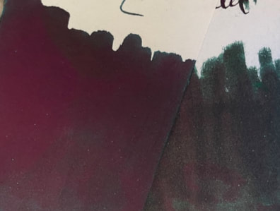
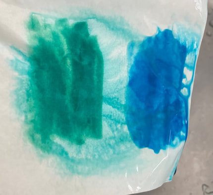
KWZ inks were first made in 2012 and come from Poland. KWZ was originally known for its iron gall inks (which are very good) but has rapidly progressed with colours and various different ink properties. Sheening inks have been really popular since Organics Studio hit the market with their super sheening inks in 2016. KWZ had its first foray into sheening inks in late 2019 with Sheen Machine1 (SM1) which was followed quickly in early 2020 with sheen machine 2 (SM2). Sheening inks have sheen because the pigment to liquid ration is very high. Due to this sheening inks tend to be darker. Less pigment and the ink can be transluscent, increase the pigment and you start to get shading inks, increase the pigment further and you lose the shade and get sheen. The high pigment to liquid ratio is probably why they also tend to be drier inks. KWZ inks come in 60ml glass bottles, they have a wide neck which is great for when the ink level drops. The bottle is a simple white box with a sticker on top to identify what the ink is within. SM1 is a blue ink with red sheen, SM2 is green but I would say more teal ink with a red sheen. Chromatograhy really gives nothing away – they are so pigment heavy it is hard to separate the pigments out using my usual techniques. You can however see the sheen at the leading edge. Swatches on col-o-ring always makes sheening inks look dull and the sheen is not always that easy to demonstrate. Tomoe or a paper of similar quality is really needed to bring our the sheen with many of these inks. Interestingly Number 2 is so sheen heavy that until you get the light right it just looks like purple ink swatched over a green ink. I didn’t really bother doing much in the way of writing samples on cheaper paper as the purpose is to see the sheen and as you can see below on cheap paper the sheen is not that obvious, the inks just look like a dark blue and a dark green. There is also lot of feathering. On Rhodia, again they looked dark. However, the sheen in SM1 can be seen if you look at it at the right angle. The sheen was really hard to see with SM2. With Tomoe I took photos inside at my desk and again in direct sunlight. In my office SM1 no real sheen but you can see there is red but it comes out more like shade and with SM2 it looks like a nice shading dark green ink. However, in sunlight WOW!!!!! These are very impressive. If you like sheening inks then these really are sheeners on the right paper, and more sheening than many other popular sheening inks. However, SM1 nice ink as it is, is nothing special as I have at least four others inks that are virtually identical Diamine Skulls and Roses and Bloody Brexit, Organics Studio Nitrogen and Vinta Blue Blood. The photo below show SM1 against two of the inks I have just listed – it really looks like three swatches of the same ink. SM2 is a different beast. I have a number of green, red sheening inks but nothing like this. The closest is Vinta Andrada but as you can see in the photo below the Vinta ink is a bit washed out compared to this. They are great inks but I think my summary would be SM1 is no different to a lot of other sheening inks that are available and SM2 is unique but for some reason the sheen is not as easy to demonstrate as that in SM1. In summary - Saturation - high Shading – no Sheen – oh yes! Shimmer - no Flow –good Nib dry-out - yes Nib creep – no Start-up – Excellent initially but if pen is left for a while it usually needs priming for re-use Feathering – yes on cheap paper Drying – didn’t test dry time but sheening inks tend to be dry Cleaning – sheening inks are not the easiest to clean and can stain pens so I always use cheap pens e.g. Jinhao. SM1 was not easy to clean and has stained the feed of the pen - the fed was white so the staining is easy to see, SM2 easy to clean no staining Water resistance – not marketed as waterproof
0 Comments
Leave a Reply. |
Ink Brands
All
|
Proudly powered by Weebly




 RSS Feed