Ink at the Heart of a Fountain Pen
|
|
|
|
|
|
|
|
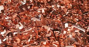
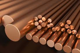
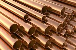
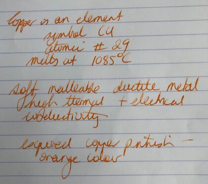
I recently bought the new Lamy LE copper pen. The pen itself is ok but I probably shouldn’t have bought it with a fine nib – my problem. I didn’t order the ink as I have never been particularly impressed with the colours of the ordinary Lamy inks but I was sent a box of cartridges and cut one up to help with this review. Copper (Cu) is the 29th element of the periodic table. It is a soft malleable and ductile metal with high thermal and electrical conductivity. Exposed copper has a pinkish -orange colour. There are no prizes for guessing that the ink is called copper as it is supposed to be a copper colour.
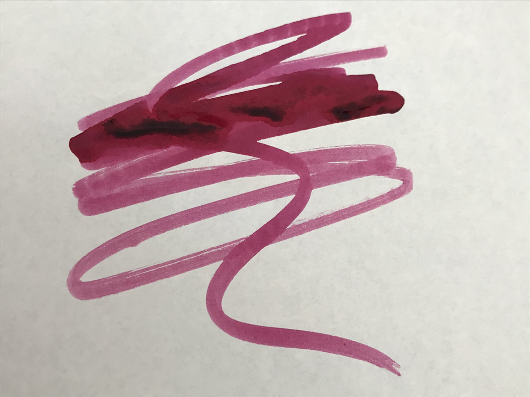
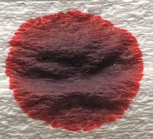
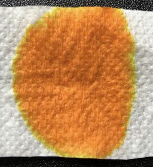
I am not sure whether the ink looks copper in the bottle or not but it doesn’t remind me of copper in the swatches and there are hints of Bungbox Yurachuko line ink from the Tokyo Metro Colors set. This ink though is deeper and therefore offers more interest. I started with the swatch on absorbent paper, the paper for once was not large enough to contain all the ink but you can still appreciate the colours contained within to make up this ink.
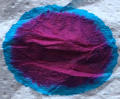
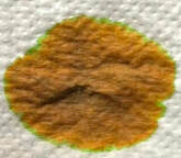
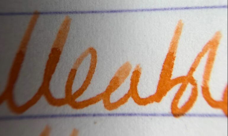
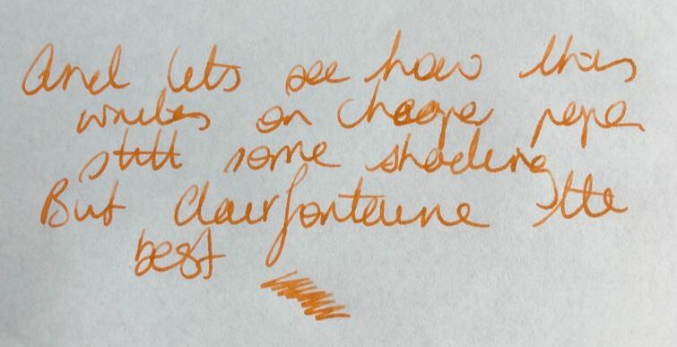
The col-o-ring revealed a deeper colour that I would now call coppery orange. You can also see some of the green coming through at the top of the swatch, it appears as a faint squiggle down the centre of the swatch. 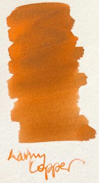 Testing the ink on Tomoe River – OH MY!!. It certainly looks coppery at the edges but this did NOT do the ink any favours. 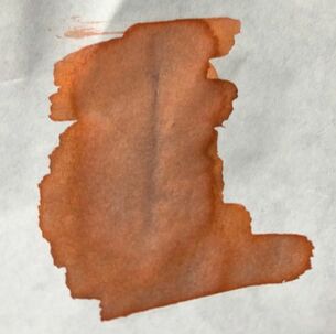 The writing experience was ok because Lamy inks are pretty reliable it was just a matter of whether the colour was interesting or not. I used my new copper pen and I started with Clairfontaine and was pleasantly surprised by the shading. The ink was almost orange which meant it was bright but it still looked like a washed out Noodlers Apache sunset or Nemosine solar storm. As far as I am concerned though this was by far the best paper to use with this ink.
Tomoe river followed and again shading as expected but it looked like a sad relative of the ink on the clairfontaine paper. Lastly copy paper and the colour was similar to that seen on Tomoe paper. I thought it was writing pretty well though as there was no obvious feathering but when I turned the paper over – show through.  Tomoe River 52gms
As I said Lamy inks are pretty reliable but the colours so uninspired. It made me go back to Lamy copper orange an ink I haven’t used since I bought it in 2015. In all the following photos copper orange is on the left. 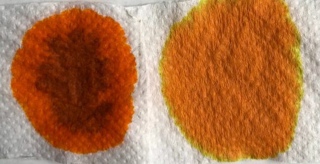 I know the copper orange looks like it is still wet - I promise you it was dry 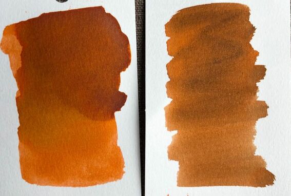 Col-o-ring hints at similarity 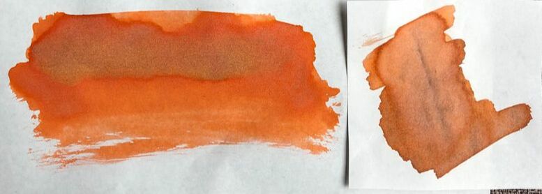 Tomoe River - still some similarities but copper orange more vibrant When I did my first Lamy ink review in June 2018 I did not post info about where to buy the inks, I am going to say the same thing here - it is ubiquitous you can get it anywhere and prices are very similar.
0 Comments
Leave a Reply. |
Ink Brands
All
|
 RSS Feed