Ink at the Heart of a Fountain Pen
|
|
|
|
|
|
|
|
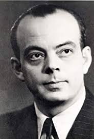
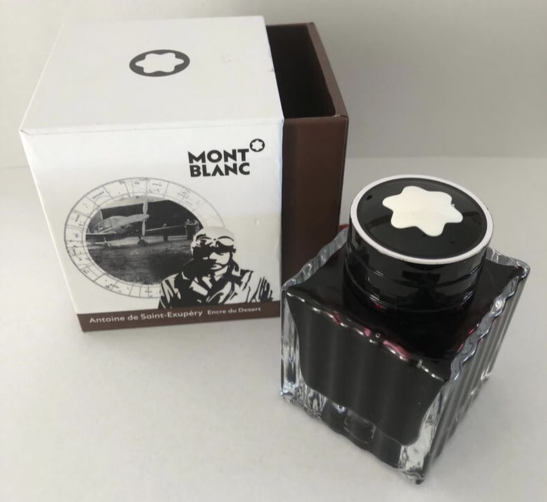
A mouthful of a name for an ink! Antoine Marie Jean-Baptiste Roger, Comte de Saint-Exupéry, (29/06/1900 – 31/07/1944) was a French writer, poet, aristocrat, journalist and pioneering aviator. Aviation was his first love and he wrote about it e.g. Wind, Sand and Stars but for most he is best known for his book The Little Prince (Le Petit Prince). He was a successful pilot before the second world war broke out flying airmail routes. He joined the French Airforce at the start of WW2 but once France signed the armistice with Germany in 1940 he was demobbed. He then spent just over two year in the USA before going to North Africa to join the Free French Air Force. He insisted on flying despite increasing age and declining health, he had had a number of plane crashes in the past.
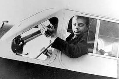
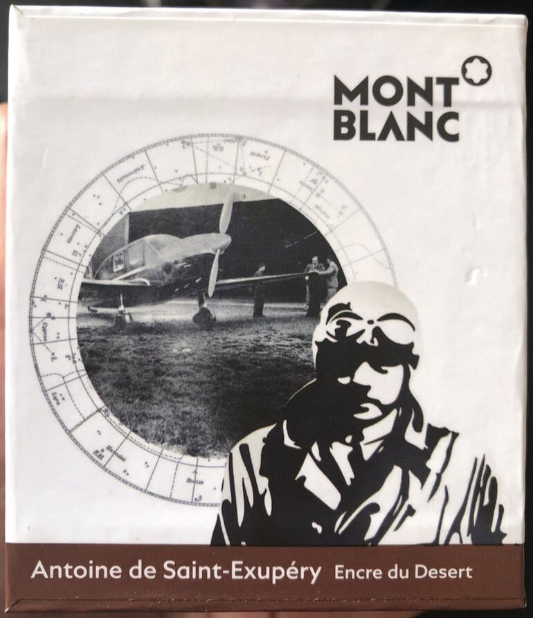
On 31st July 1944 he flew from Corsica for a reconnaissance mission over France. He never returned and was deemed killed in action. He made the news again in 2000 when a scuba diver exploring near Marseille discovered plane wreckage later identified as Saint-Exupéry’s. Evidence indicated that he had likely been shot down. Mont Blanc call this ink – encre du desert = ink of the desert, this I could believe looking at the colour on the box which is brown. I have never been that interested in it because I thought it was brown, I got to swatch some recently and just fell in love with the colour as its not Brown. I bought the ink in the USA but could have bought it from the Mont Blanc international web shop for NZ$61, the same ink in Australia is NZ$57 but I would have to pay p+p, in the USA it retails for approximately NZ$66 and again p+p would need to be applied. The only reason I can think that Mont Blanc called this ink Desert in homage to Saint-Exupéry is because of where he used to fly. The packaging is the standard Mont Blanc box of outer hard sleeve with a drawer inside holding the ink bottle. The bottle is square glass and looks like crystal, the Mont Blanc logo is on the cap. For once the colour on the box is not representative of the ink.
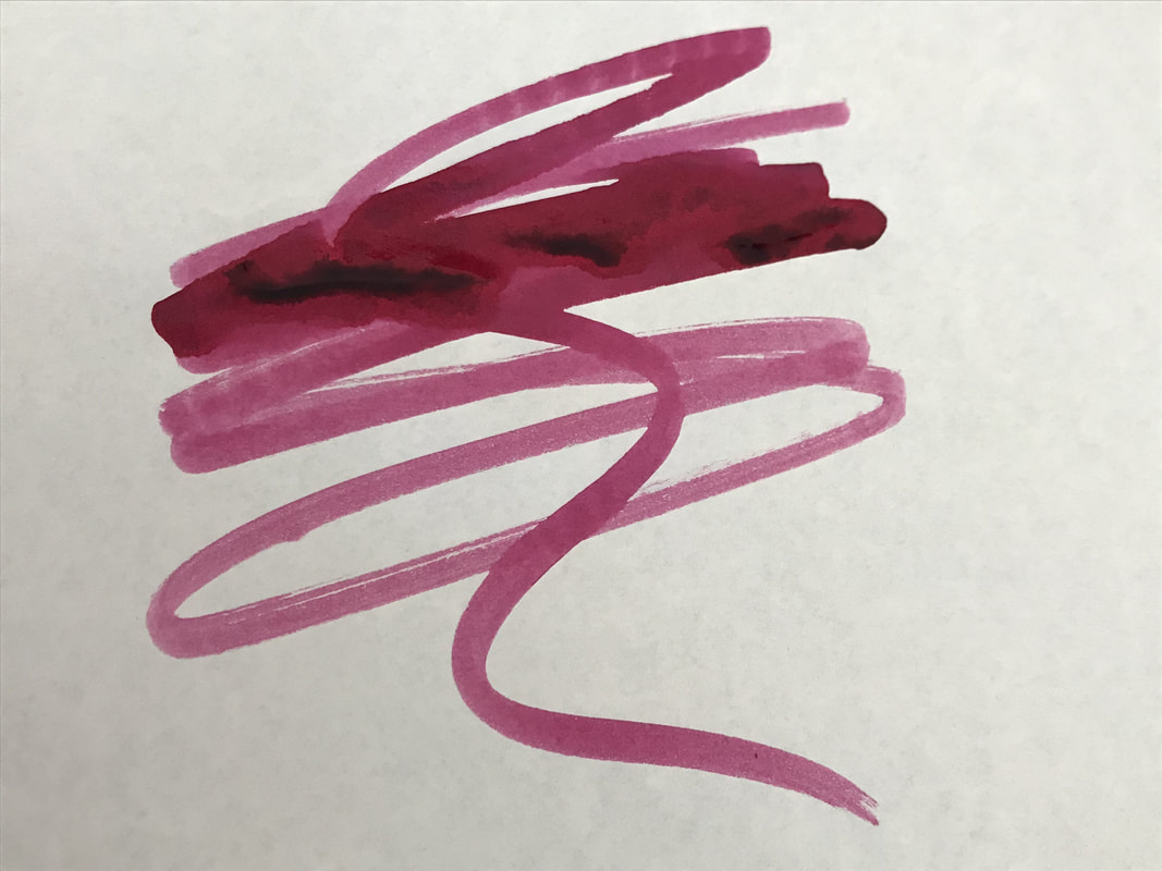
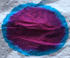
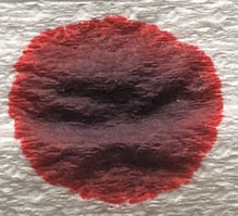
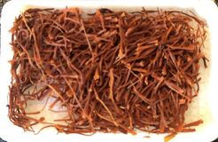
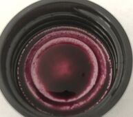
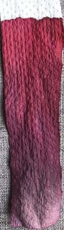
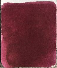
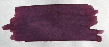
On the col-o-ring the ink is a dark red almost wine coloured ink i.e. Shiraz comes to mind again. On Tomoe it is a deep purple, what I would call grape rather than a specific wine.
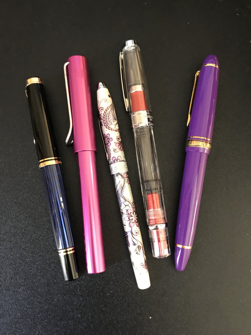
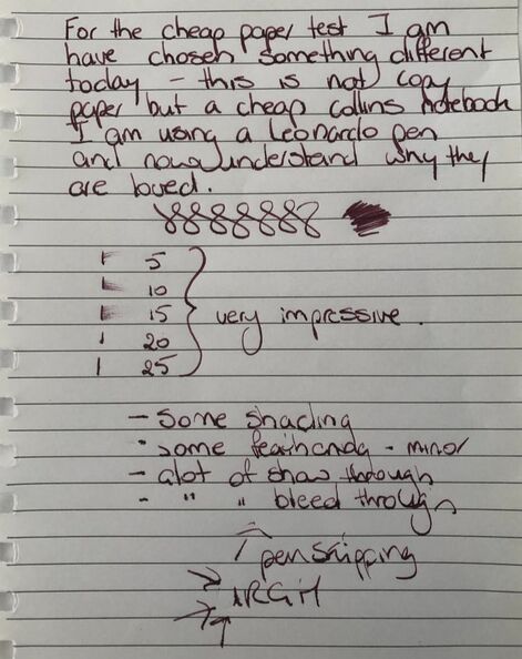
I started my writing with my new Leonardo pen which turned out to be a big mistake, maybe I should have flushed the pen before use. It took ages to get the ink to flow and I had to prime 4 times before I could write. It then seemed ok and I was really enjoying the pen until it started to skip. I thought it could be the ink so inked another pen, a Schaeffer and again had a lot of issues getting the ink to start flowing, priming the pen twice this time. However, once it was underway the Schaeffer was great and most of the problems were my first pen choice – you will see some of the results of this in the following photos. I have since used the ink repeatedly in a Monteverde pen and had no issues with hard starts. My cheap paper today is not copy paper but something thinner from a notebook. The ink dried to a browny maroon colour. The drying times were good but there was feathering and too much show and bleed through. After a great start this is where my love of the Leonardo started to wane.
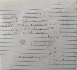 I went on to Rhodia and the ink was more brick red, in fact just a much better colour reminding me on Diamine's Oxblood one of my favourite inks. Some great shading was now apparent but the skipping ultimately got the better of me. 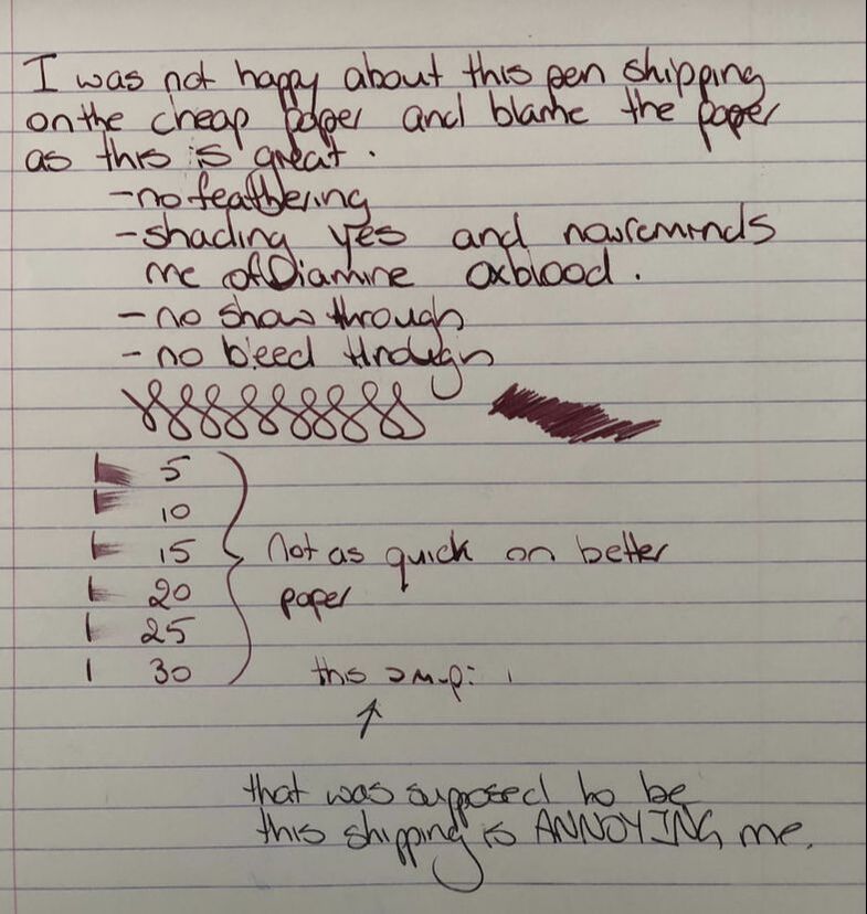 Though it reminded me of Oxblood here they are different inks. Oxblood is slightly more orange based than this ink though they are close. 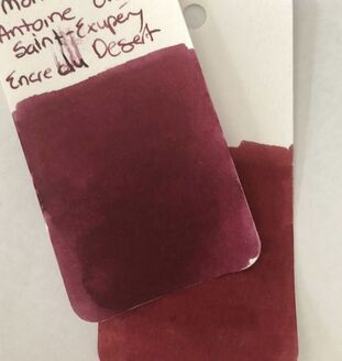 The problem with so many inks is you can forget what you have. When I was putting the col-o-ring for this ink away I found another similar. I always seem to make a mess of writing the ink name. 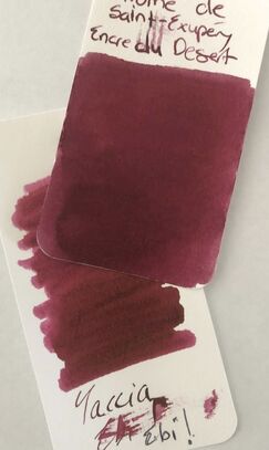 Because of the skipping issues as I wrote above I used another pen. I didn’t have any skipping but you can see less ink is being laid down as I write. 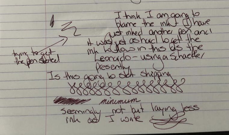 For someone who wasn’t that impressed with Midori paper when I first started using it it has really gown on me and quite a few of the inks I have reviewed lately have been the best on this paper. I just wish the white paper was optical white not creamy coloured. I will go with Mont Blanc calling this dark saffron as I really can’t think of another descriptor. On Midori dry times are similar to Rhodia and you get the same shading. 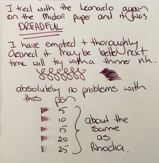 I really like this ink, Mont Blanc inks are reliable and I love this colour. I am not sure I would buy another bottle though mainly because it is not cheap, I will just be very select about who gets samples though. This ink flows well in the right pen and dries reasonably quickly, losing no colour as it does so. There is some shading. A cheaper dupe for this ink is Taccia ebi. In summary – like most Mont Blanc LE inks not the cheapest but the LE usually makes the ink popular Saturation – high Shading – yes Sheen - no Flow - good Nib dry-out - none Nib creep – none that I saw when I used the fountain pen Start-up – hard in both pens, needed repeated priming but since ok in a Monteverde Feathering – on cheap paper Drying – good Cleaning – easy, I have cleaned the Leonardo pen I started with Water resistance – not sold as waterproof but pretty impressive water resistance 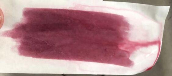
2 Comments
Emre
25/11/2020 17:24:10
Could you look at the bottom of the bottle and check something? Just bought a bottle and the seal on the box was broken. Mine says “1707-N705 encre marron” on the bottom of the bottle. Trying to figure out whether I was scammed.
Jane
4/3/2021 23:33:29
Hi, I just bought this ink and the bottle has the same number on the bottom. I think is original. Leave a Reply. |
Ink Brands
All
|
 RSS Feed