|
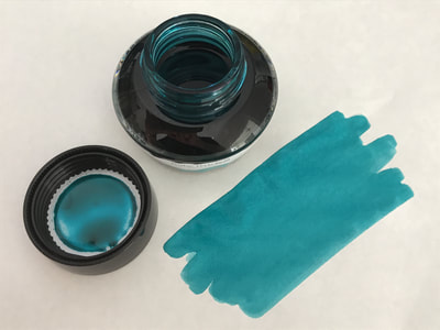
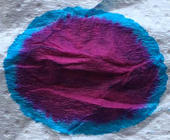
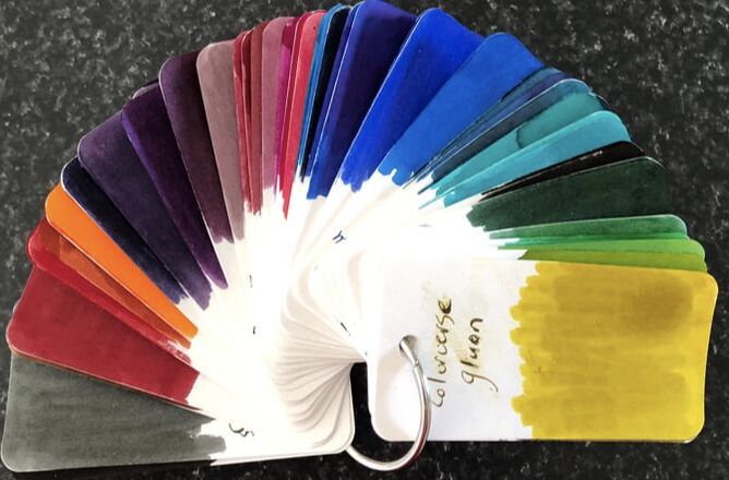
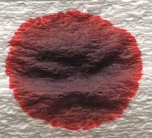
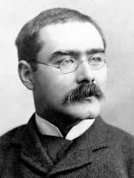
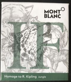
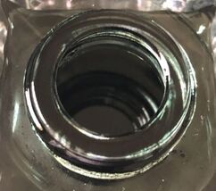
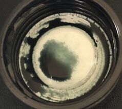
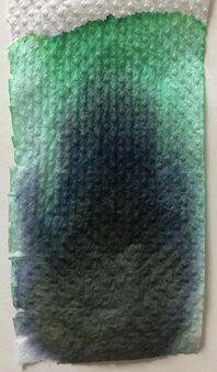
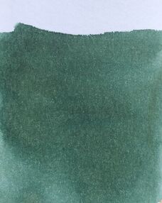
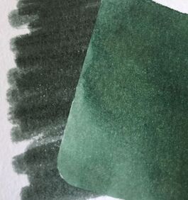
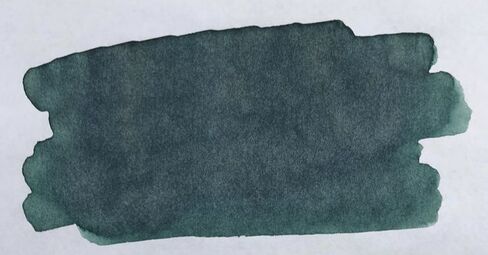
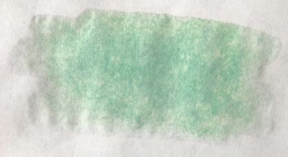
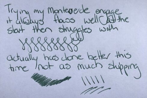
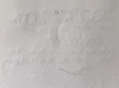
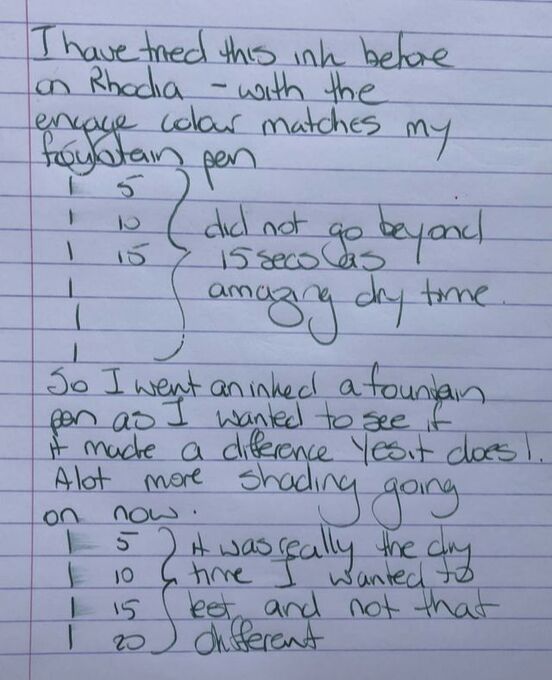
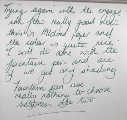
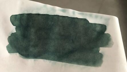
This is the first of the Mont Blanc writers edition inks I have used. The writers edition series began in 1992 with the Shakespeare pen. Since then pens have continued to be released in tribute to writers whose works have become part of world literature. There has not always been a limited edition ink released with the pens and if there is it may not be in the same year e.g. Shakespeare pen in 1992 and the ink in 2016. This year it was the turn of Rudyard Kipling to be honoured. Rudyard Kipling was born in Bombay on 30th December 1865, he spent much of his life traveling and living between India and England, dying in London at the age on 70 on 18th January 1936. Kipling used India extensively as a backdrop to his stories so it really is fitting that Mont Blanc named the ink Jungle. The pictures show some of the many colours of green one might encounter in the jungle. The ink matches none of them but it still manages to evoke the jungle. Opening the bottle revealed a very dark green more reminiscent of Pilots 100th anniversary Hoteison. Even the ink on the cap looked very dark. You will appreciate why I mention how dark the was in the bottle when you see the writing samples. Chromatography revealed a range of green shades. There was some blue but the greens ranged from a dark olive to spearmint and lime/bright green. This suggested it wouldn’t be as dark writing as the first impression the ink gave in the bottle. Swatches on col-o-ring and Tomoe river paper followed. On the col-o-ring it’s easy to appreciate the various shades of green that make up this ink. In fact there were even subtle shades of yellow. It also became very apparent that though the ink was reminiscent of Hoteison in the bottle it wasn’t when swatched. It was much darker on Tomoe and the shading was not as obvious – it was a more consistent colour. I do use more ink to do a swatch that I would use for writing, so I wasn’t surprised it bled through on the Tomoe – what was interesting was the colour that showed on the other side, a pale spearmint colour. When it came to the writing I had just received my Montverde engage pen and wanted to try it so used it here. For those that don’t know it is a rollerball that has a converter so can be filled with fountain pen ink. It’s a great way to get into ink and avoid the mess that can be fountain pens though it will still need cleaning as thoroughly. It is a lovely looking pen but a lot bulkier and heavier than expected. I like big pens but this will take a bit of getting used to. I have also gone back to trying ink on cheap copy paper for the simple reason that if you use a pen at work this may make up the majority of the paper you get to use. Quality papers are great but you are not going to be given them at work. My first test was on copy paper and I spent some time figuring out the best way to hold the pen and how much pressure I could use. I ended up with a lot of skipping which didn’t show either the pen or the ink in their best light so I persisted until I got it right which didn't take long at all. I am not sure how I would describe this green, I think the closest I can get is khaki green which fits its jungle name. It is not bright, emerald, olive, Kelly or any other green adjective I know but I do like it. On the copy paper there was some show through, it was slight and from the following photo you will note I press rather heavily when I write and that is probably the cause of the show through. The cheap paper was followed by Rhodia, I have used the ink before on this paper so was comfortable the engage pen was allowing enough flow etc to be a match for a fountain pen. I wasn’t so sure when it came to drying times as I thought the engage did not lay down as much ink as a fountain pen and therefore, drying times would be inaccurate for fountain pen use. I needn’t have worried the drying times were very similar and though it may not be obvious in the photo there was more shading with the fountain pen. Lastly Midori and I really like the ink on this paper. It is not as dark as on the other two papers but the pen and ink just flowed so smoothly across the paper, I don’t mind the lighter look. This is my favourite and the most accurate colour representation as it is virtually identical to the colour on the box. This ink flows well and dries very quickly, losing no colour as it does so. There is some shading, but overall it laid a fairly ‘consistent in tone’ line. In summary – like most Mont Blanc LE inks not the cheapest but the LE usually makes the ink popular Saturation – high Shading – minimal to virtual nothing (for the sake of answering this though not shown in the review I wrote a couple of lines on Tomoe and shading was still non-existent even on Tomoe). Sheen - no Flow - good Nib dry-out - none Nib creep – none that I saw when I used the fountain pen Start-up – immediate Feathering – nil on any of the papers used Drying – excellent Cleaning – easy Water resistance – not sold as waterproof but virtually no ink lost when held under a running tap
0 Comments
Leave a Reply. |
Ink Brands
All
|
Proudly powered by Weebly




 RSS Feed