Ink at the Heart of a Fountain Pen
|
|
|
|
|
|
|
|
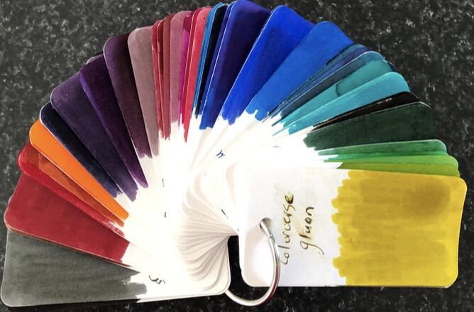
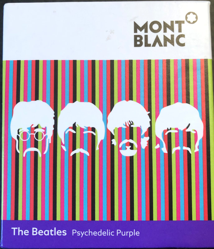
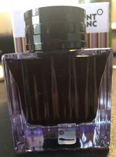
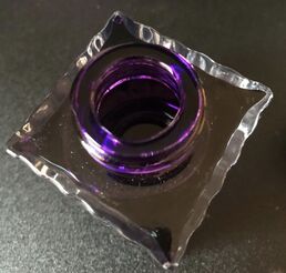
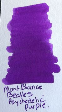
This is the ink I used for June 5th or day five of the #30inks30days challenge and right at the outset I need to declare I love this ink, it is a bright bold purple. I think it is the purple I have been looking everywhere for and I intend to buy more. This ink was released late in 2017, it is a limited edition ink from the Mont Blanc great character series, despite it being a limited edition ink it still available just about everywhere I look. As there is no Mont Blanc shop in NZ I have taken to buying directly from their online shop. As I love the ink I needed to know more and I think to fill this page with information about the Beatles would be a waste as so much is known so I went on a hunt as to why, for this ink purple is associated with the Beatles. I found a few sites that claimed purple was the favourite colour of George Harrison and other sites claimed he had a different favourite colour, thus not much help so far. Then I found some interesting information about Deep Purple (the band) and a tenuous link to the Beatles. I will settle for that being the reason to call this ink purple and associate it with the Beatles. I like Deep Purple, I think hush is one of the best progressive rock tracks to come out of the 60s, I like the Beatles and I love this ink – what more could I ask for. Deep Purple made a demo of the Beatles song ‘Help’ and it was this demo that enabled them to get a record deal. It was included on their first album “Shades of Deep Purple” released in 1968. It was number one track for the Beatles in 1965. 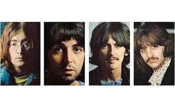 Hush was also on the first album and it was decided to release this rather than the cover version of Help as the promotional single. It proved to be a sensible decision as Hush was widely played and brought the band considerable attention peaking at No. 4 in the USA and No 2 in the UK. Interestingly, and this is something I have just learned Hush was not a Deep Purple original. The song had been released the year before by Billy Joe Royal, a well-known session musician and song writer. The packaging is similar for all the Mont Blanc limited edition inks. There is a hard outer sleeve with a drawer holding the ink bottle. The bottle is the same square bottle that the Ladies edition ink came in.
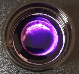
On opening the bottle this is a bright purple which I liked immediately.
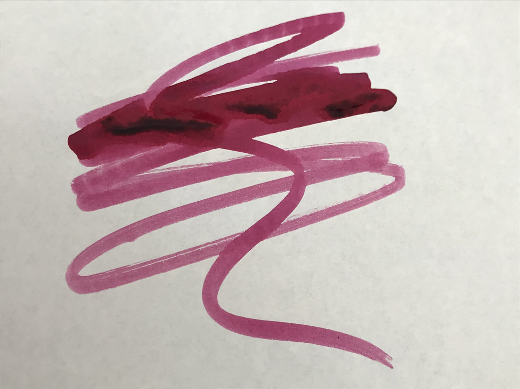
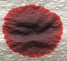
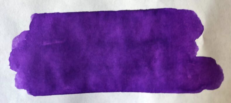
Chromatography held out promise that this would be a nice shading purple ink as it contained some very bright vibrant colours in its mix. 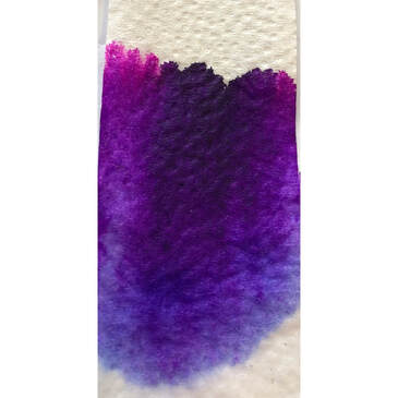
I decided to do an ink needs to match the pen day and chose to ink a pen I had recently received from Hardy Penwrights. I love the pen so I felt I couldn’t go wrong using this ink in it. 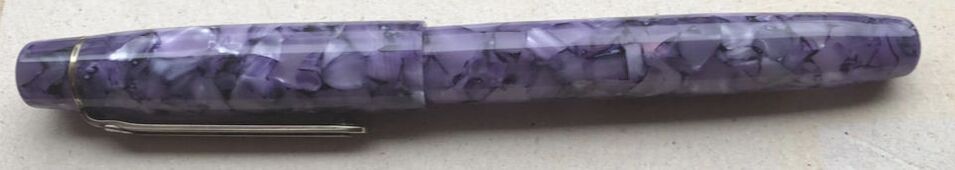 Photographed middle of the day near a window 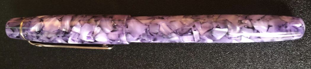 Under a light looks much lighter but you can appreciate the chatoyance more I started with a heavier and I have assumed cheaper paper. When I bought the pen I received a small notebook with it, it is this I have used for the not so ‘fountainpen friendly’ paper test. The paper has a similar weight to copy paper, around 80gsm. The ink is quite wet as you write causing some spread on this paper but no real feathering as such, it just laid down a very thick line. 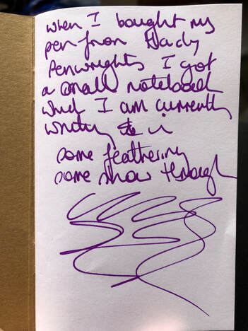 On Tomoe river it wasn’t as wet but still took a reasonable time to dry. Ink was very consistent with minimal shading. Interestingly it didn’t run when I used correcting fluid to try and hide a mistake – I failed you can see it in the photo. 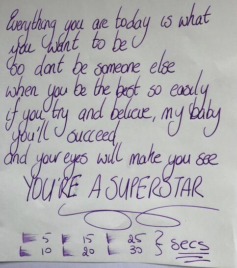 Lastly on Rhodia, again very consistent but a much better drying time.   The ink is wet, but dries in a fairly reasonable time. There is some shading, but overall it laid a fairly ‘consistent in tone’ line. This ink loses no colour as it dries and remains quite vibrant. In summary - Saturation – high Shading – minimal Sheen - nil Flow – perfect Drying – reasonable Waterfast – not sold as waterproof but my usual test is below. Would I recommend? Most definitely! 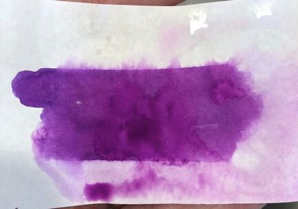
0 Comments
Leave a Reply. |
Ink Brands
All
|
 RSS Feed