Ink at the Heart of a Fountain Pen
|
|
|
|
|
|
|
|
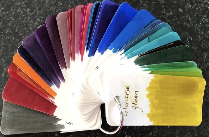
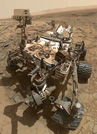
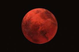
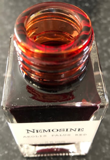
Another ink from Nemosine, it is unusual for me to review inks from a company one after the other. I tend to have no plan or consistency in the companies I review. I swatched this ink at the same time I did my solar storm review and I just loved the colour. Information on price and where to buy can be found in my previous Nemosine review. As previously mentioned all Nemosine inks are named after something astronomical. Here its Aeolis Palus a plain on Mars and the red (I guess) as Mars is the red planet. Aeolis Palus lies between the northern wall of the Gale crater and the foothills of Aeolis Mons (Mount Sharp) on mars. Its claim to fame is that the Curiosity rover landed on Aeolis Palus in 2012. The rover was landed by the NASA Mars Science Laboratory mission and spent two years exploring the plane as it made its way to Aeolis Mons. 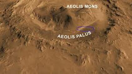 Landing site is the purple ring
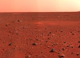
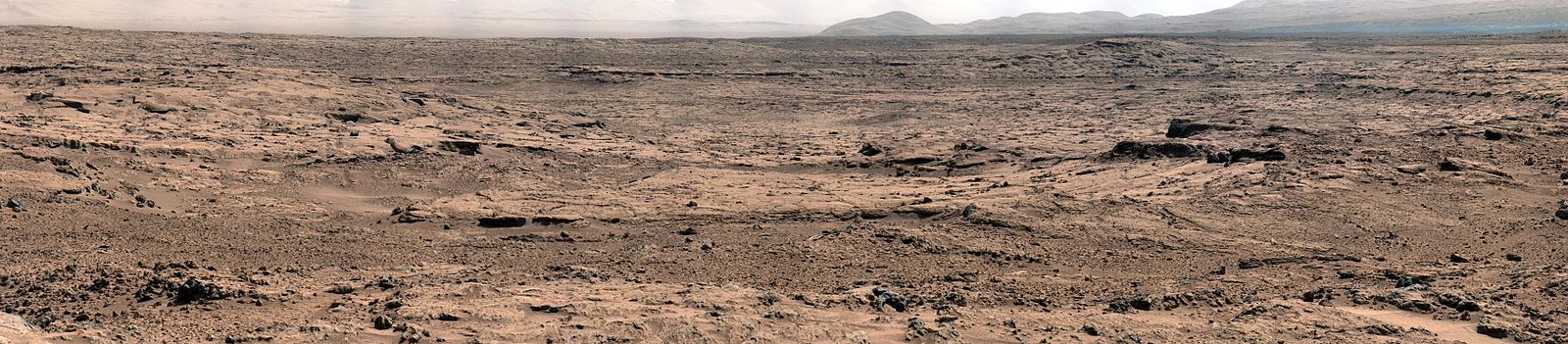 Aeolis Palus courtesy of Curiosity Mars is known as the red planet but the photos from Curiosity make it look anything but red. Typically Mars photos are more like the following -
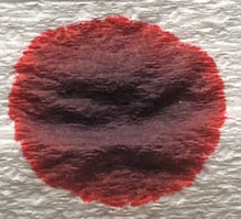
Mars looks red because its surface material contains a lot of iron oxide – we all know rust is red and that also contains iron oxide. From a distance you get the reddish hue but close up the surface can be brown, tan, green, etc, it depends on the minerals. Hence the rather dull looking colours in the Curiosity rover photos from the surface. The packaging for the ink is the same as that for Solar Storm 1859. On opening the bottle it is a definite red but with some orange undertones. The colour on the bottle cap is less orange looking.
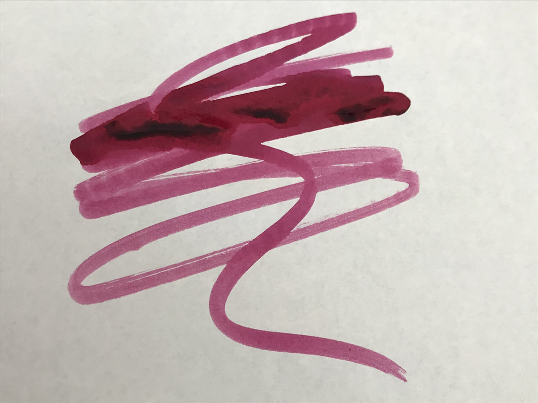
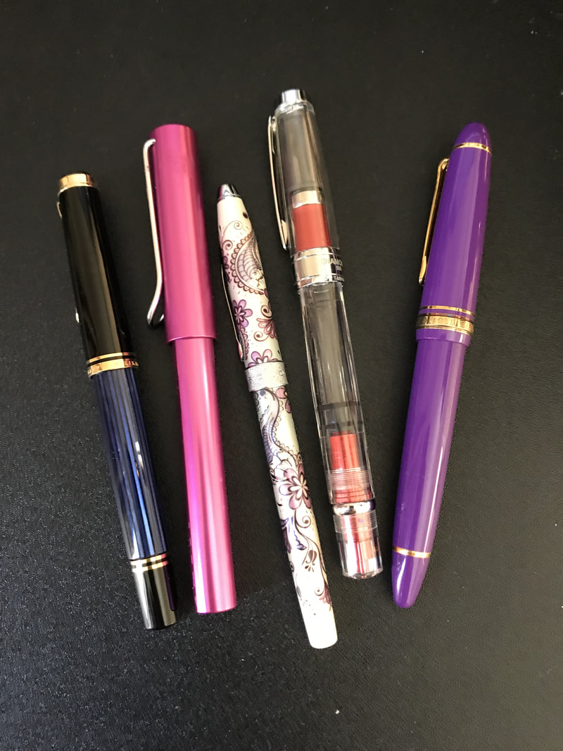
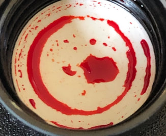
The swatches of the ink were interesting because for the first time ever (for me at least) an ink looked more vibrant on the col-o-ring than on Tomoe river paper. It was the col-o-ring swatch that I really liked that led to me reviewing this ink immediately after solar storm. I was thinking this ink will be great for work for marking documents up when reviewing, I still like hard copy when it comes to editing. 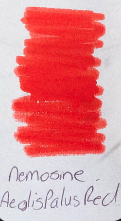 Col-o-ring swatch 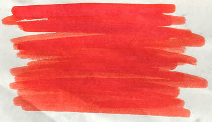 Tomoe swatch On absorbent paper it was even brighter but lacked anything that suggested it would have some shading or sheen when used. 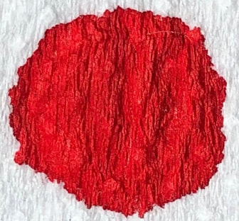 As with all my reviews first up was some cheap notebook or copy paper. I used a Nemosine singularity pen with a medium nib. Excellent pens for the price. Unlike the previous Nemosine ink I reviewed on cheap paper this one did not bleed or show through and the feathering was minimal. 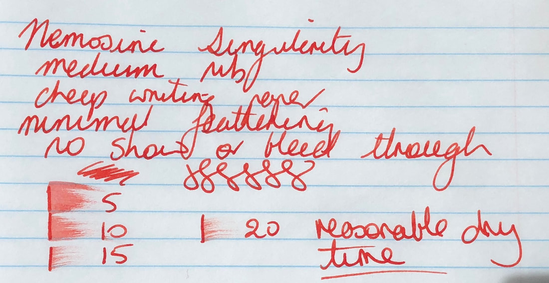 Cheap paper was followed by Rhodia. 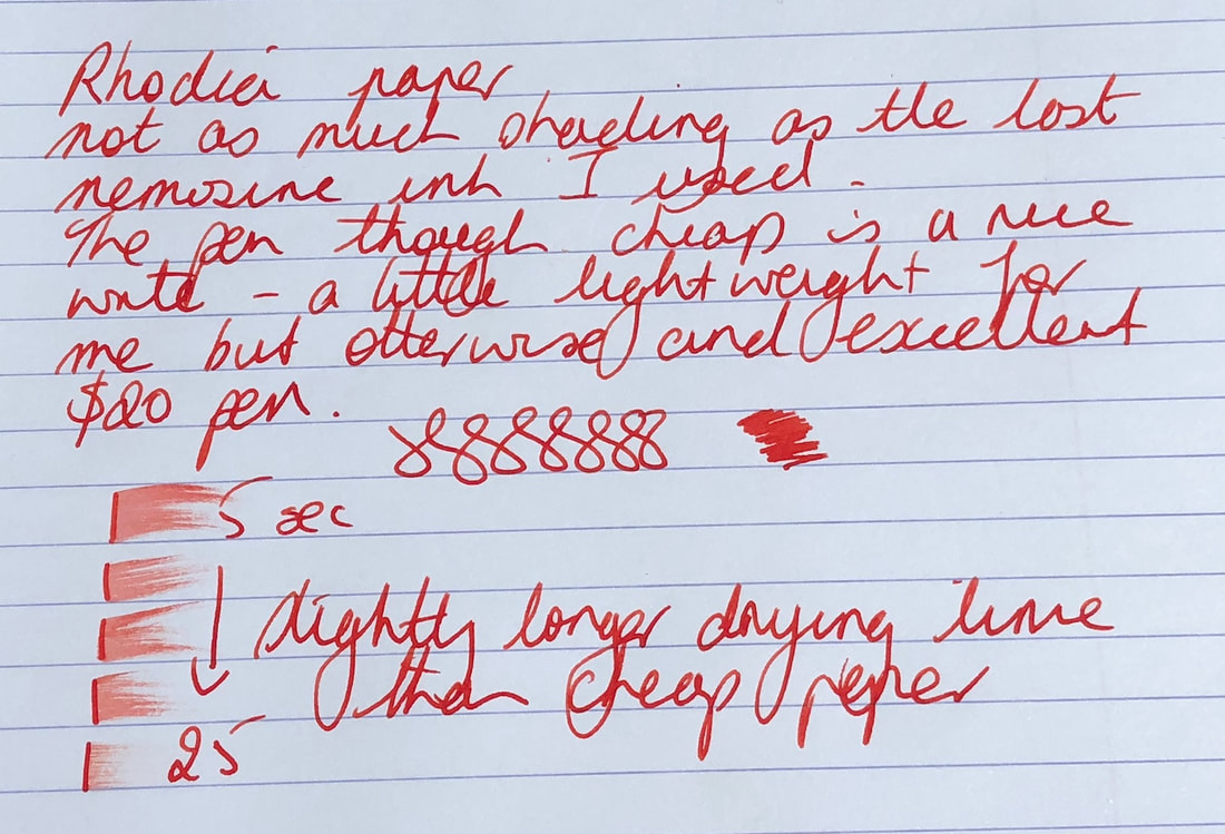 Last but my no means least Tomoe River 52gm. 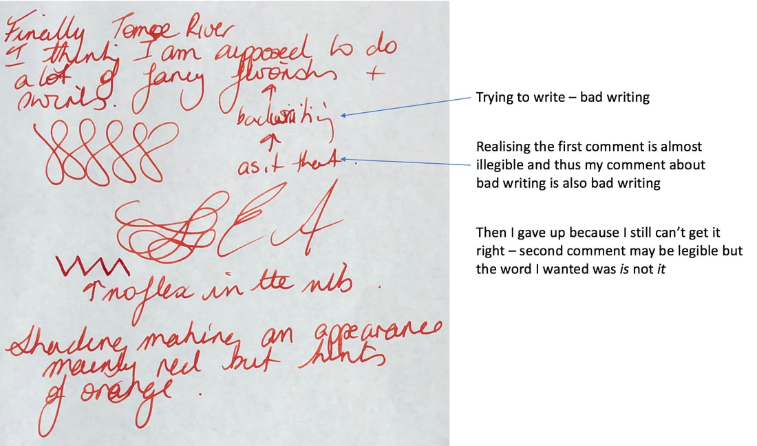 This is not going to be an ink I use day to day because it is red. However, despite the minimal shading I do like it and will find a use for it marking or similar. It also passes the running water test. 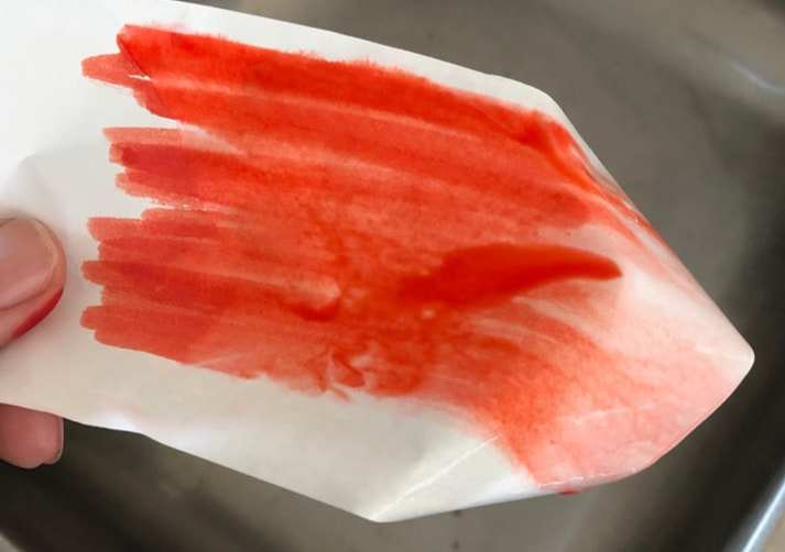
0 Comments
Leave a Reply. |
Ink Brands
All
|
 RSS Feed