Ink at the Heart of a Fountain Pen
|
|
|
|
|
|
|
|
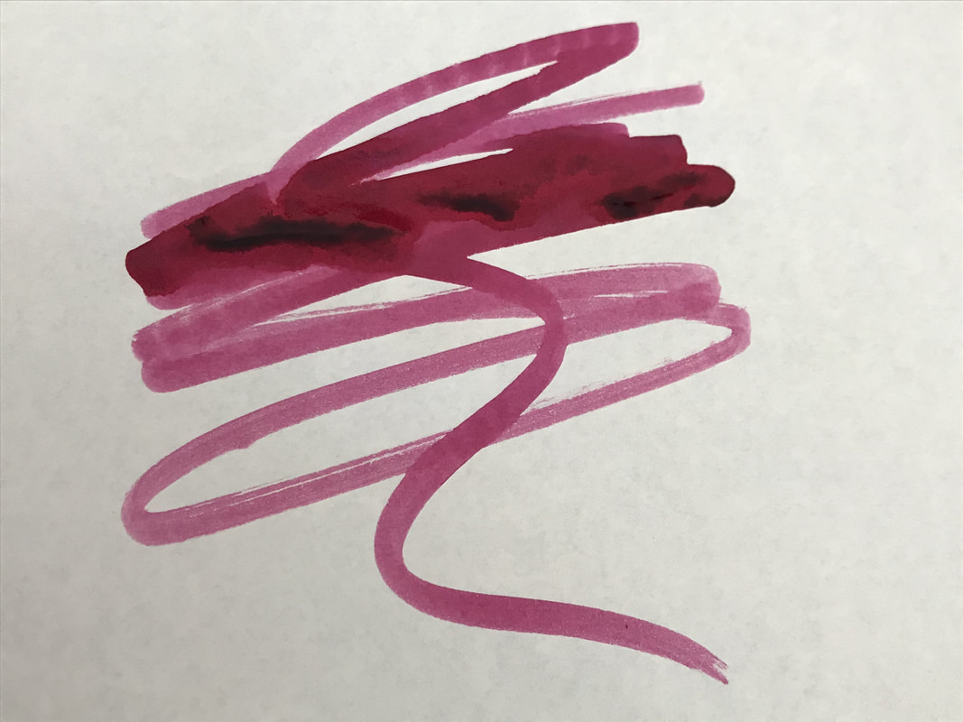
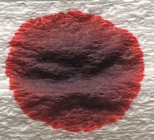
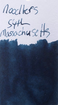
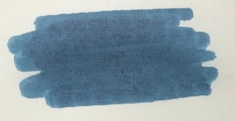
This is an ink I have wanted to try for awhile and I so wanted to love it but like many others have found it a difficult ink. According to the Noodlers web site this is a waterproof, bulletproof archival quality ink. It is named after the 54th Massachusetts infantry regiment – the second black union regiment to be formed during the American Civil War. 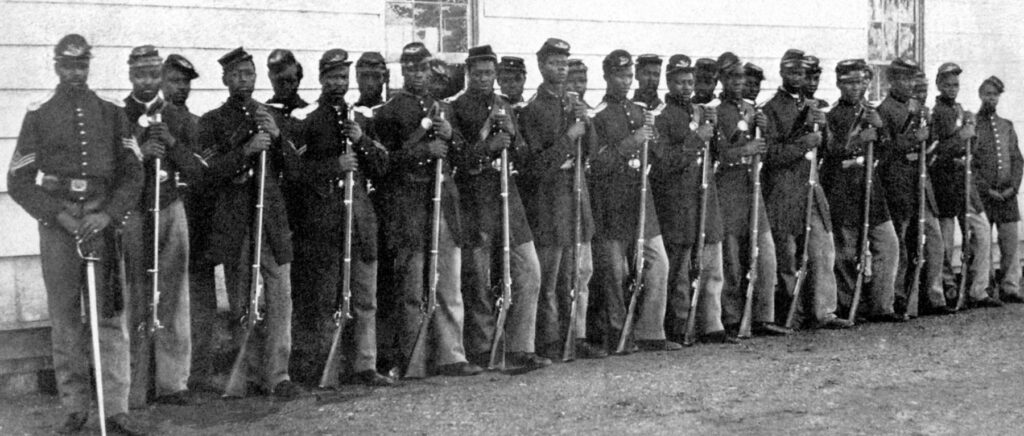 54th Massachusetts I am not American but even I know that the 1st Kansas was the first black regiment not the 54th Massachusetts. However, if you go to the Massachusetts Historical Society web page they claim the 54th Massachusetts was the first. 1st Kansas formed in January 1863, the Governor of Massachusetts didn’t call for volunteers until February 1863. The 54th Massachusetts is famous for: 1. the stand all the soldiers of the regiment took against the inequality in pay between black and white members of the regiment 2. the attack and their subsequent massacre at Fort Wagner 3. the way the Confederates disposed of the bodies after Fort Wagner 4. the film Glory for which Denzel Washington won his first Oscar. With such an illustrious history I expected / wanted more from this ink. The packaging of all Noodlers inks is the same a 90ml square bottle and a picture on the label representing something about the inks name. For this ink the famous painting of the 54th Massachusetts storming Fort Wagner. The bottle is then placed a fairly plain white box with Noodlers Ink made in the USA printed on it. 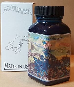 Chromatography was a surprise, for a blue-black ink that had looked so dark on my initial col-o-ring swatch. The combination of blue shades is quite light and bright. 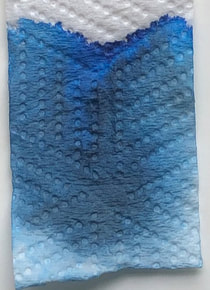 As previously mentioned on colo-o-ring very dark and then fairly washed out on Tomoe river paper.
I'm going to start by saying this ink is difficult. The pictures to follow will speak for themselves. However, I had read a number of other reviews and agree:
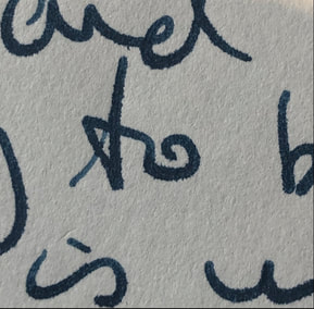
First up I used cheap paper – I tried copy paper, a number of notebooks then settled on what I am showing here, it is the best of a bad bunch. You will note with the cheap paper the lines are not consistent it gives the impression of inconsistent ink flow, a sort of stop start look to the writing. I can assure you this is not the pen though I was getting worried it was (new pen first use), this issue improved with better papers. Feathering is not as bad as some of the other cheap papers I tried, dry time was quick as the paper just ‘soaked’ up the ink, show through was not the worst I have seen but not good. It writes as blue-black ink. 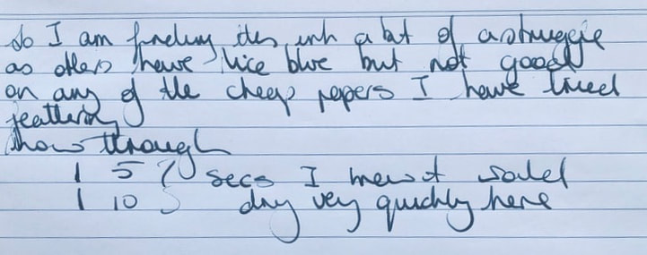  I then went to Midori and wow – this is good paper and the ink was just rubbish on it. The lines are more consistent i.e. doesn’t look at bad as the cheap paper but still not a consistent flow / delivery of ink. Too much ink was laid down and it looks like I am using a medium nib. Dry time was again very quick which did not surprise me as Midori also has a tendency to soak up ink rather than having it sit on top like Tomoe . What did surprise and disappoint me was the feathering and show through, it was like reading through tracing paper. 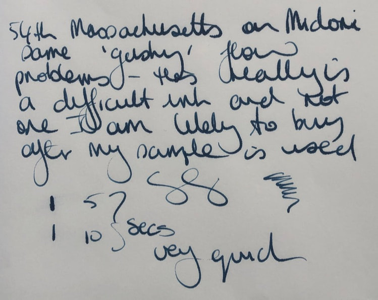
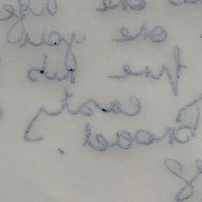
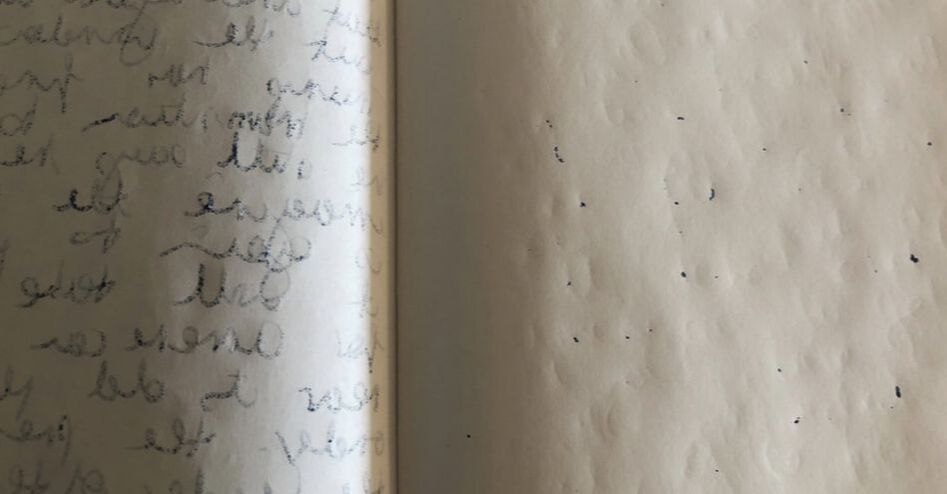
Lastly Tomoe on which it should have been impeccable – this is supposed to be the best paper for fountain pen ink. A great colour and finally the lines are almost 100% consistent, what previously looked like a flow issue has virtually disappeared but the dry time is long. To cap it off this is Tomoe and yet not only does it show through it has bled onto the next page of my note book. Not happy! 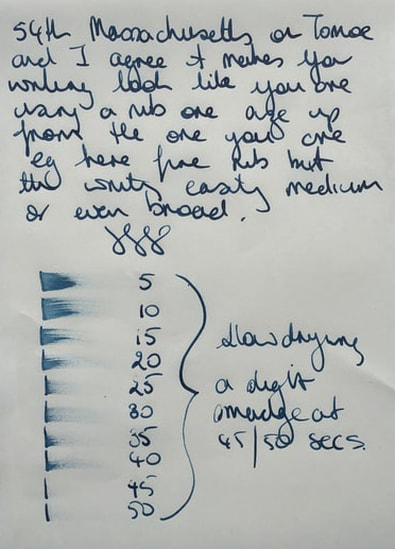
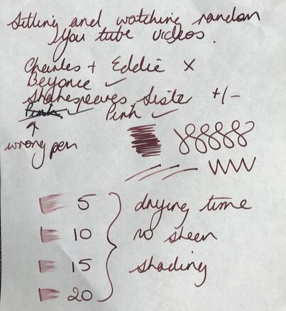
I got a sample of this ink and I am glad that is all I bought. A great colour but it is unlikely I will use it again though I might try it in a drier pen. I wouldn't rush to recommend this ink, there are credible dupes out there. In my collection I found Bungbox 4B and Colorverse mariner. 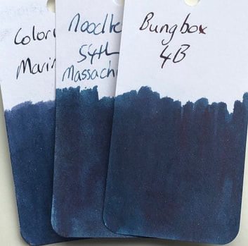 In summary Saturation – high Shading – no Sheen – no Shimmer – no Flow – inconsistent but improves with paper quality, wet ink Nib dry-out - none Nib creep - none Start-up – ok Feathering – yes even on some quality papers Drying – excellent on cheap paper, slow on Tomoe Cleaning - good Water resistance – waterproof 
0 Comments
Leave a Reply. |
Ink Brands
All
|
 RSS Feed