|
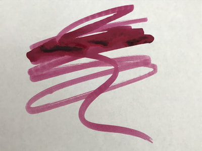
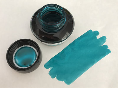
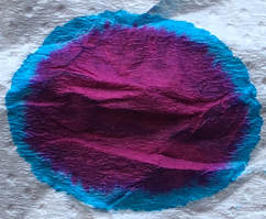
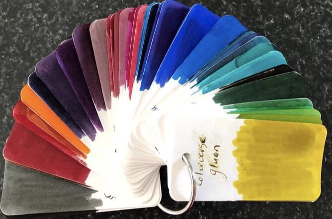
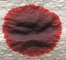
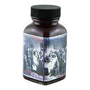
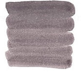
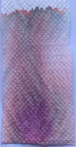
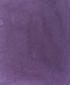
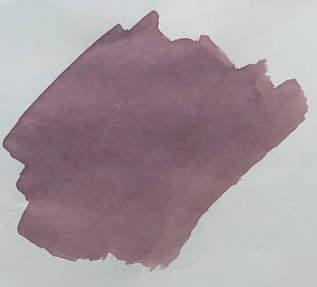
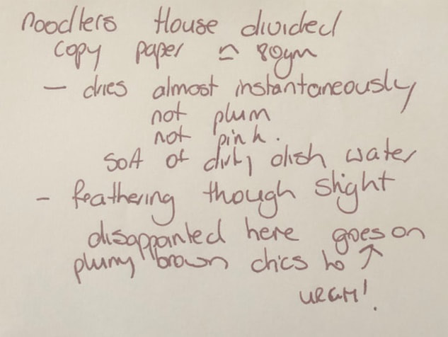
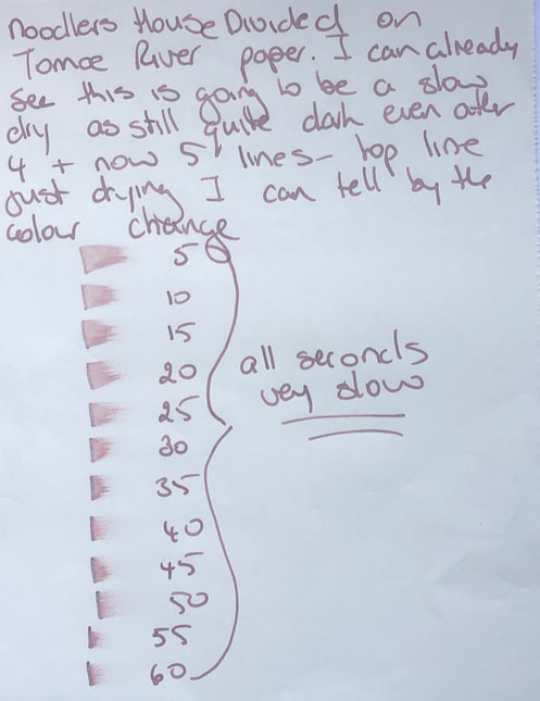
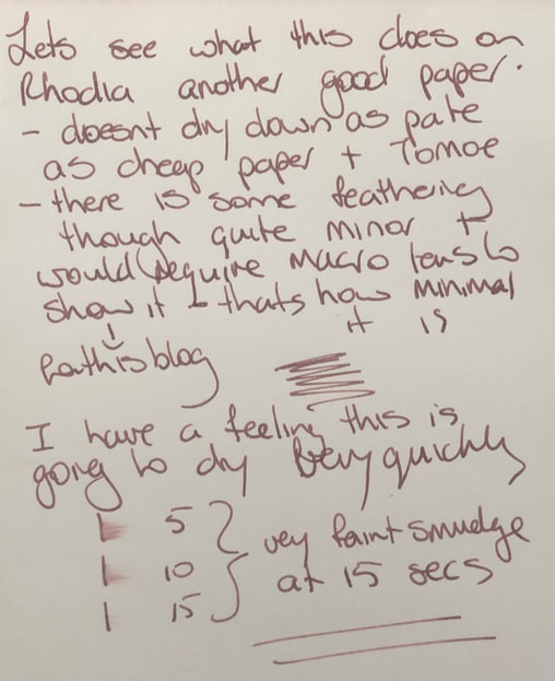
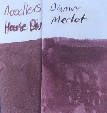
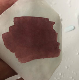
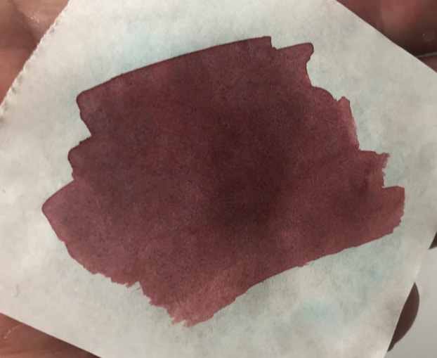
Noodler's as a brand often use their inks to make political statements. Noodler's House Divided debuted at the 2017 DC Pen Show. The name I suspect refers to the partisanship in US politics more noticeable since November 2016. However, when most hear the phrase they think of Lincolns 1858 speech. House divided refers to ‘The House Divided’ speech given by Lincoln on June 16th 1858. It was the last speech of the republican convention given after Lincoln accepted the Illinois Republican party’s nomination for the state’s US senate seat. It is one of his most famous speeches, with the opening remarks being the best-known passage. The remarks are about the danger of disunion due to slavery. However, contrary to what many think it was not an anti-slavery speech per se, Lincoln is on record stating that the ‘negro’ and the white man could not live in harmony and the North was in its own way just as racist as the South. The speech is about unifying the country with everyone either accepting or not accepting slavery, at no time does it state slavery is bad and should be abolished. "A house divided against itself, cannot stand." I believe this government cannot endure permanently half slave and half free. I do not expect the Union to be dissolved — I do not expect the house to fall — but I do expect it will cease to be divided. It will become all one thing or all the other. Either the opponents of slavery will arrest the further spread of it, and place it where the public mind shall rest in the belief that it is in the course of ultimate extinction; or its advocates will push it forward, till it shall become lawful in all the States, old as well as new — North as well as South. The packaging is as for all Noodlers in, a fairly plain white box with a 90ml glass bottle and a statement label. Noodlers web site says this is a red ink, I have also read Noodlers state it is a plum ink. The following photos are from three US retail sites and you can see they are very different, the ink could even be considered to be grey Let’s see how I got on....... Chromatography was interesting – muddy colours but a dominant magenta and even some orange. It gives no indication of the end result. On col-o-ring I can see why it is considered a plum colour. Tomoe was a dusky pink colour. Both swatches there is a hint of blue showing – both have a subtle blue hue. I think the blue hue has something to do with the fact the ink is fluorescent. For the writing I used a Leonardo Furore with a medium nib. Papers – copy, Rhodia and Tomoe River. On copy paper the ink dried almost instantaneously to a muddy pink / dirty dishwater colour. There was some feathering and a lot of ghosting though neither make this an un-useable ink on cheap paper. On Tomoe a muddy pink colour and very slow drying. No feathering or ghosting. On Rhodia it didn’t dry out to such a pale colour as on the other papers, there was very very slight feathering, no ghosting and it dried very rapidly. When this ink was released I really really wanted to try it as it looked such an interesting pink colour. I didn't however, want to purchase a 90ml bottle just in caes I didn't like it. Recently I bought a sample and I am glad that is all I bought. The colour this ink dries to is rather insipid. I know others have had problems with its performance I didn’t find it bad just not a very nice colour. The closest colour I could find was Diamine merlot In summary - not to forget this is fluorescent, Saturation – high Shading – no Sheen – no Shimmer – no Flow – on the wet side Nib dry-out - none Nib creep - none Start-up – ok Feathering – yes but not to the point of it being un-useable Drying – excellent on cheap paper, slow on Tomoe Cleaning - good Water resistance – waterproof of the main ink but there is some blue run off so I guess it loses its fluorescence.
0 Comments
Leave a Reply. |
Ink Brands
All
|
Proudly powered by Weebly



 RSS Feed