|
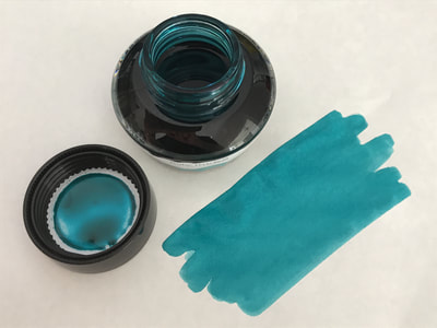
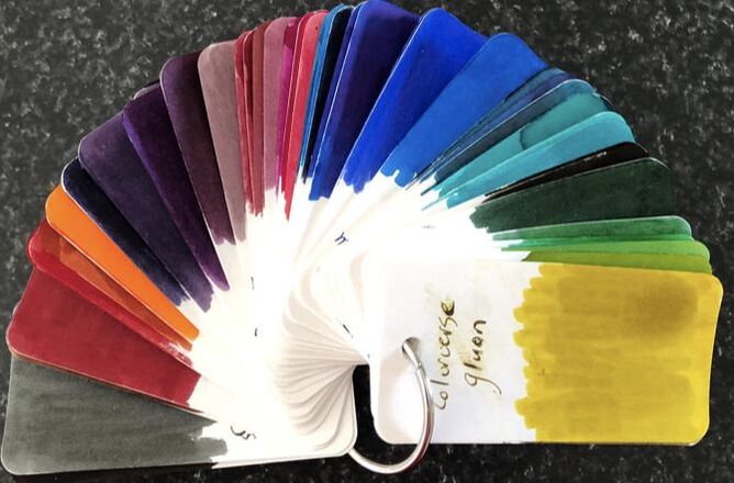
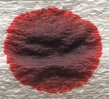
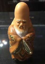
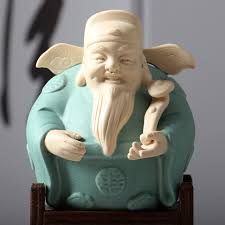
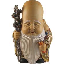
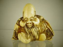
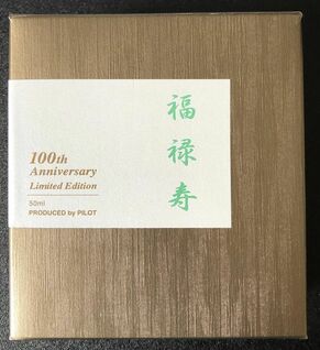
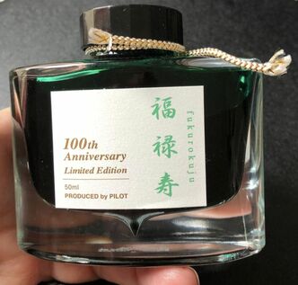
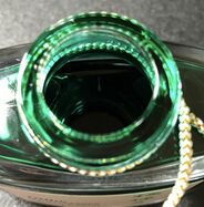
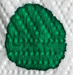
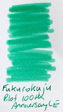
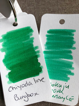
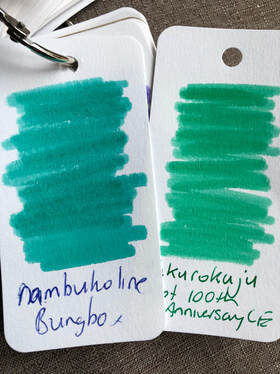
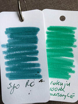
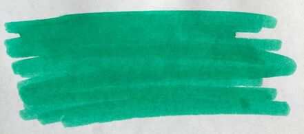
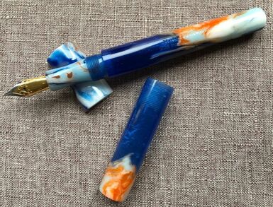
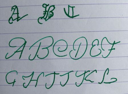
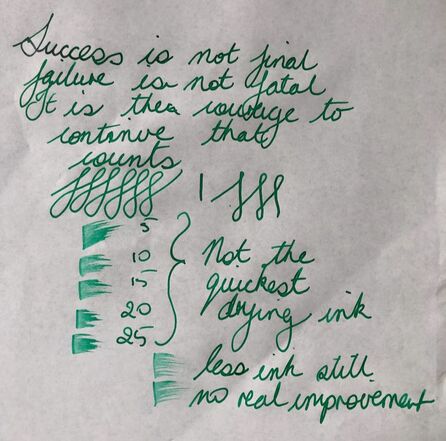
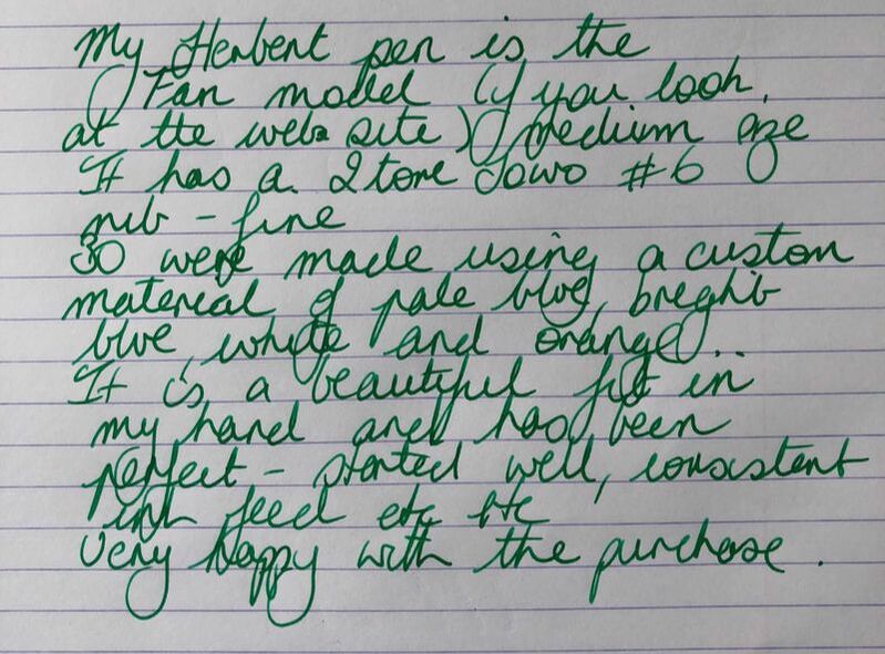
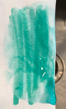
Shichi Fukujin are the Seven Japanese Gods of luck and good fortune. They symbolise the following virtues: Honesty, Fortune, Dignity. Amiability, Longevity, Happiness and Wisdom. They were chosen from Hinduist, Buddhist, Taoist and Shintoist gods or saints, and settled into Japanese Folklore Gods, believed to have been grouped together around 17th century. According to Japanese legend, they travel in a ship called Takarabune which is filled with treasures and comes from sea to bring fortune and prosperity to everyone. It is said that if you leave a picture of the Shichi Fukujin below your pillow on New Years eve you will be lucky and have good fortune for the following year. Pilot has released seven limited edition 100th anniversary inks named after these Gods. They are: Bishamonten, the god of dignity - red Ebisu, the god of honesty - blue Jurojin, the god of wisdom - purple Benzaiten, the god of amiability (the only female god) - coral pink Daikokuten, the god of fortune - yellow Fukurokuju, the god of longevity - green Hoteison, the god of Happiness (outside of Japan known as the laughing Buddha) - dark green (almost black) I recently had the opportunity to buy all of them except the red ink. They were quite expensive at $AUD35 a bottle so I restricted myself to two bottles – but which two? NO swatches were available so the decision had to be based on the colour representation on the packaging. The yellow and coral pink looked lovely but I knew I would never use them again, the purple looked pale and I have so many purples, the blue looked a fairly standard sky blue colour so I settled on the two green inks Fukurokuju and Hoteison. I bought the inks at pen City in Melbourne, the only place in this part of the world I have been able to find them. Fukurokuju (福禄寿) comes from Japanese fuku, "happiness"; roku, "wealth"; and ju, "longevity". It has been theorized that he is a Japanese assimilation of the Chinese Three Star Gods (Fulushou) embodied in one deity, in appearance is similar to the Chinese star god Shou. Fukurokuju was not always included in the earliest representations of the Seven in Japan. He was instead replaced by Kichijōten (goddess of fortune, beauty, and merit). He is now an established member of the seven and is usually portrayed as bald with an elongated forehead and long whiskers. He has a sacred book tied to his staff which either contains the lifespan of every person on earth or a magical scripture. He is always accompanied by the symbols of longevity, a crane and a turtle and sometimes a black deer is included. He is the only member of the Seven Lucky Gods credited with the ability to revive the dead. The ink comes in the same box that the standard Iroshizuku inks come in however it is gold rather than Silver. The name of the ink is on the side rather than bold and on top. The bottles are also the same shape and size as the standard inks. On absorbent paper there wasn’t much in the way of a shade mix and it did appear as if it was going to be emerald green. I was at this point disappointed as I had been hoping for something different. The colo-o-ring swatch was more in keeping with the colour on the packaging but I thought it was still deeper than mint. I put the swatch up against Chiyoda Line from Bungbox as that really is an emerald colour, they are similar but not the same and I began to see a hint of teal. I began to think I had another ink no different from Coloverse photon, Kobe Story nunabiki emerald or Nambuko Line from Bungbox. However, when put up against one of these it is clearly different and begins to look more green again. I really wanted to be sure this was something different from Pilot and not just a repackaged ink. From the pilot web site I got the impression syo-ro and this were the same – the colour swatchfro Syo-ro on my computer looks just like the colour on the box for this ink. The two inks couldn't be more different. On Tomoe river paper it was back to the minty colour. For the writing I finally inked up one of the two pens I bought from the Herbert pen company. I started writing in a Clairfontaine journal. The paper is supposed to be very good, its the same company as Rhodia but surprisingly there was some feathering. I am trying to improve my writing and would love to take elegant photos of gothic script and beautiful copperplate quotes as most people do. I share my first and only attempt. Frustration set in real quick. My writing may be messy but its mine. I didn't make any special attempt at anything on Tomoe River paper. This was followed by Rhodia and some information about my beautiful Herbert pen. It was not a particularly quick drying ink but it is one of the best that has been put to my running tap test. This is a Pilot ink so it will be a great performer. Would I buy it again if given the chance? NO!. I did not have the opportunity to see it before purchase, I had to make my decision based on the colour on the box and that is really what I wanted – instead I have another nice green but not particularly special ink.
0 Comments
Leave a Reply. |
Ink Brands
All
|
Proudly powered by Weebly

 RSS Feed