|
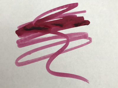
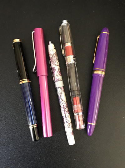
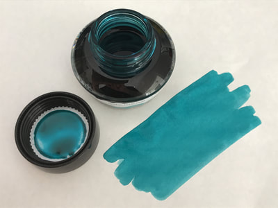
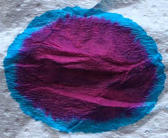
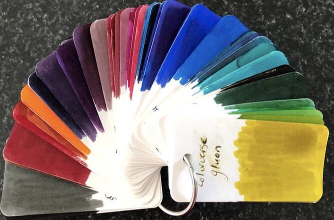
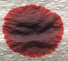
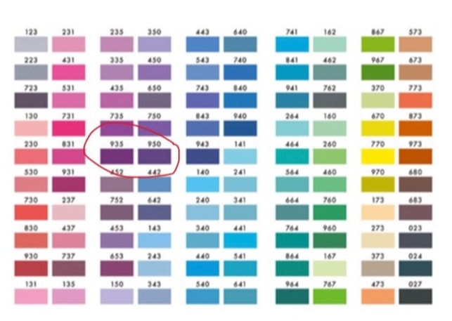
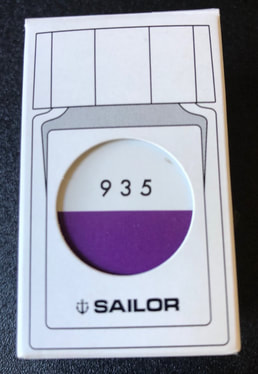
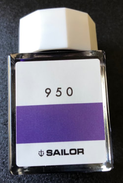
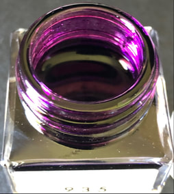
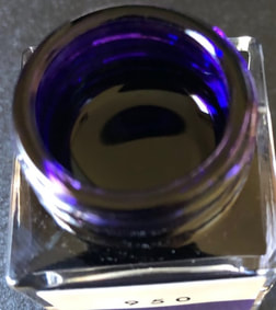
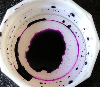
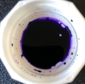
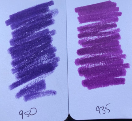
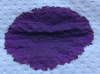
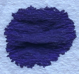
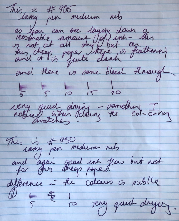
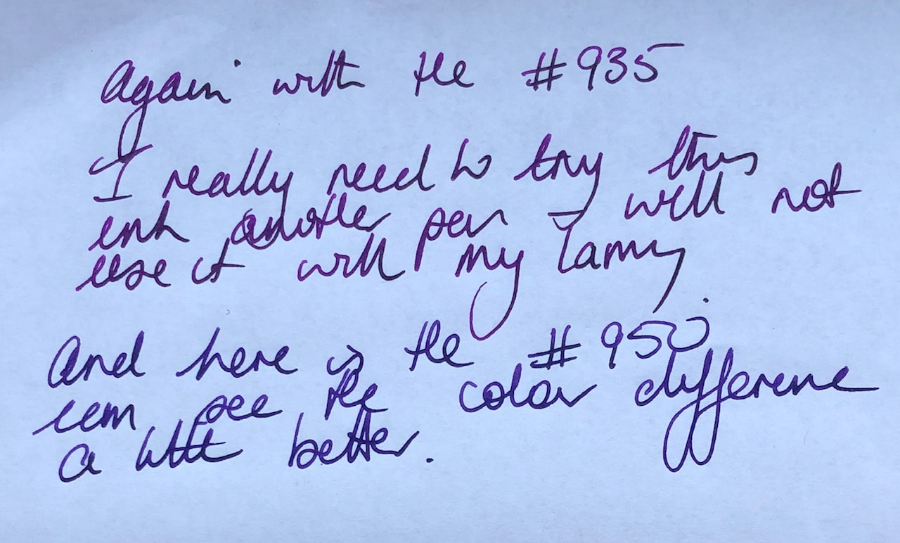
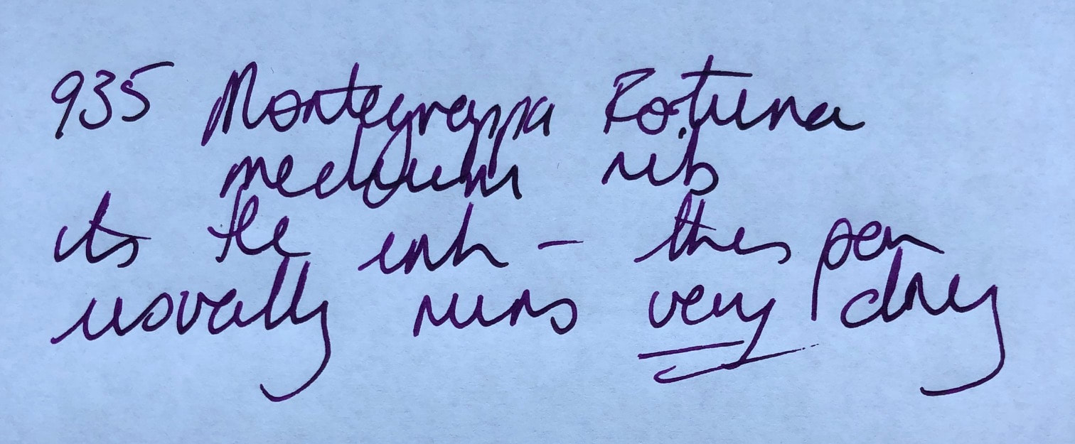
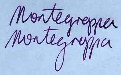
Sailor as most pen aficionados would know make some very good inks, in fact most Japanese inks are very good. They have recently released a new range of 100 colours that are not named just numbered. The inks were apparently chosen from over 20,000 that were custom blended by Sailor inkmeisters at Ink Studio events. Personally I suspect there is just some reworking of older Sailor inks though these do handle slightly differently than my other Sailor inks. I did however try to find something important out about 935 and 950. There historical events for the years 935 and 950 but nothing that most people would have heard about. The most interesting thing (for me anyway) or useless bit of information is that 935 and 950 are what are known as deficient numbers. They are both natural numbers but are larger than the sum of their proper divisors without the number themselves e.g. the divisors of 935 without 935 itself add up to 361 (1 + 5 + 11 + 17 + 55 + 85 + 187 = 361) and for 950 the total is 910 (1 + 2 + 5 + 10 + 19 + 25 + 38 + 50 + 95 + 190 + 475 = 910). 100 inks is a large palette and when I saw it I wanted to buy quite a few until I knew the price. First up these inks are NOT cheap. They come in 20ml bottles at a cost of $NZD28 or $1.40/ml ($AUD24.76, $USD17.45). I can buy other Sailor inks for half that price. I could not find a retailer in the US but probably didn’t look hard enough, in Australia the Desk Bandit is selling the ink for $AUD26. I bought because I like Japanese inks and I am still in search of my every day I just love it purple ink. Looking at the palette I am now not sure why I chose the two I did as they look very similar (I have circled them in the photo) and when they arrived the colour on the bottles was only subtly different. The packaging is simple. A simple white box with a small glass bottle with a simple label. As you can see the difference between 935 and 950 is not huge. On opening the bottles 935 looked more fuschia than purple and 950 more blue with a hint of purple. I was a bit disappointed at this point as neither colour was what I was expecting and so far quite different to the colour chart from Sailor. I was therefore surprised when I swatched them onto my col-o-ring test book. 950 certainly has blue tones but it looked more purple than in the bottle and with 935 the fuschia was still there but not as bright and dominant as in the bottle. At this point I started to get a bit excited about the colours. Doing the swatches though is when I first noticed that the inks behave differently to my other sailor inks. They seemed quite dry. I usually use a cotton bud (q-tip) dipped into the ink bottle then swiped across the paper. I had to keep dipping the cotton bud as it was almost as if it was drying out as I did my first swipe, as I later discovered these really are very fast drying inks but seem to write very wet. If you have read any of my other posts you will know I like to I like to see what colours make up the inks by dropping the ink onto absorbent paper, it’s a cheap but effective method of chromatography. So, imagine my surprise when I did this and got nothing but two dark blobs of what looked like a purplish grey (935) and a dark blue (950). I do know that I have to leave the ink to dry to see its true colour however even when wet most inks hint at the final outcome and immediately start to show the various shades that may have gone into making them. Here I had to wait a good ten minutes to see anything like the ink in the bottle which was unusual considering how quickly the ink dried on the col-o-ring. All of these photos are taken in the same place with the same lighting but now the 935 looks purple and I don’t really see fuschia, the 950 looks completely blue. So how was the writing experience? I started with cheap notepaper and two Lamy al-stars with medium nibs. I used the Lamy because I wanted to use the same type of pen for both inks, they are good everyday workhorse pens that a lot of people use. If one of these inks is going to go into high rotation it had better be good in a frequently used work pen. The first thing I noticed is the ink flows and I mean flows. I always find the lamy to a reliable pen that works well with any ink I use but I did not like the experience with the studio inks on the cheap paper. Too much ink led to feathering and there was bleed through, I don’t think this was because of the paper I used and I will explain why a bit further on. The other thing of note is the colours are quite dark and again only subtly different the 935 certainly has purple hues but the 950 remains blue to my eye. Dry time was very very impressive. After the cheap paper it was time for Tomoe river 52gms and for the first time ever I did not enjoy the writing experience. There is no shading but the colours are definitely different now and though 950 still looks blue to me there is a purple hue to it. Tomoe certainly brings out the best in an ink but I did not like the amount of ink I was laying down as I wrote At this point I thought I should try another pen because maybe the flow issues were due to the Lamys I was using rather than the ink though I don’t remember a Lamy being this wet before. I inked up a Montegrappa pen – I have two and I find them very dry to write with, with moderately hard starts, consequently I hardly use them. I know I can alter the feed etc to correct this, I have explained in a previous post why I don’t. Filling what I consider to be a dry pen with the ink should help me work out if the flow is the ink or the pen - it is the ink! I finally have an ink that works brilliantly in my Monetgrappa – easiest start ever, consistent flow loved it. Having inked the pen and tried it on the Tomoe river I went back to the cheap copy paper and this is how I know it wasn’t the paper that was the problem – I haven’t photographed it but I promise there was no feathering and no bleed through as not as much ink was laid down with the drier pen. In summary there is a great range of colours in the ink studio but they are not cheap and do not always live up to the promised colour. I certainly won’t buy more and don’t think I would recommend to anyone. Of the two I bought I do not like 950 as its too blue but will use the 935 again especially in my ‘drier pens’ as it is the better of the two colours for me. Despite behaving wet in cheaper pens they are very rapid drying inks. I haven’t done my usual test of holding a swatch under running water because I was disappointed with the inks and I just couldn’t be bothered.
0 Comments
Leave a Reply. |
Ink Brands
All
|
Proudly powered by Weebly

 RSS Feed