Ink at the Heart of a Fountain Pen
|
|
|
|
|
|
|
|
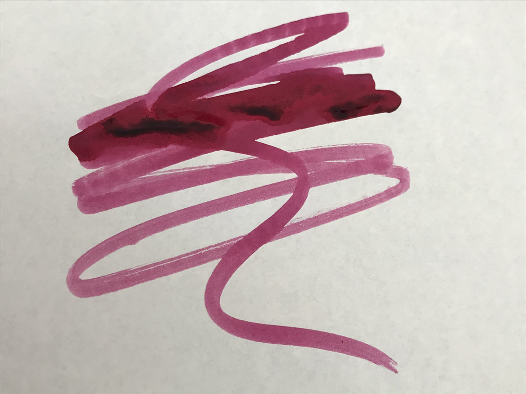
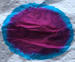
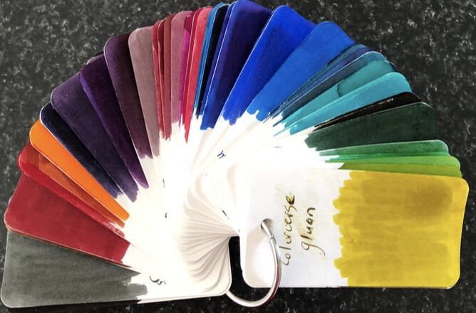
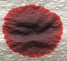
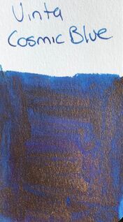
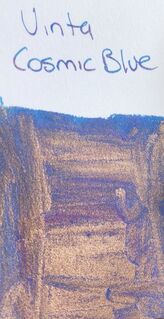
The Manila observatory was founded by the Jesuits in 1865, it is housed in the grounds of the Ateneo de Manila University in Quezon City.  In 1865 an article was published that described Jesuit Fr, Fransisco Colina's observations of a typhoon. This led to the people asking the Jesuit Superior for these observations to continue. Initially the Jesuits were reluctant as instrumentation at the time was quite primitive but ultimately the Jesuits agreed to start the systematic observation of Philippine weather. The observatory was founded and run by the Jesuit cleric Federico Faura.  The observatory started issuing typhoon warnings in 1879, earthquake observations in 1880, its time service in 1885, seismology in 1887 and astronomy in 1899. In 1884 the Spanish government recognized the observatory as the official institution for weather forecasting in the Philippines. The American, colonial government established it in 1901 as the Philippine Weather Bureau with its work being interrupted by World War 2. During the Battle of Manila, all of the instruments and important documents of the bureau were destroyed. The observatory resumed operation in 1951 mainly for studies on seismology and the ionosphere. In 1963 it was transferred to the Loyola Heights campus of the Ateneo de Manila University where it continues its studies into seismology, geomagnetism, and radio physics, among other areas of research. I recently reviewed another vinta ink and there you will find information on where the ink can be obtained, pricing and packaging. From the Vinta website we are told – This beautiful shimmering ink evokes the image of stars glimmering amidst the backdrop of the Philippine sky. On opening the bottle it is a dark blue but from what you can see around the neck of the bottle the expectation is that this will be a sheen monster, the red you can see though is from the pink shimmer in the blue ink. 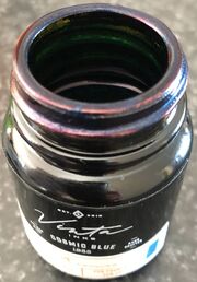 Chromatograhy and you can see the pink shimmer clumped at the bottom. The base ink itself is a combination of some very vibrant bright blue shades. I was liking the look of this ink even before writing anything. 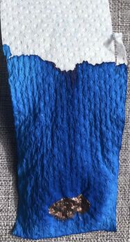 A photo taken looking directly at the colo-o-ring shows how bright the base colour is but the shimmer looks dull and therefore detracts from the blue behind. However, as with all shimmer inks it depend on the angle you look at them. Shift the col-o-ring a bit and the pink shimmer is infinitely more attractive.
The swatch on Tomoe river shows the ink at its best. You don’t need to move the paper around to appreciate the pink shimmer and neither does it look dull or dominate the vibrancy of the base blue ink. 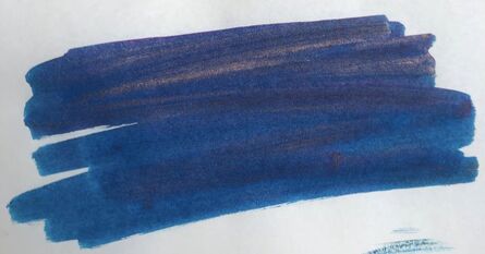 For the writing a used an Esterbrook pen with a medium nib. I started with copy paper. You really can’t see much of the shimmer on this paper its just a nice dark blue. I am not sure what was going on with the pen as the ink didn’t seem to flow and I thought the feed was getting clogged. I cleared it and then everything was fine, you can see where the change happened as I write. Since then I have had no problems with this pen and ink combo. The ink dries very quickly compared to the previous Vinta shimmer ink I reviewed. 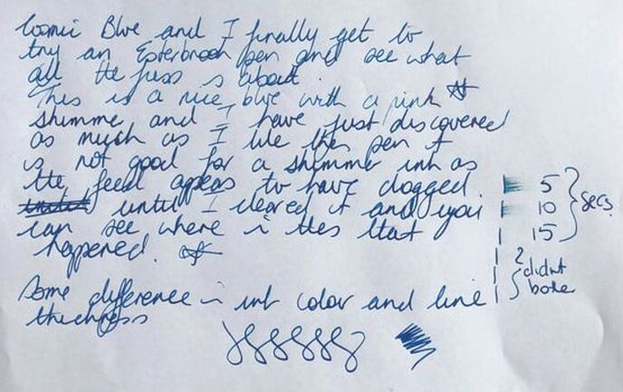 On Rhodia again not much shimmer apparent, interestingly it took a much longer to dry and when I smudged the ink for the dry time test some green in the base colour became apparent. 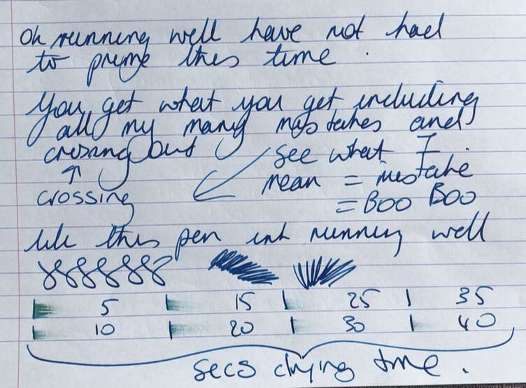 just It was only on the Midori paper that the pink shimmer could be seen but it looks more like a blue ink with the meerest hint of a red sheen. However, with the macro you can see shimmer is there. 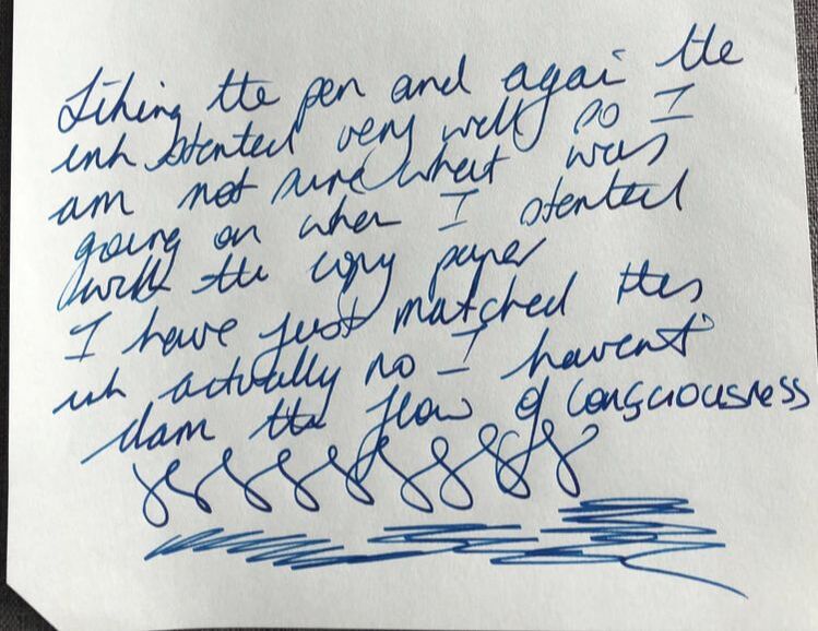 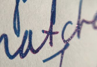 This ink is very reasonably priced, the packaging is nice but the bottle is going to become increasingly impractical as it empties. The ink flows well, there was no hard start but it doesn’t dry very quickly. As with the pink sand ink I reviewed there is a surprisingly inconsistent look to the shimmer component of the ink. I like the blue ink which is high praise indeed for someone who is not a fan of blue inks but I am disappointed with the shimmer. The swatches held out such promise for the ink and its only on Midori I can really see any hint of shimmer but it looks like a sheen not a shimmer. I said I would buy the pink sands ink again but after using this if I could only buy one it would be this mainly because blue is a more usable ink colour. In summary – Saturation – high Shading – no Sheen – no but note my comments about how the shimmer looks Flow - good Nib dry-out - none Nib creep – none Start-up – immediate except my first writing test, but no problems since then Feathering – nil on any of the papers used Drying – slow Cleaning – very easy Water resistance – not sold as waterproof and quite rightly so. 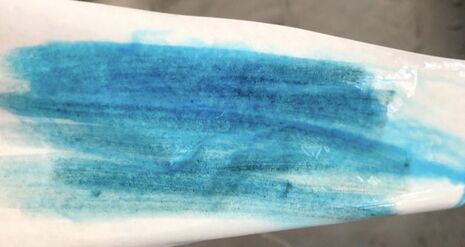
0 Comments
Leave a Reply. |
Ink Brands
All
|
 RSS Feed