|
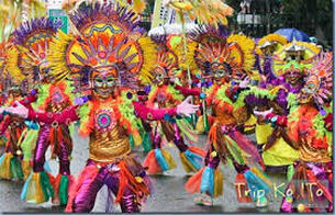
After a break I have come back to Vinta inks as I recently got my hands on some of the pastel shades and thought I would complete reviewing all I had. The first of the pastel inks I tried was Violet (Maskara 1890) and though I find it pale seeing it in the flesh so to speak I can understand why this ink is so popular. In previous reviews I have explained were to buy inks and how much they cost. For those that have read previous posts you will know it’s not just the ink but I usually provide background information to the name of the ink and for the first time I am confused – but then the web helps to sort it out. The following is from the Vinta inks website The maskara festival was conceived in part due to the sugarcane crisis in Negros. 1890 was the year the Spaniards split Negros region into two: Negros Occidental and Negros Oriental. These regional divisions remain today. It is a little confusing as to how the two are linked
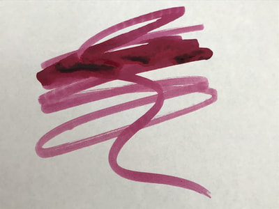
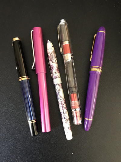
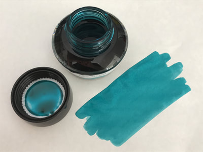
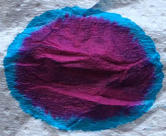
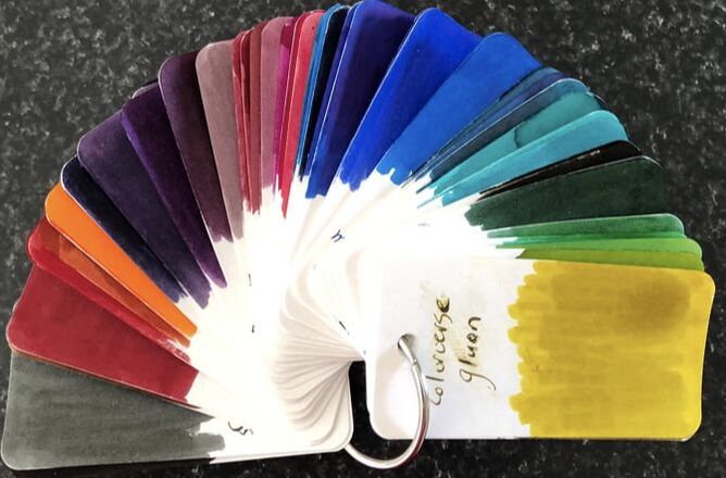
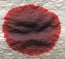
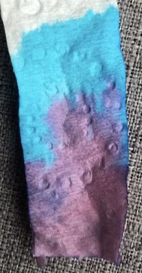
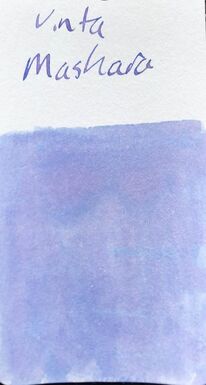
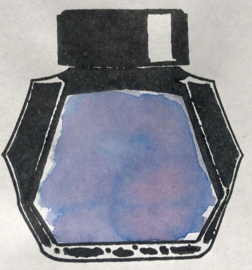
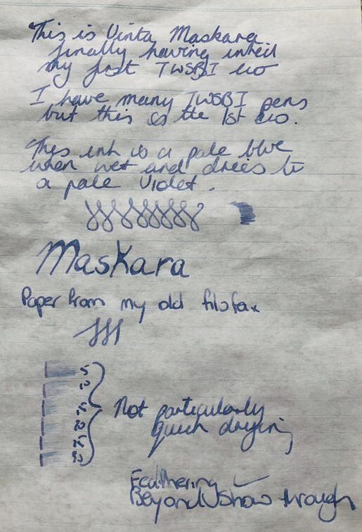
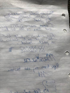
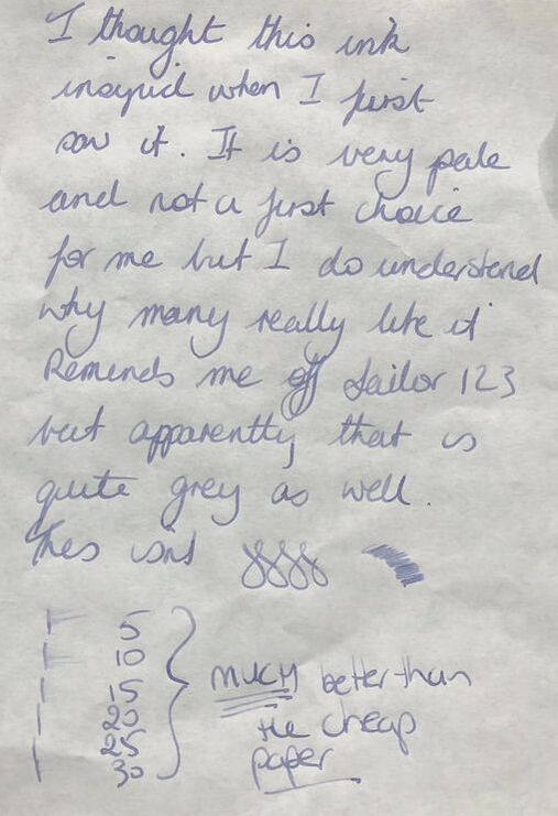
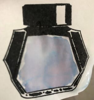
The area where the festival is held is very dependent on sugarcane and in the late 70s the high fructose corn syrup was introduced into the US which had a huge impact on the sugar cane industry. At the same time the Don Juan tragedy occurred in which an inter-island vessel collided with a tanker, 18 lives were lost and 115 were missing. The local government suggested a festival of smiles to lift everyone out of the sad / bad atmosphere after the ferry tragedy and thus the Masskara festival was born. This year is its 40th anniversary. With respect to Negros the island was partitioned by the Spanish in 1890 into the two provinces of Negros Occidental and Negros Oriental. Meliton Larena as the first Mayor of Dumaguete, as well as Demetrio Larena. These are the only two provinces in the Philippines situated on the same islnd but belonging to two different administrative regions. The movement to join them started in the 1980s and finally came to fruition under President Aquino in 2015 only to have President Duterte reverse this in 2017. The Negrense people are again working for unification. I bought this ink as a sample so I can not show you what it looks like in the bottle but in the sample vial it is very dark Starting with chromatography the colours were surprisingly vibrant considered the soft and muted tone of the dry ink. It was a combination of a dusty pink, violet and a bright blue. It was the swatch on my col-o-ring when I began to appreciate why this ink is so popular. I do find it too pale for my taste but that doesn’t mean it isn’t a good ink. It dries to a pale purple colour but has a blue undertone and when wet it is the blue that dominates. On the colo-o-ring it is violet but you can see the blue. On Tomoe it was even more interesting. It reminded me of Sailor Ink Studio 123, however, when I look on line people say that is a grey ink though there are many pictures in which the two inks are nearly indistinguishable. Unfortunately for me the ink didn’t live up to its initial promise colour-wise when written with. It is all very well seeing a lot of nice shading and different colours when swatching but as this is a pale ink I had hoped I would see some of this when writing. I used a TWSBI eco with a medium nib. I have had the pen sitting on my desk for about 4 months and thought it was time to try it. The first paper used was from an old folder. The paper is quite thin and has a Tomoe quality so I thought it wouldn’t be too bad. The picture makes the ink look bluer than it actually dried – I have for the first time played with filters and lighting to get a correct representation to no avail. It is only at the smear for the dry test towards the bottom of the page it gives a hint of violet. Unfortunately, there was feathering, show through and even bleed through to the next page. The ink started straight away and had good flow but it does not dry very quickly. On Tomoe there was a little shading and it dried a lot quicker than on the cheaper paper. Tomoe again a pale colur when dry. The dry time was much better than the cheaper paper. On the better paper it is a pretty violet ink. I am not sure why i kept saying ti reminded me of Sailor 123 as they are nothing alike. I have said many times before Vinta inks are reasonably priced, packaging is simple but the bottles are going to be hard to use as the ink level drops. This is a wetter ink but dry time is dependent on the paper used and it is not friendly to cheaper papers. In summary – Saturation – low Shading – minimal Sheen – no Flow - excellent Nib dry-out – no Nib creep – none Start-up – immediate Feathering – a lot on cheaper paper Drying – depends on the paper Cleaning – Easy Water resistance – not sold as waterproof but quite impressive resistance. I discovered not only doesn’t the ink move much but the stamp ink is also waterproof.
0 Comments
Leave a Reply. |
Ink Brands
All
|
Proudly powered by Weebly


 RSS Feed