|
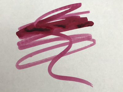
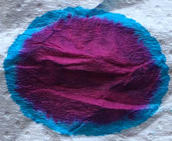
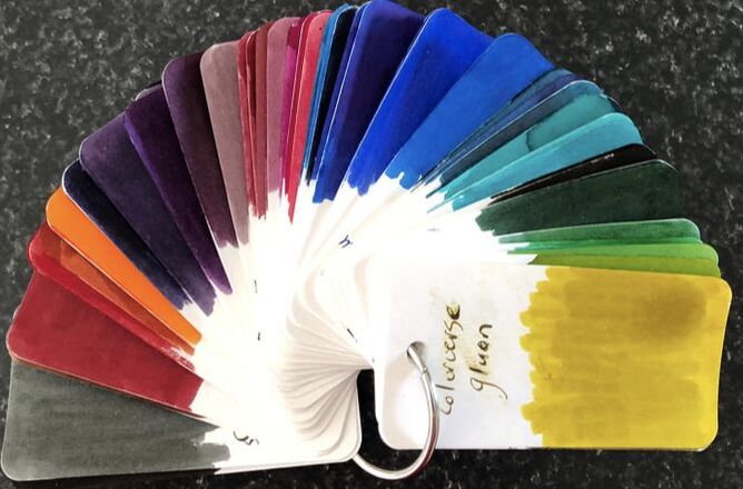
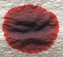
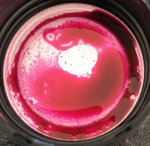
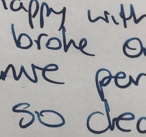
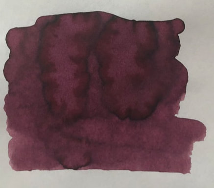
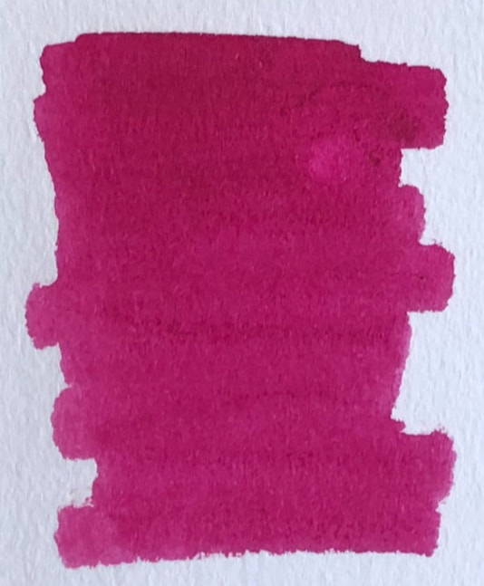
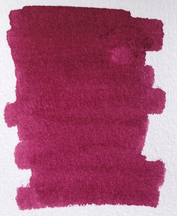
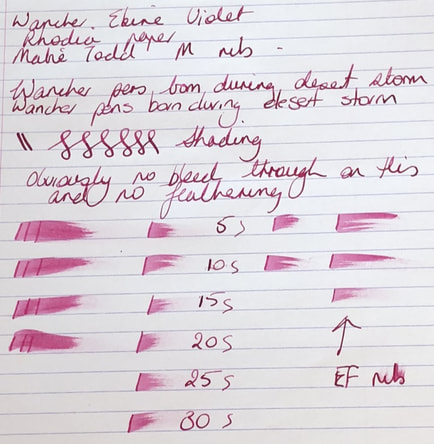
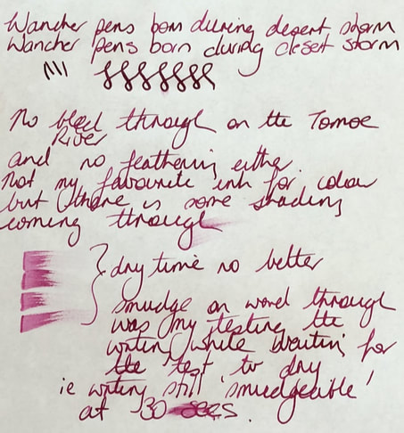
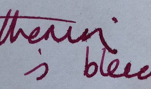
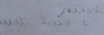
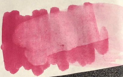
If you have read any of my previous posts you will know I tend to focus more on the naming of the ink than the inks itself. One could argue that an ink is an ink is an ink however some of the names are so creative it makes me curious as to how or why they were chosen. The reason I start by mentioning this in this post is for the first time I am at a loss to find out anything about this inks name. I do know Wancher pens were first developed during desert storm, but I can find out nothing about the inks. Wancher only makes five colours and they do seem pretty uninspiring – so why buy some? Well, Wancher is a Japanese brand, the Japanese tend to make superb inks and I read nothing but great reviews for Wancher pens. I bought three inks and am going to start with ebine violet. Coming back to the name, my searches were fruitless though I did find a tenuous connection to an orchid with violet flowers and an even more tenuous connection to the name Ebenezer. The ink can be bought in 30 or 100ml bottles, the 100ml bottle is better value for money. The packaging is very minimalistic. For 100ml the ink comes in a 9cm tall glass bottle with a simple label stating ‘Wancher from the land of the rising sun’. There is no labelling to tell you what colour the ink is however, if you look at the photo you will see violet as part of the geometric design on the label thus you know you are getting the violet ink. The blue and green inks I bought at the same time have blue and green colours in the design. 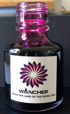 I don’t usually mention the packaging, but I do here because the bottle is going to become very user unfriendly as the ink volume drops. I have posted a photo of the bottle without cap because I want people to note the neck of the bottle. This is 3.5cm long which is a significant proportion of the total bottle height. As the level of ink drops it is going to become increasingly difficult to fill a pen and just about impossible to fill a converter directly from the bottle. Bottle design is not well thought out. The ink is not what I would ever call violet, you can see the violet / purple hues through the bottle but what tends to dominate when used is the hot pink colour you can also see. This is more of a pink ink than violet and it is evident the minute you take the cap off the bottle. The colour ink the cap is vastly different to what is expected when you see the colours after dropping ink on absorbent paper. On the absorbent paper it is a deeper pinky red I am well aware that the colour you see is dependent on a number of things such as the lighting at the time the photograph was taken, the resolution of the photo posted and the quality of the monitor the post is viewed on. I have started playing around with my photo taking as I want to be able to post a picture that is as faithful as possible to the colour I see when I use the ink, I am going to post a few examples here to demonstrate what I mean. Depending on which one I come to post you would get a a very different impression of this inks colour. After waxing lyrical about how a violet ink is not violet how did it handle? For this test I used a Mabie Todd pen with a medium nib. The pen is a limited edition modern Mabie Todd, one from the rebirth of the line not a vintage and will be the subject of its own review at a later date. The papers used are Rhodia, Tomoe river and a cheap copy paper. If this is the first of my posts you have ever seen, then be forewarned my writing is bad. I am not sure what it is but I never seem to be able to get my inks to dry in the same time other reviewers do. The pen I used is on the wet side so a lot of ink is put down. I usually do three lines as you see on the left of the photo but thought today it was too much ink so tried one line with no improvement. I then thought maybe I press too heavily with my finger when I swipe to see if the ink is dry, the third column is my attempt at a lighter touch – still no improvement. OK so maybe it is the pen and if I used something different not as much ink would be on the paper and I would get faster drying times. For the last column on the right an extra fine nib was used and the ink doesn't appear to dry any faster. I therefore conclude its not me, the ink is not quick drying, at least not on rhodia paper. The next test was on Tomoe river. It is still a pinky ink but now some nice shading is starting to appear. Dry time was no better than on rhodia. In fact when I was waiting for 30sec dry time trial on Tomoe I swiped my finger across the word through (just above the drying time tests) and this was still smudgeable nearly a minute after it had been written (you can see this on the photo above). Last test was copy paper and there was feathering and bleed through. Wancher do not advertise their inks as water resistant and they certainly aren’t. I think if I had used more than the drop of water I did the page would have been washed clean. In summary the ink is cheap at US 5c/ml and it behaves well but it is a disappointing colour and not one I will probably use again. I purchased the ink directly from Wancher in Japan as I could find no suppliers in Australasia. It costs $US20 for 100ml plus postage, all together my purchase worked out at about NZ 30c/ml. If there is anyone in NZ reading this that would like to try the ink I am happy to post a sample – you can email me through the contact page. Addendum Since writing this post I have been using this ink at work - since I had a full pen I thought I should empty it. The colour has grown on me and I really like it now - only problem is it really does not handle well on cheap paper, I have had to be very very careful about where I use it due to feathering and bleed through.
0 Comments
Leave a Reply. |
Ink Brands
All
|
Proudly powered by Weebly



 RSS Feed