Ink at the Heart of a Fountain Pen
|
|
|
|
|
|
|
|
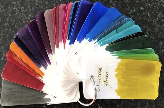
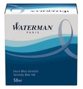
One of the first bottles of ink I bought was Watermans serenity blue or Florida blue as it used to be known. It is such a good all round liked by everyone colour and Waterman inks are good quality, not expensive and always reliable. I liked the ink so bought absolute brown and tender purple, just as I almost emptied the bottle my ink collection exploded and I haven't used it for a number of years. The March ink journal drop contained seven Watermans inks. It was an opportunity to rediscover lost loves and try some new colours. 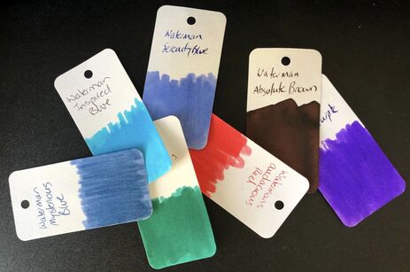 The names of Watermans inks and the packaging has changed a number of times in the last 10 years.
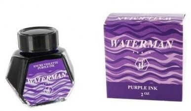
Then the packaging, bottles and names changed sometime around the end of 2011, beginning of 2012 and people went crazy. It is amazing to read now how upset people were about the change. The boxes were said to be cheap and non-distinct looking. The biggest gripe was for the name changes eg purple became tender purple, Havana brown became absolute brown and Florida blue became serentiy blue.
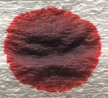
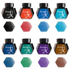
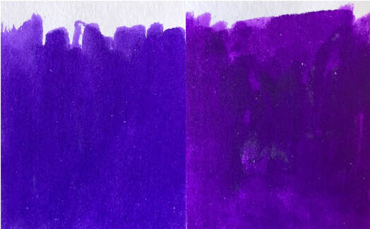
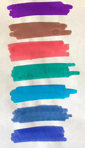
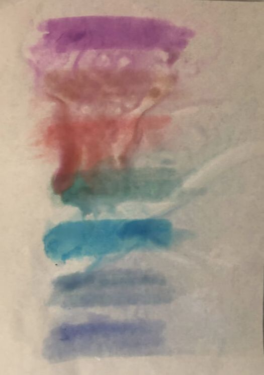
The ink bottles have undergone another change but I can not find a picture anywhere not even the Waterman web site to see if the packaging has also changed. The bottle shape has never changed just the labeling. 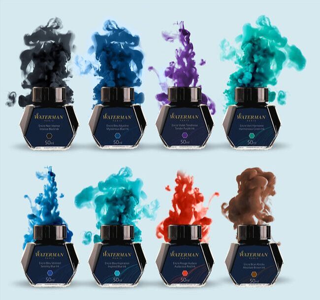 Picture from the Waterman website - the difference between harmonious green (top far right) and inspired blue (bottom 2nd from left) is not that obvious. Ive just realised as I come to write this I haven't done chromatography for any of these inks. To be honest they are such simple colours ie lack any shade or sheen I am not sure it would add anything so I will just do a brief review of each ink as it came out of the box. Waterman inks are available everywhere ranging from NZD$18.99 - $19.50 in New Zealand for 50ml and AUD$13.38 - $14.50 in Australia. ABSOLUTE PURPLE I bought a bottle of this in 2015 and either something is wrong - it has faded but that's not supposed to happen if its kept in its box in a cool place etc or the formula has changed. 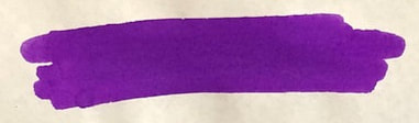 A lovely royal purple on Tomoe
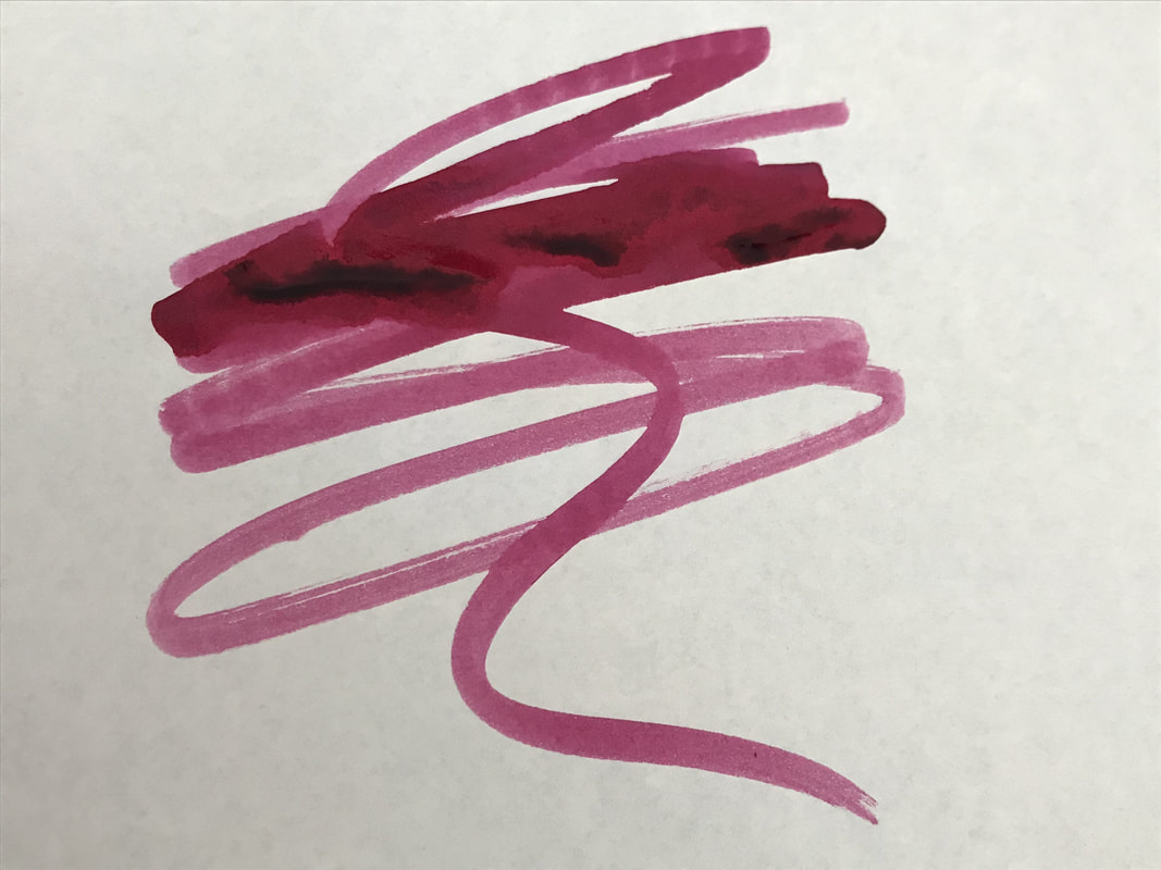
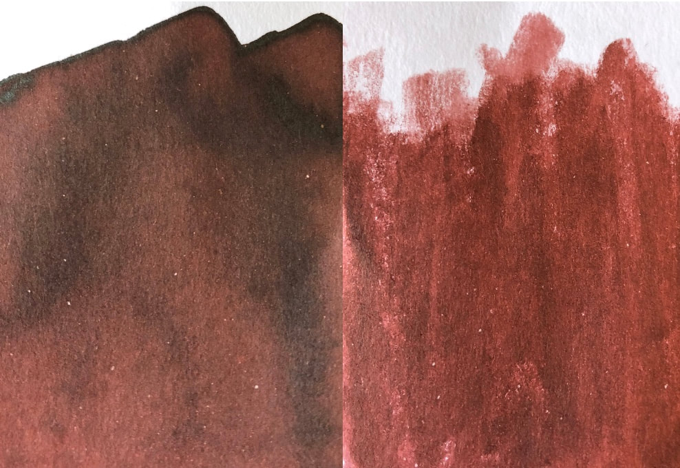
I love purple inks and used to use this a lot, I remember it being more like the ink on the right so clearly something has happened to my bottle of ink. I started the writing test on Rhodia. I have only used Rhodia and Tomoe for all the inks. I was so disappointed with this ink on Rhodia, I was going to say can you see why? and realised I had written the answer. 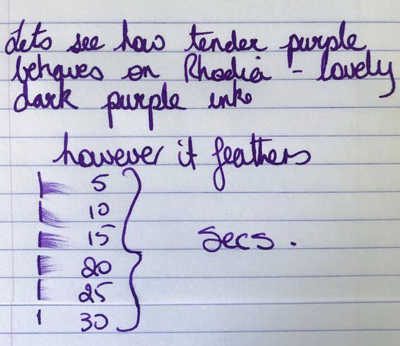 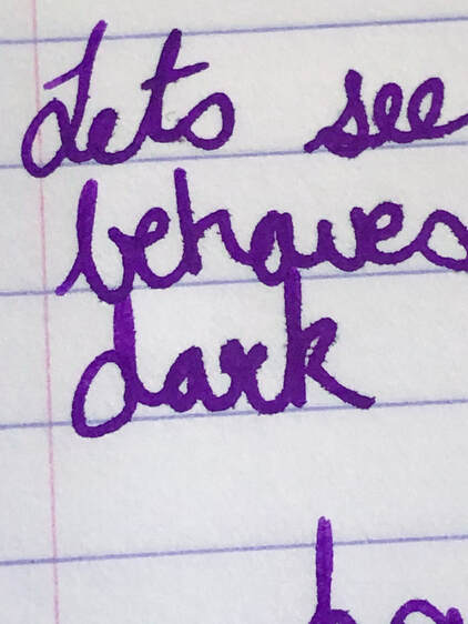 It was a nice purple but the feathering was awful and I was very surprised to see it. On Tomoe it was better behaved, still a nice purple with a little shading. On both papers quite slow drying. 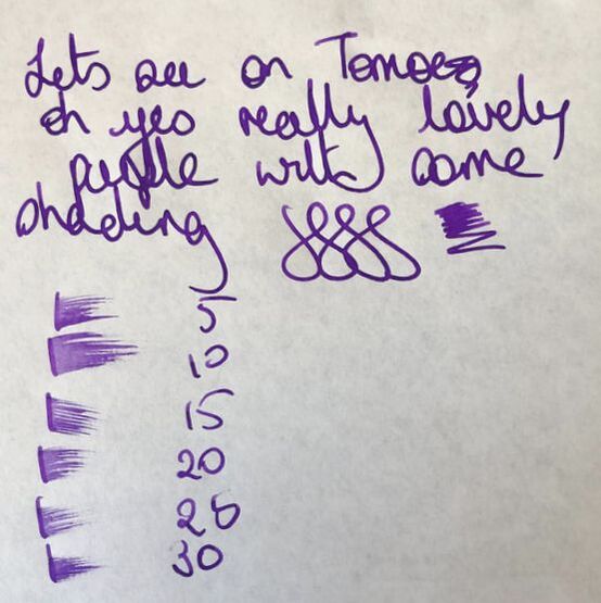 As I have so many purple inks I thought I would find many credible dupes for this in my collection but I didn't, I could only find two. Even then they weren't that great just the closest I could find. 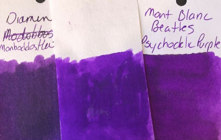 ABSOLUTE BROWN I bought mine about the same time as the purple ink, like the purple there are differences between mine and the new ink but I like my older ink better its more saturated. 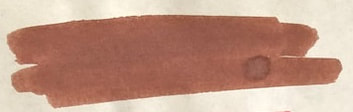 Just brown on Tomoe or should I say absolute? (this is the new ink)
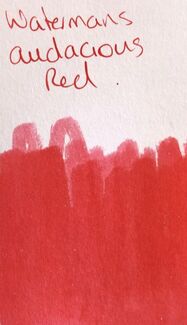
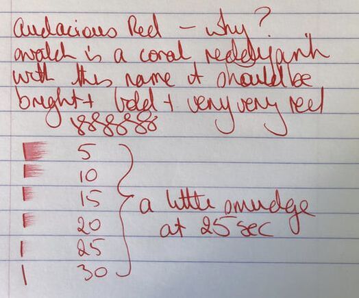
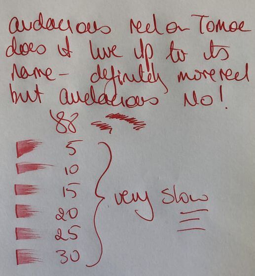
As with the other inks Rhodia paper followed by Tomoe 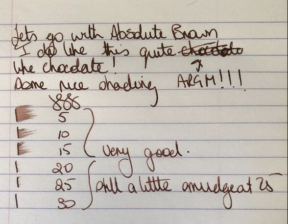 Rhodia On Rhodia a nice chocolate brown that was a quicker drying ink than the purple. I'm just not a great brown fan. 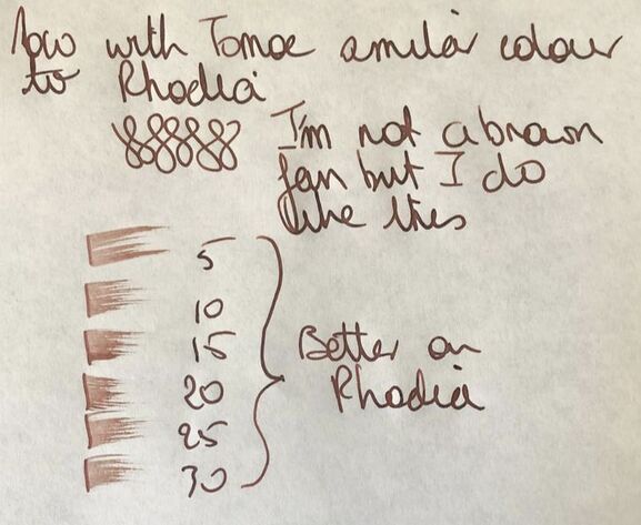 Tomoe river 52gms It was a nice colour on Tomoe and I could see me using it more often on paper like this, no shading though just a straight up and down brown. It suddenly took longer to dry, now being very similar to the purple. I couldn't find anything similar in my collection, I suspect because I possess so few brown inks. AUDACIOUS RED I have no idea why they called this audacious because it is anything but. To me audacious suggest a really firey bright red red red, something audacious. This red is limp! 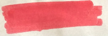 What is audacious about this?
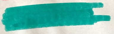
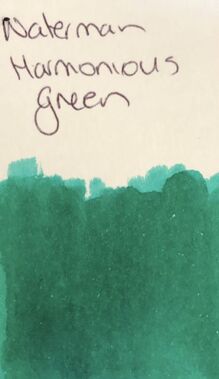
Like brown I am not the biggest fan of red inks though there are some really lovely ones available e.g. Nemosine make some rd inks that just pop. Despite not having many I did find a couple of inks that are a reasonable match for this, though they do make audacious red look more pink 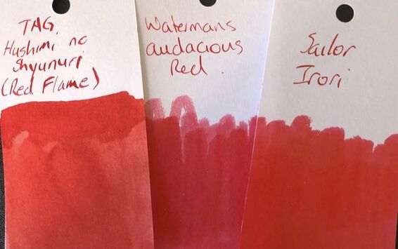 HARMONIOUS GREEN I do like a green ink, not as much as purple but a close second. This is a nice kelly green.
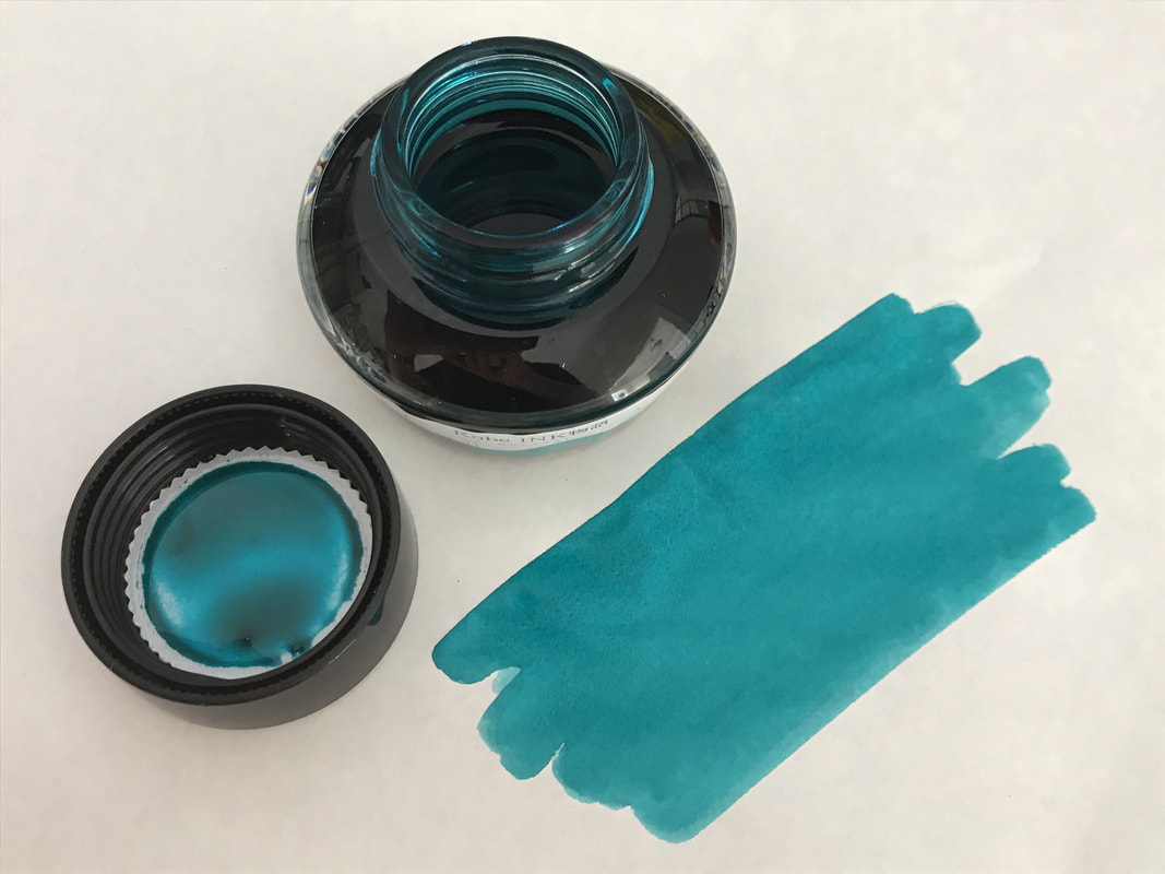
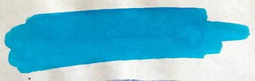
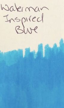
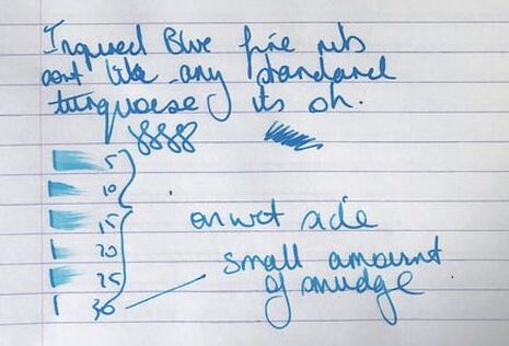
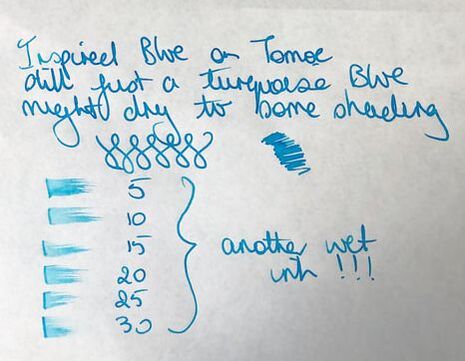
Again paper used Rhodia and Tomoe 52gms. 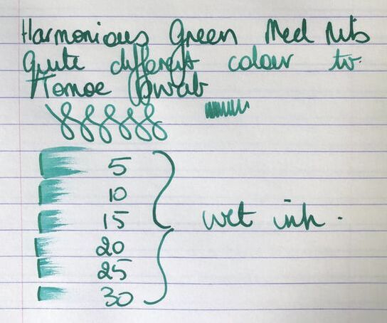 On Rhodia there is a some shading apparent, it writes as a blend of the two sahes seen on the col-o-ring. Darker green with hints of a more teal colour. Unfortunately it is very slow drying. 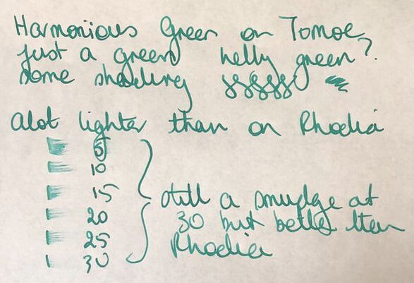 On Tomoe the ink leans far more to the teal end of the spectrum, though still green and still slow to dry but slightly better than on Rhodia. As I have previously said green inks come in a close second to purple inks in my heart so I have a few but again was surprised by how few were the similar to this ink. I found one, a similar green but without the teal tones. 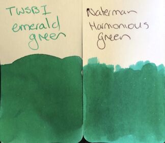 INSPIRED BLUE Otherwise known as another turquoise ink!
On Rhodia a turquoise with little shading and as I write this I have just noticed it also feathered but not to the same extent as tender purple
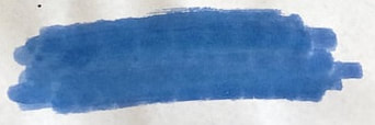
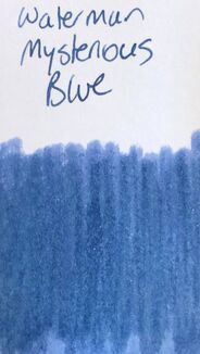
Finding a dupe for this was relatively easy. 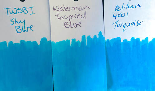 MYSTERIOUS BLUE I have been a long time user of serenity blue but was surprised by this blue, it has the look of denim when swatched and I quite like it
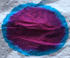
My first writing test was on Tomoe rather than Rhodia. 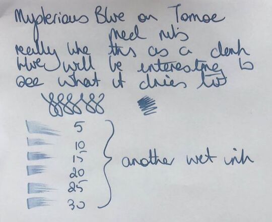 On Tomoe it certainly manages to keep that look of denim blue. It was not as dark when dry as I expected.  A similar shade on Rhodia and better drying than on Tomoe. Blue is such a popular ink colour and there are hundreds of variation son the sahde available. Thus you would think I would find a lot of similar shades in the collection, but no just one. 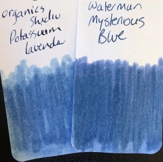 SERENITY BLUE Last but by no means least probably the most popular of all the Watermans inks. This ink along with Pilots Iroshizuku Kon-Peki are the two inks most recommended for those starting in the fountain pen world. It is a bright but deep blue, simple with no shading or sheen that is suitable for any use. This is the first watermans ink I ever bought and used it all the time and then just suddenly stopped and have not used it in about 4 years. The ink I had has clearly altered and not for the better, you will see wat I mean via the col-o-ring swatches. 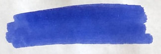 Tomoe swatch, new serenity blue 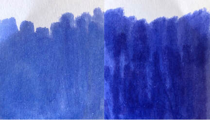 My ols serenity blue on the left and the new ink on the right, both on col-o-ring There is no doubt in my mind which is the better of the two and I remeber mine being more like that on the right. The remaining few mls I have will now be disposed of. I used the new ink for the writing and went back to the Rhodia then Tomoe order of papers. 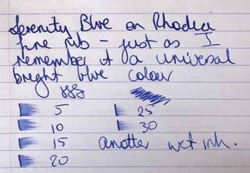 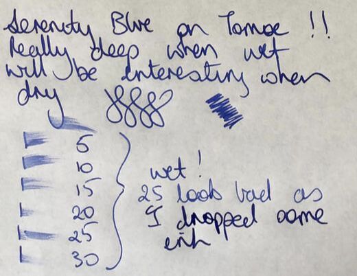 The flow was patchy when I wrote on Tomoe but I think that is the pen not the ink. In my collection only one similar ink.  I really am not sure why I stopped using my Waterman inks. They are reliable though not particularly special in colour range, just simple bold colours with nothing wizz bang about them. They are reasonably priced wherever you buy them and make excellent workhorse inks. In summary - Saturation - good Shading - no Sheen - no Flow - excellent Nib dry-out - no Nib creep - no Start-up - excellent Feathering - no except tender purple and inspired blue on Rhodia. Purple worse than the blue ink. Drying - slow all inks both papers Cleaning - excellent Water resistance - not sold as waterproof because they really aren't
0 Comments
Leave a Reply. |
Ink Brands
All
|
 RSS Feed