|
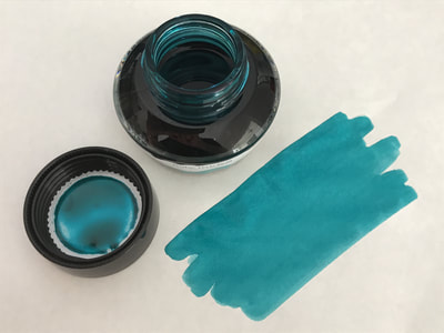
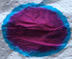
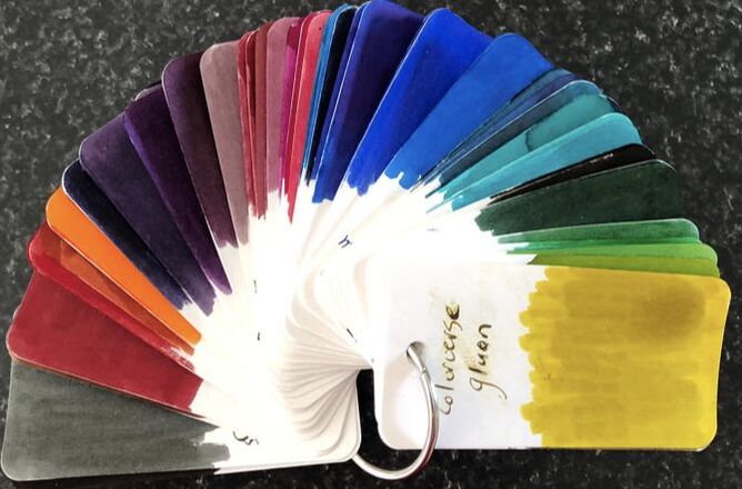
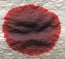
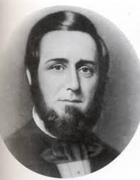
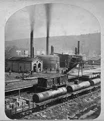
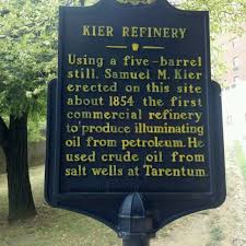
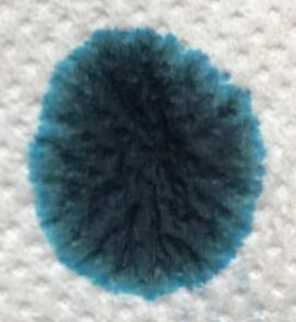
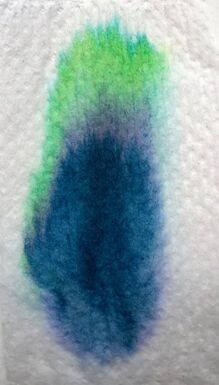
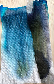
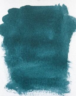
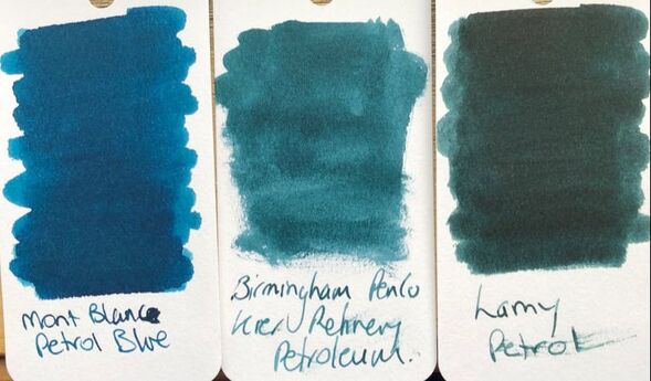
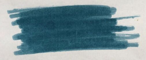
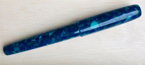
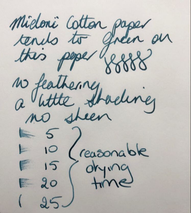
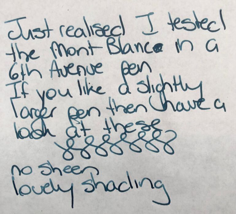
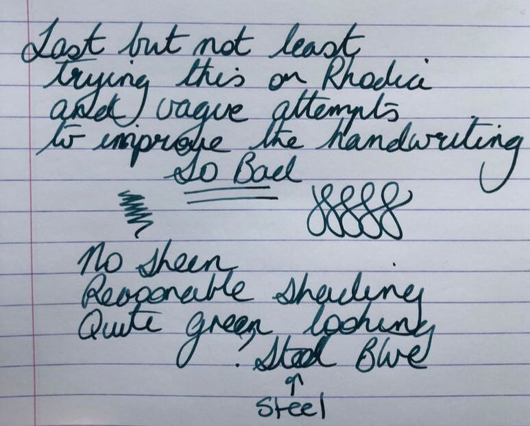
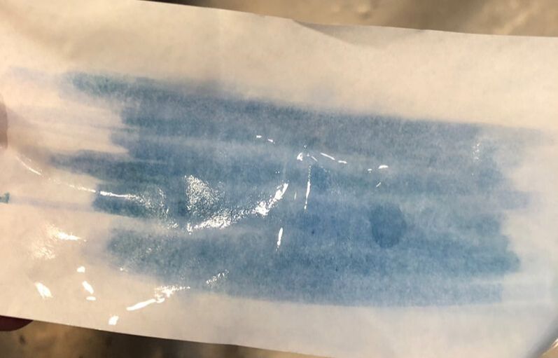
I had hoped this ink would have arrived for me to include with my previous petrol inks review. I had ordered a 6th Avenue Pen from the Birmingham Pen Co and it came with a free 30ml bottle of ink so I chose this. It didn't arrive in time so this is a stand alone Petrol Blue ink review. In my previous post I explained a little about why petrol blue is petrol blue. This time I will focus on the Kier refinery rather than the colour of the ink. Samuels parents were Scottish-Irish immigrants that owned a number of salt wells around Livermore Pennsylvania which he obviously inherited. By the 1840s the salt wells were being fouled by petroleum contamination. Initially the petroleum was dumped into a nearby canal but after an oil slick caught fire Samuel got the idea to profit from what until that time had been a useless by product. Initial experiments led to ‘Rock Oil’ and ‘Seneca Oil’ and then he made petroleum jelly. Neither products were a success. After further experimentation he found a way to make kerosene, this was not thought to have any commercial value but at the time he started to make it whale oil (the main fuel for lamps) was becoming expensive and scarce. Kier began selling Kerosene named ‘carbon oil”, he also invented a lamp to burn the oil and for both products he never sought patent. Samuel Kier also established America's first oil refinery in Pittsburgh. If you have read any of my other Birmingham Pen Co. reviews you will know I am a big fan of their inks and the service you get from the company. I think I have previously said I am not a huge fan of blue inks but I am learning to love them. I ordered a 6th Avenue pen when the Ariel design came out. It was my fifth 6th Avenue, I say was, because my sixth pen is now on its way to me. Clearly I really like these pens and the writing for this review was done said pen. I have described the packaging for Birmingham Pen Co inks before and nothing has changed re this. Also I do not think there has been any new colours since my last count in April at 74 shades. When I put the ink on absorbent paper it reminded me of when I first started reviews, I just used the drop on paper and waited to see if it dispersed. This ink does but I have changed my technique as many inks don’t, they need help in the form of some water. The initial drop revealed blue, turquoise and green. Water added and what a difference. Again the blues and greens but here a very lime / bright green colour was revealed. On col-o-ring the ink looks sea-green to me. The colour fits neatly between the Mont Blanc and the Lamy Petrol inks. That is not as blue as Mont Blanc but not as green as Lamy. On Tome river paper I had the same experience as with the Mont Blanc ink – it dried to a duller colour and didn’t seem to be as saturated as first expected. The pen I used had a medium nib. I started with Midori cotton paper. The ink handled quite well with an acceptable drying time. It writes almost steel blue on this paper, maybe steel blue and petrol blue are the same who knows. There was minimal shading and no sheen so I found it uninteresting on this paper. Midori was followed by Tomoe River and I was reminded as to why Tomoe River is considered the best fountain pen paper. It is a lovely saturated colour with abundant shading. Lastly Rhodia. I am not sure the photo really captures it but the ink has dried quite green on this paper. In summary Saturation – swatches suggest not but writing very saturated Shading – abundant on good paper especially the Tomoe river Sheen - no Flow - excellent Nib dry-out - none Nib creep – none that I saw while using the pen Start-up - immediate Feathering – nil on any of the papers used but could be a problem with cheaper writing paper Drying – reasonable at 20 secs Cleaning – easy, no pen staining Water resistance – not sold as water proof but hold up ok after being put under a tap
1 Comment
|
Ink Brands
All
|
Proudly powered by Weebly
 RSS Feed