Ink at the Heart of a Fountain Pen
|
|
|
|
|
|
|
|
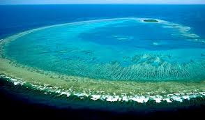
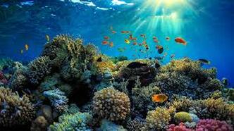
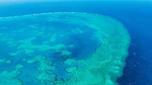
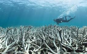
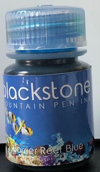
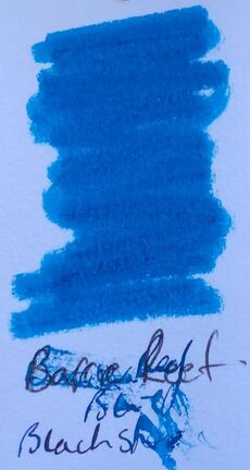
The ink I chose for June the second, I liked it so much I refilled the pen. The Great Barrier Reef is composed of nearly 3000 individual reefs and 900 islands, it stretches for more than 2000km in the coral sea off the coast of Queensland. Contrary to the urban legend that the Great wall of China can be seen from outer space the Great Barrier can be seen, it is the worlds largest structure made by living organisms. There continues to be controversy about whether the reef is suffering the effects of global warming or not. Some reports have been accused of being premature and not taking into account the reefs resilience. No matter what you believe large sections of the reef have died due to warmer water temperatures and the percentage of baby corals being born has dropped off due to the loss of mature breeding adults during recent bleaching events. The reef is subject to many threats including climate, pollution, loss of coastal wetlands, mining pollution, sediment runoff, pesticides, crown of thorns starfish, overfishing and shipping.
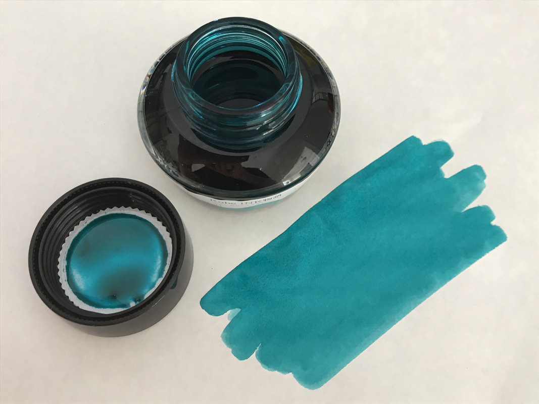
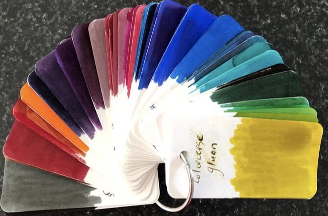
In my previous Blackstone ink reviews I have provided information about where I got the inks and also a little background about how they came to be. You can access those reviews via categories. Packaging naturally remains the same but with a different picture on the bottle.
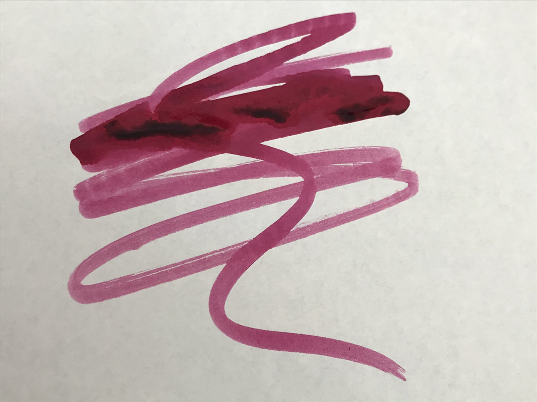
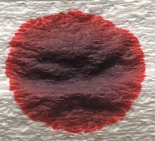
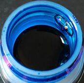
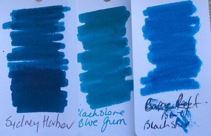
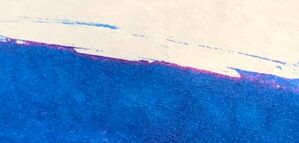
It is not marketed as a sheening ink and I didn’t think it was until it dried. It does have some sheen but it is not as obvious as in Sydney Harbour Blue. Chromatography revealed various shades of blue, a hint of green and some deep red.
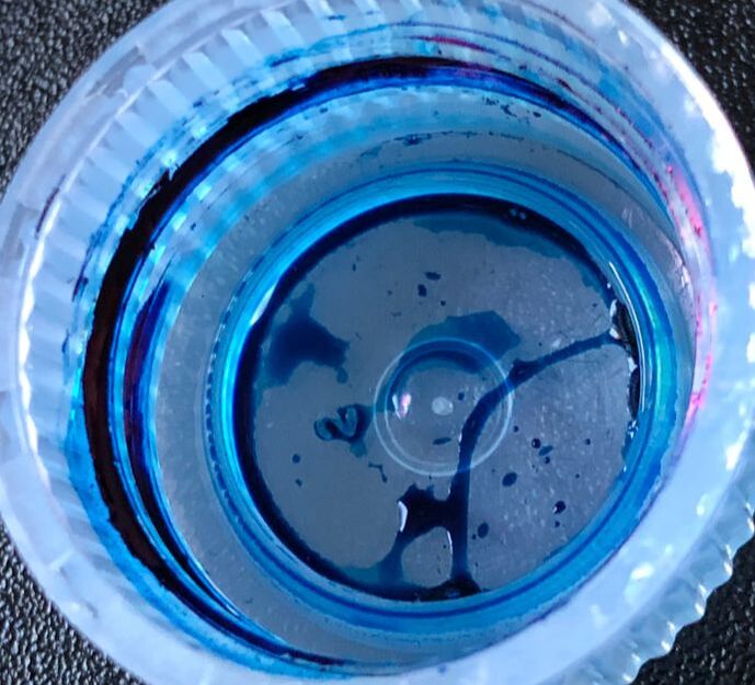
On col-o-ring it was a rather bland colour, against the other two blue Blackstone inks I have reviewed it is the least interesting. Then again I don’t find any of them that good on the paper in the col-o-ring, the col-o-ring paper may be for testing inks but it does one of these any favours.
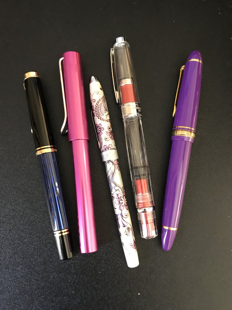
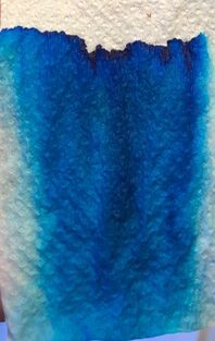
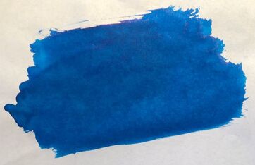
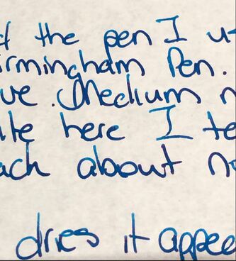
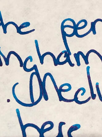
For the writing tests I used the pen I had used on day two of the challenge. It is a 6th Avenue model from the Birmingham Pen Co. in cotton candy. I have reviewed a number of this company’s inks and if asked about the pen I would wax just as lyrical – it is a fabulous pen for me in feel, weight, look, ink flow etc etc. Today I ordered my fourth. 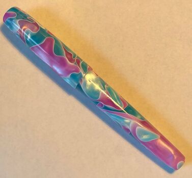 The first was paper in a cheap notebook. 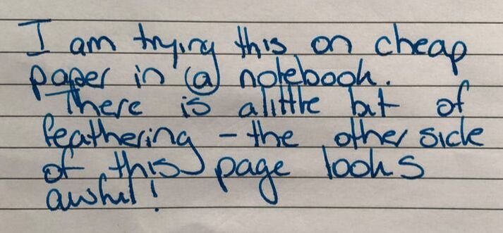 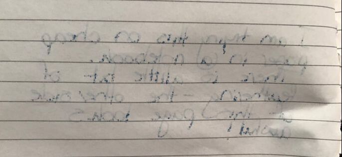 I think that test speaks for itself so not much got written here and not just because of the feathering and show through but the ink was fairly non-descript on the paper. Next up Tomoe river, as you may notice I don’t use filters etc for my photos – at the most I crop as I try to keep things as natural / real as possible. I did try a photo box with LED lighting and it just washed everything out so I try to use as much natural light as possible. The reason for telling you this is because of all the effort that went into getting a photo of this ink that conveyed the real colour on Tomoe river paper and not something that was either too dark or too washed out. I think I got there. The paper always comes out looking slightly yellow, it is white but not an optical white. 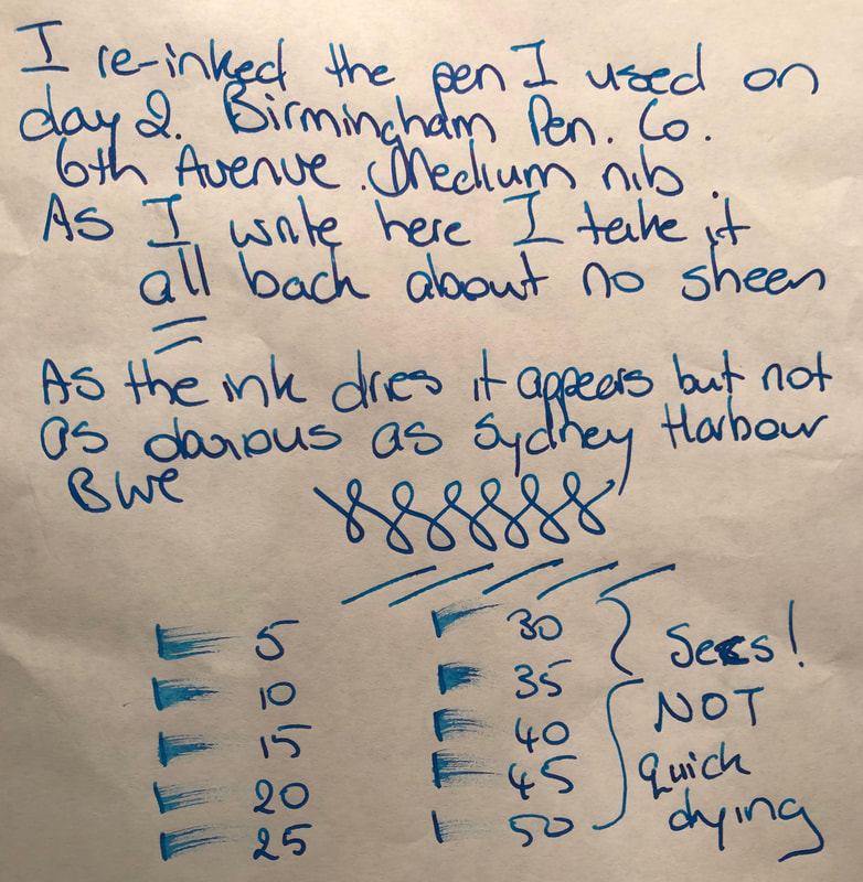
Recently I started trying Midori cotton paper as some recommend it as an alternative to Tomoe river, I like it but it is NOT the same. It feels heavier and somehow coarser than Tomoe river, I have also had some significant bleed through problems with a couple of inks. There was no bleed or show through here and surprisingly the ink dried much quicker. 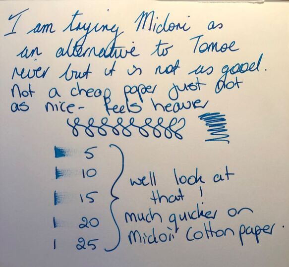 My writing gets no better I’m still not a huge fan of blue ink but I do have some pretty cool ones from Blackstone. In summary Saturation – high Shading – moderate Sheen yes but subtle Flow – excellent Drying – very very slow on the best quality paper, Waterfast – not sold as waterproof but still excellent just like the other inks I have reviewed from this company 
1 Comment
|
Ink Brands
All
|
 RSS Feed