Ink at the Heart of a Fountain Pen
|
|
|
|
|
|
|
|
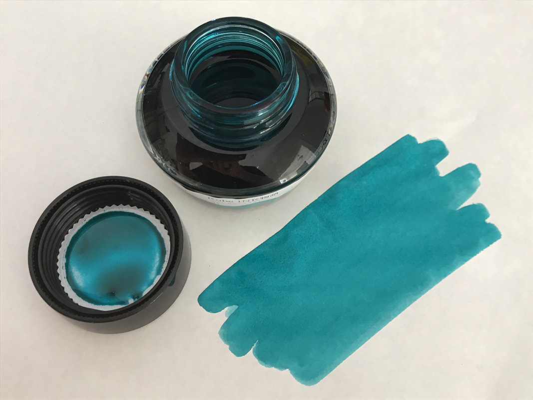
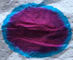
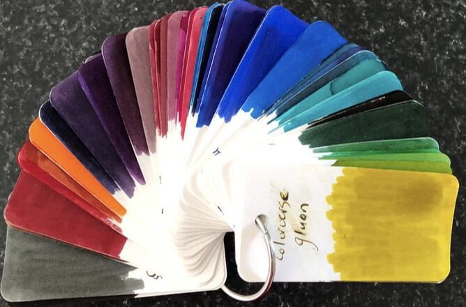
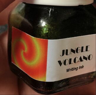
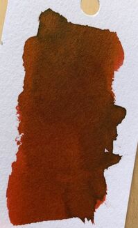
Finally I am reviewing the ink that made me buy Krishna inks in the first place. Since I reviewed Winter in 2018 the web site for Krishna inks has been improved with respect to graphics but now has less information about the inks themselves. Currently there are over 50 colours divided into three groups sheening inks, bold vivid inks which I suspect means they are very saturated and iron gall. The list of retailers has been improved and increased and can be found here. The packaging is very simple. Many other blog writers seem to put a lot of store into the quality of packaging elevating it to the same level as the product within – the ink. Krishna bottles are small and plastic, the packaging a simple cardboard box 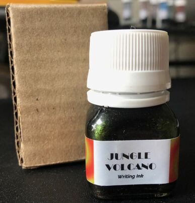 There really isn’t much to say about how Jungle Volcano got its name. I think the inspiration has been the look of hot lava flowing through a jungle. Photos are not easy to come by to demonstrate this the best I could find was a picture from the Star Craft II website (a real time strategy game) One of the terrain training exercises involved lava flowing through a jungle and it is the only thing I found the completely reminds me of this ink. 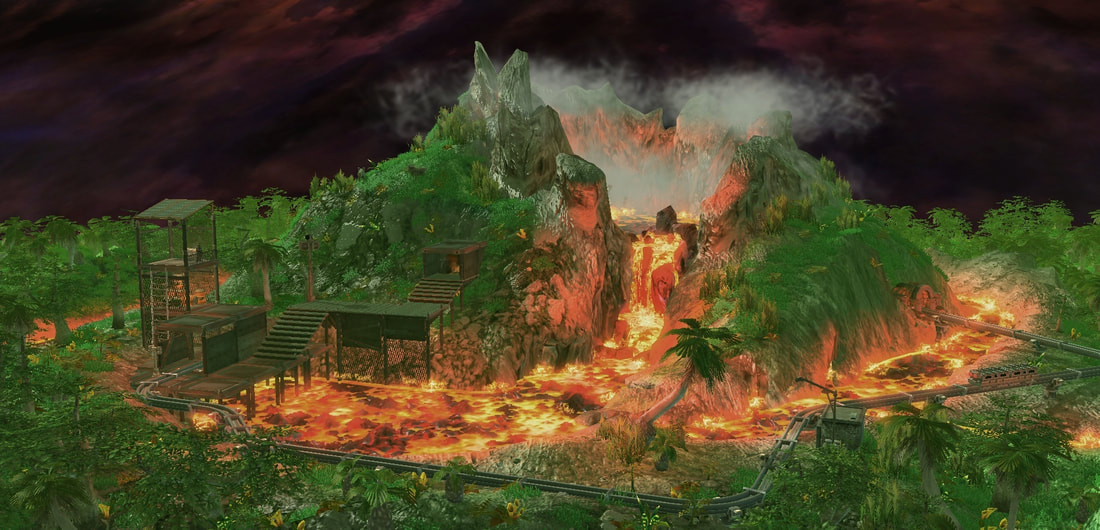 On opening the bottle the colour looks quite orange, getting sunlight through the bottle neck and it does brighten up and look like hot lava. Surprisingly through the bottle the ink looks deep green.
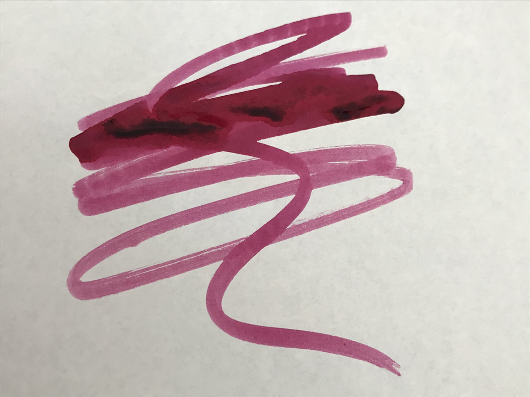
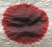
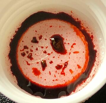
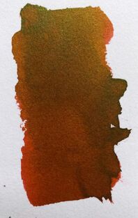
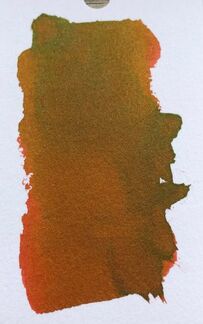
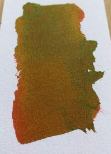
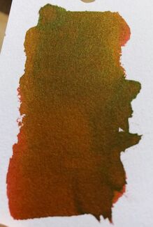
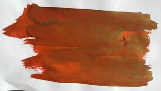
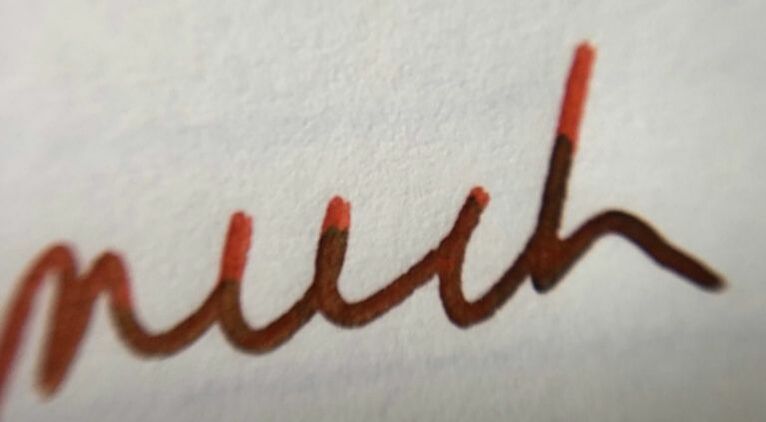
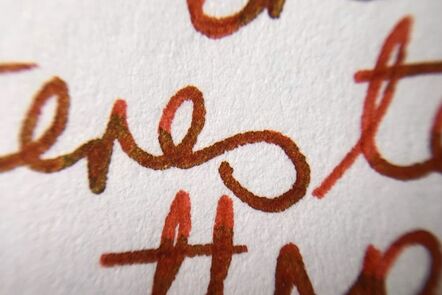
I know this is a sheening ink and it was seeing this online and IG that made me buy it. Not unsure why it has taken me 6 months to open the bottle though. My test on absorbent paper was disappointing to say the least, I have seen others who have unearthed pinks and oranges etc. My test is a brick red with a centre of greeny gold. 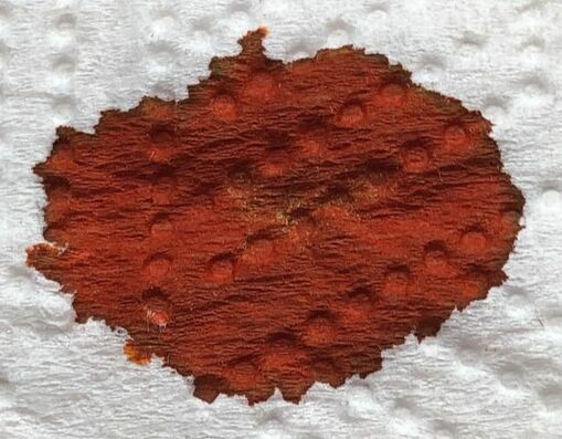 My swatches on Tomoe River and my col-o-ring did not disappoint. This ink is even better in the flesh than any photo I have seen can convey, which means my photos will also probably disappoint. I have taken a few photos of each attempting to show how the ink changes depending on the light on it and angle from which it is viewed. All the photos were taken in the same location one after the other with the swatch being laid flat or tilted slightly to change the way the light fell across them. First six are my col-o-ring, the last four on Tomoe River paper 52gms.
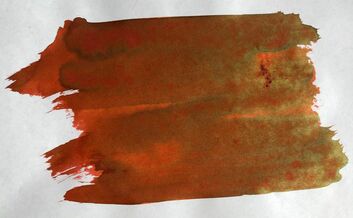
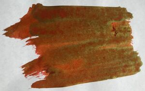
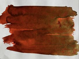
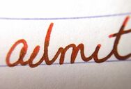
For the writing I used a Visconti pen with a medium nib. I am trying to learn to love my Italian pens. First up was Rhodia paper and it worked quite well with a lot of sheen apparent but overall colour for writing was as bright as the swatches would have you believe. As with other Krishna inks I have used this is not quick drying. 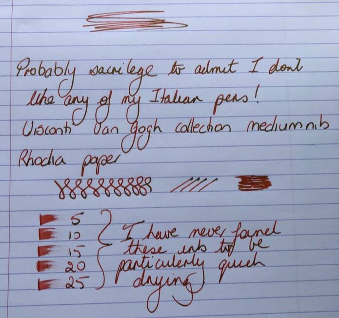
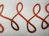
Then I tried Tomoe river and it worked well here. There is very little difference between the Rhodia and the Tomoe River in bringing out the characteristics of this ink. 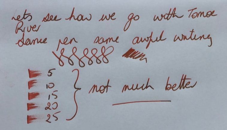
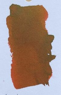
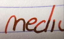
Last but not least copy paper and again it worked very well with a lot of sheen coming through. I was pleased to see no feathering or show through. Despite all the photos being taken in the same place at the same time of day the photo of the ink on copy paper is the truest representation of how this ink is when used for writing and not swatching. 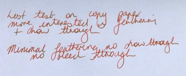
This is a beautifully sheening ink that looks great in its swatches but when used is a not particularly inspiring peachy orange with hints of green. I was won over by the images I had seen and every one talking about how sheening this ink was, I didn’t really give much thought to the final colour. I will jungle volcano again and I will always be positive about how it sheens but I am non-committal to not impressed about its final writing colour. As I was putting my col-o-ring swatch away I realised what it reminded me of. This is very similar to Lamy Copper but that doesn’t have sheen. When I reviewed that ink I thought also thought it was an insipid colour. 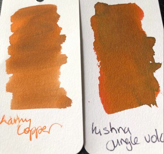 It will be interesting to see if this is just as difficult to clean as Winter - I will post an addendum when I clean my pen. 1st June 2019 It is 22 days since I posted this review and 32 days since I started cleaning my pen. After 4 weeks the water the nib was being soaked in appeared to be clean but I still wicked ink out when I put the nib on absorbent paper to dry. Lovely ink - difficult to clean - it takes a lot of work even using pen flush to get these sheening inks out - do not use them on any expensive pens.
1 Comment
Shelby
10/7/2020 07:16:42
Yes, I have the Jungle Volcano #2 formulation, and it is a stainer. I am glad I have gotten a bit in the habit of using like colors of inks to pens, because the orange-black pen I have used JV2 in will never be free of a hint of the color. At least it won't interfere with other dark orange/red inks I will use in the pen. I have found the Vinta Sikatuna just a tad easier to clean. Leave a Reply. |
Ink Brands
All
|
 RSS Feed