Ink at the Heart of a Fountain Pen
|
|
|
|
|
|
|
|
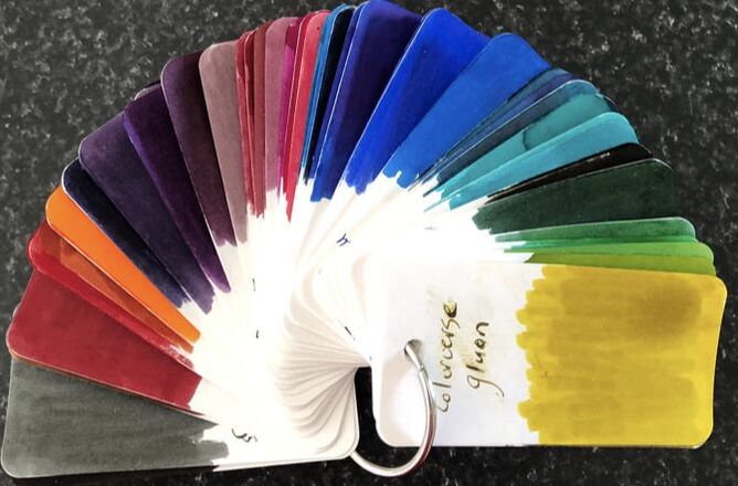
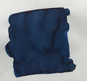
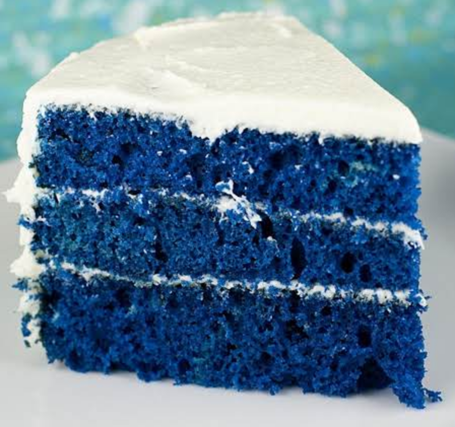
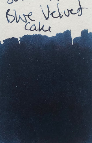
The introduction is repeated from the previous reviews. In 2016 Monteverde started to re-imagine / configure their inks and as a part of that they have released a number of collections e.g. noir, emotions, gemstones and this, the Sweet Life collection released early 2019. The collections are not easy to obtain in my part of the world but Pen and Ink (Queensland) have the sets for AUD$99 plus postage. I contacted Monteverde in the USA about some of their other inks, the US people directed me to the Australasian distributor who in turn directed me to Pen and Ink. It would appear Pen and Ink are the only retailers in this part of the world, (and have been fantastic) in the US many retailers stock Monteverde inks. There the sets retail on line from US$90 - $100. As said there are 10 inks in the collection, I will divide the reviews but make some general comments here and after the last review summarise what I have found / think. The same pen was used for each ink i.e. a Birmingham Pen Co 6th Avenue pen The inks are named after a collection of popular American desserts, I couldn’t think of anything more American than keylime pie or blue velvet cake, some of the others are fairly international e.g. chocolate pudding and birthday cake. Each ink comes in a 30ml glass bottle with more interesting labels than some of Monteverdes other inks. They all contain ITF technology. ITF stands for ink treatment formula which in Monteverdes words - “drastically improves ink flow quality, extends cap-off times and lubricates and protects the ink feeding systems from corrosion and clogging” The inks come in a black magnetic sealing box which is ‘specifically designed for reuse and recycling. The box is contained within a soft cardboard outer sleeve. Pictures of the packaging are in my first review. The colour range is limited with a preponderance of browner shades.  Blue Velvet Cake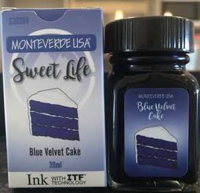 To me this is such an American dessert I have never come across it anywhere else. I was amused to find it also comes in various shades of blue.
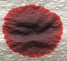
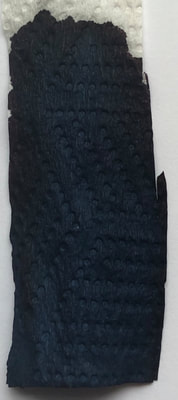
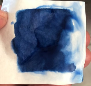
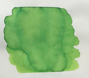
Chromatography was a very dark almost black blue with a hint of red at the edges.
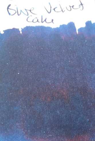
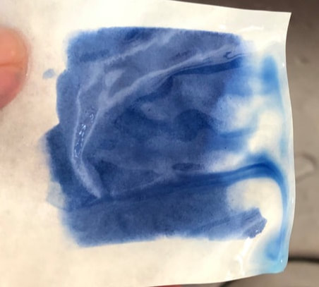
On col-o-ring it was a very dark blue with that hint of red again which was far more obvious if held in bright light though that washed the blue out. On Tomoe again dark blue but the red sheen was more obvious.
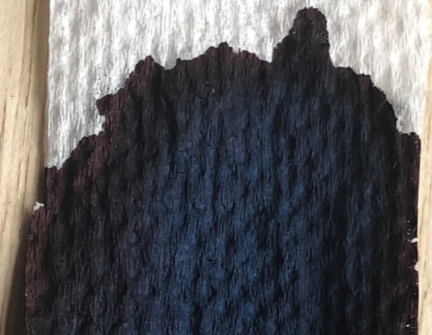
 Tomoe 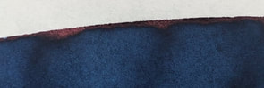 On Midori it is a dark blue. It looks like it is shading but it is the red sheen that gives it this look though the sheen is never enough to make it obvious that it is a red sheen. The dry time is quite good. 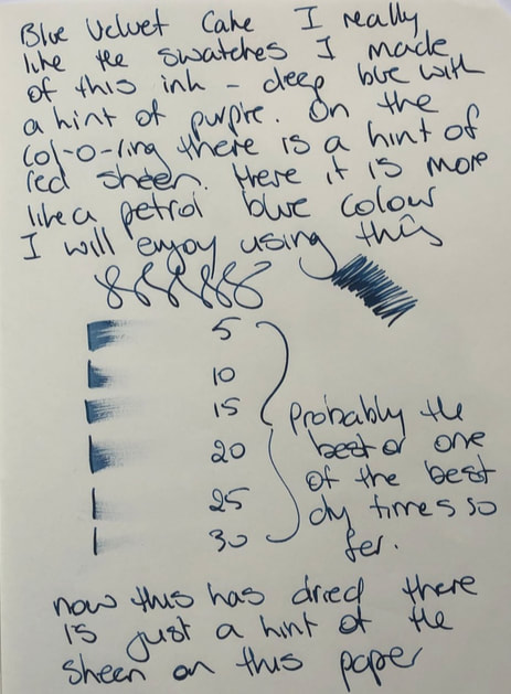
On Tomoe the colour leans more towards a petrol blue but the sheen is more obvious in that it is clear the colour variation is due to sheen rather than shade. The sheen though, is never too dramatic like e.g. KWZ sheen machine. Dry time again very good. 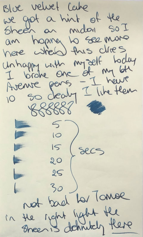 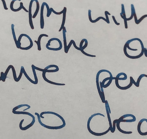 I can report for this ink no start up problems when I reused the pen. I have been using it quite a lot at work and on cheaper paper the sheen is absent and the ink so dark many colleagues have thought I am using black ink. In all the blue inks I have swatched I could not find anything similar to this. In summary Saturation – high Shading – no Sheen – slight Shimmer – no Flow – good Nib dry-out - none Nib creep - none Start-up – ok Feathering – none not even on cheap copy paper at work Drying – good Cleaning - good Water resistance – poor, not sold as waterproof
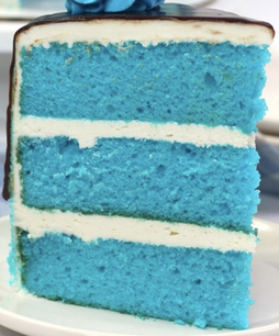
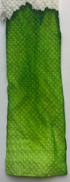
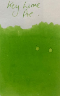
Keylime Pie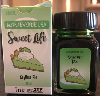 I do not understand why Americans go crazy for this dessert. It is just a lime pie (or lime tart in other parts of the world) made from limes from the Florida Keys. I don’t think I have ever had Key Lime pie I would walk over hot coals for. I like Lime pie but do not find Key Limes anything special. I also find this colour too bright for regular use. Chromatography was as expected a bright lime green there is however, a hint of turquoise.
On both col-o-ring and Tomoe its bright.
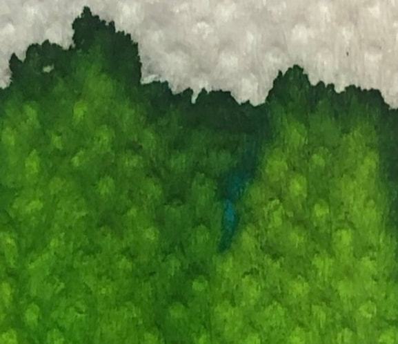
On Midori the ink was bright, had some shade and dried reasonably quickly. 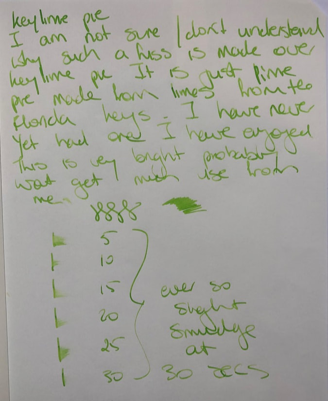 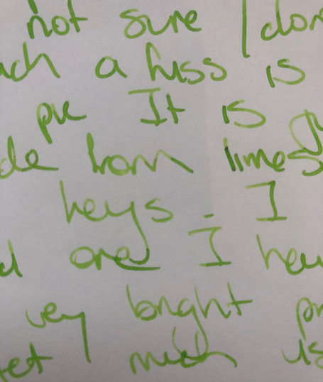 On Tomoe a similar colour, acceptable dry time and some shading. 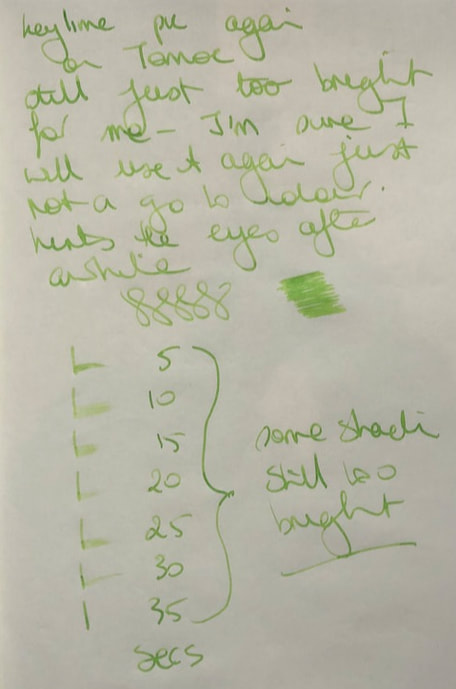  I just don’t like this colour and I think my bias comes out in my fairly pedestrian review. Im not motivated to find anything good about it however it was one of the better drying inks in this collection. After a while this colour hurts my eyes. When I reviewed the TWSBI inks earlier this year I said the prairie green and this were similar and they are. 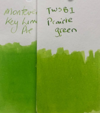 In summary - Saturation – high Shading – minimal Sheen – no Shimmer – no Flow – good Nib dry-out - none Nib creep - none Start-up – good Feathering – none, but didn’t try cheap paper Drying – reasonable Cleaning - good Water resistance – not sold as waterproof but I a actually quite impressed, very little ink movement after being held under running water 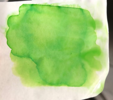
0 Comments
Leave a Reply. |
Ink Brands
All
|
 RSS Feed