|
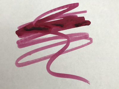
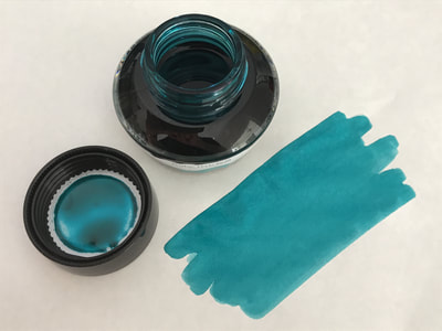
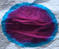
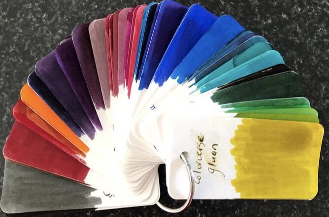
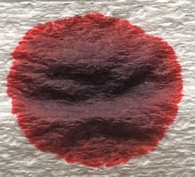
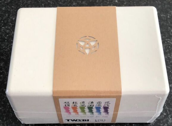
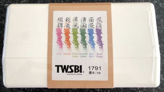
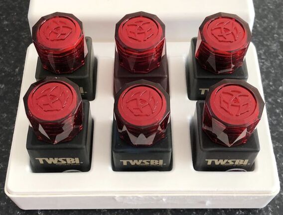
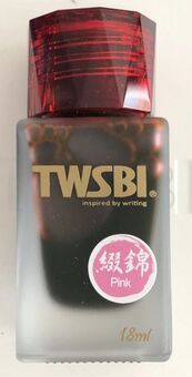
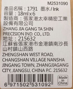
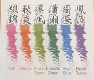
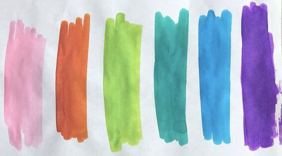
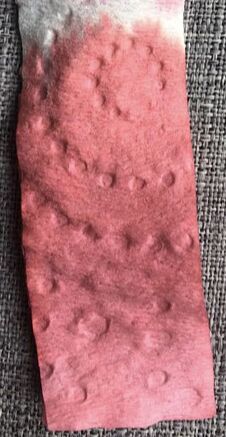
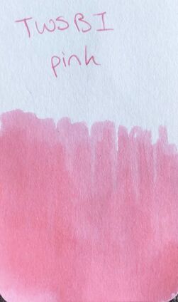
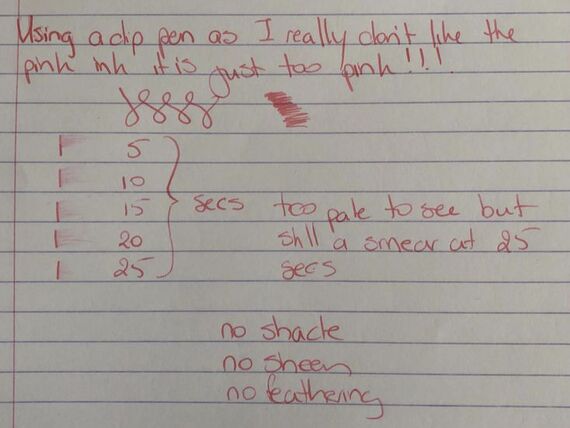
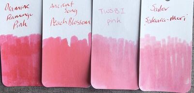
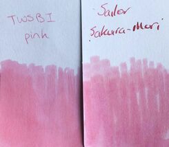
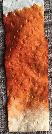
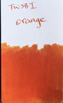
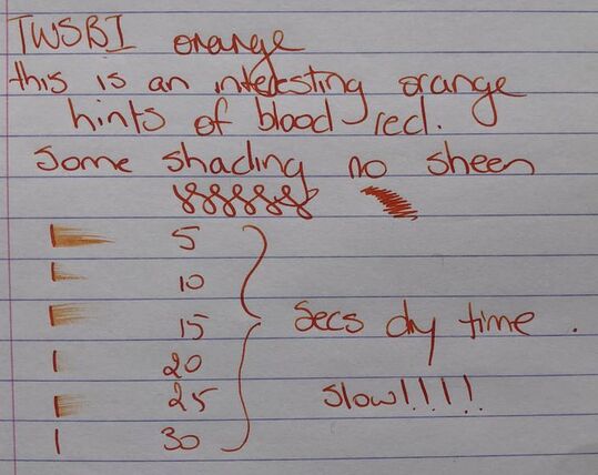
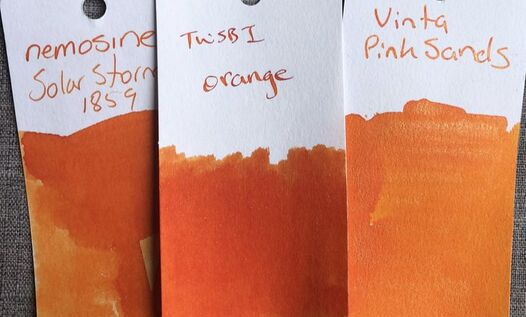
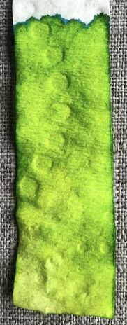
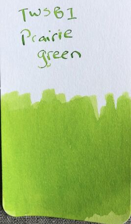
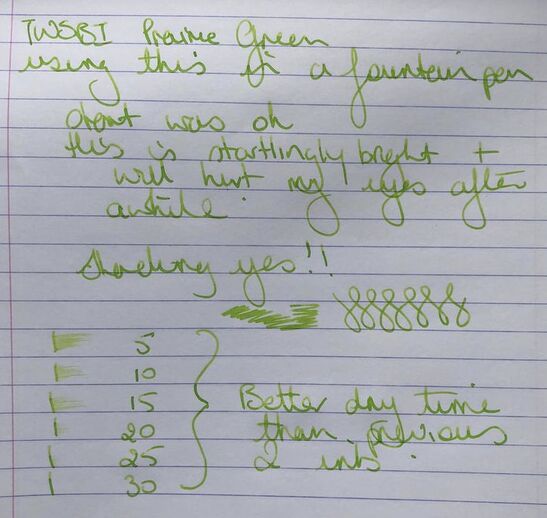
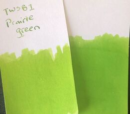
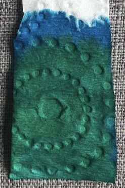
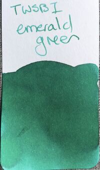
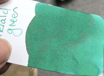
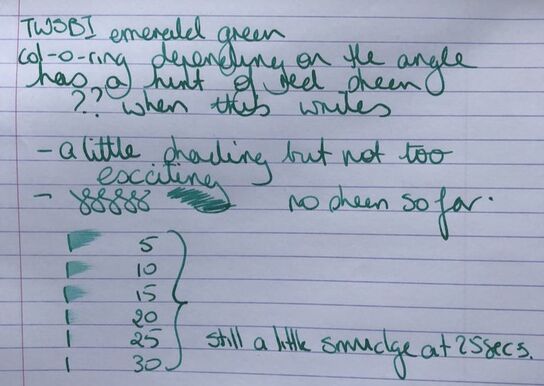
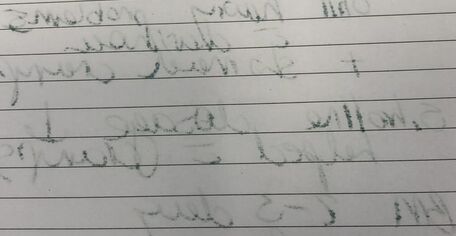
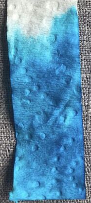
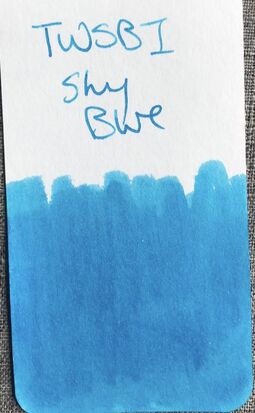
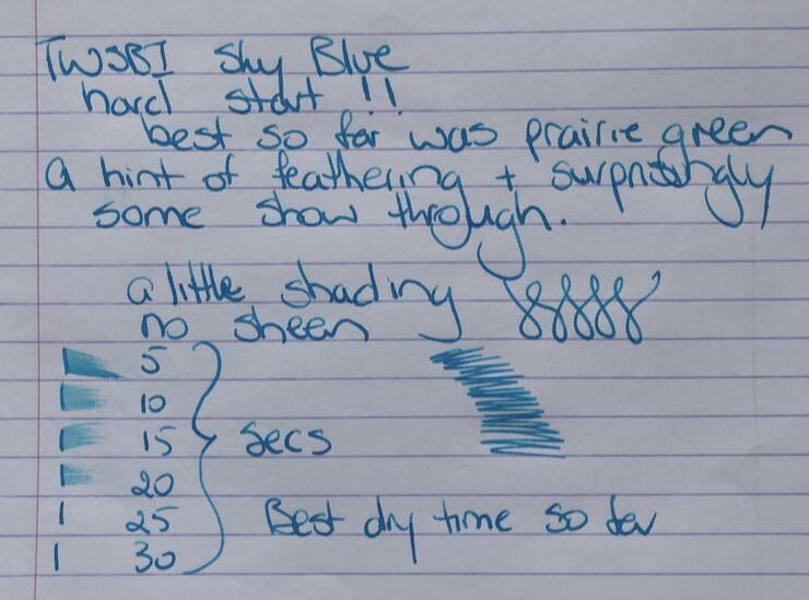
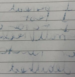
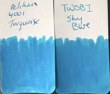
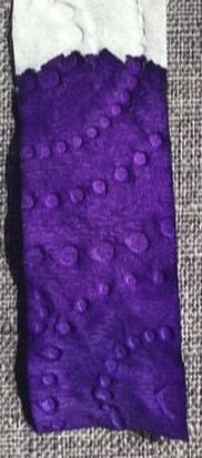
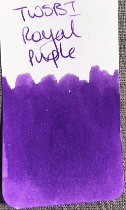
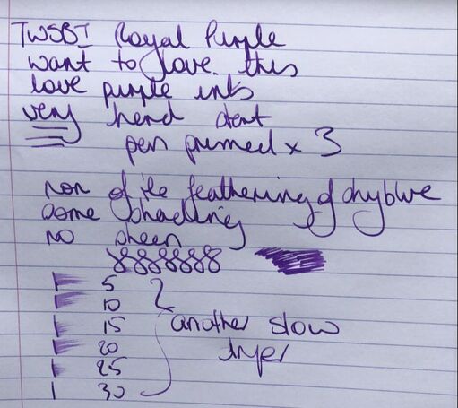
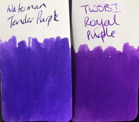
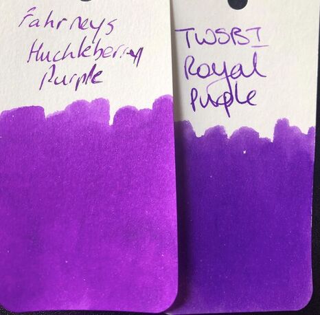
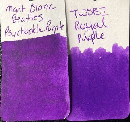
TWSBI was formed in 2009 as a subsidiary of the Taiwanese manufacturer Ta Shin Precision. For over 50 years the company had manufactured parts for other pen manufacturers. From the TWSBI web site: TWSBI's name stands for the phrase "Hall of Three Cultures" or "San Wen Tong" in Chinese. The character "Wen" translates into language and culture. The phrase "San Wen Tong" also brings to mind the Hall of the Three Rare Treasures created by Emperor Qianlong as a memorial to three great masterpieces of Chinese calligraphy. The initials of the phrase "San Wen Tong" was reversed and thus turned into "TWS". The last letters "Bi" was added with its literal meaning of "writing instruments". Thus combining the two segments, creating TWSBI. TWSBI have their fans and detractors in the fountain pen world and this year they released their first set of limited edition inks. I am not sure why I bought these inks, the colours are fairly standard and a number of people have posted credible dupes for them online. However, they ended up in my possession. The six inks come in fairly sturdy box that looked plastic but isn’t, at least I think it isn’t as it handles and breaks like a hard cardboard. On opening the box the 6 inks are there in frosted glass 18ml bottles, the bottles have a similar cap to the TWSBI 50 and 20ml refillable ink bottles. It was only after opening the box I noticed to my slight disappointment TWSBI don’t actually make their own inks. They are made in Mainland China, Chinese inks can be good but I thought these were TWSBI inks. The colours on the box are very consistent with the colours of the inks in the bottle as you can see from the swatches below (Tomoe river 52gsm). The only difference is the purple in is more intense / brighter when swatched than the colour seen on the box. As someone who loves purple inks I was quite happy about that. The first ink out of the box is pink and it pink. There is not much more to be said than that. Even chromatography offered nothing but pink. On col-o-ring the ink has more colour depth than the Tomoe swatch. My pink ink prejudices are coming out but in my defence this ink has nothing to recommend it unless you really want a pink ink that is reminiscent of the girls sections of baby clothing shops. I only tested the ink on Rhodia and did not fill a pen because I knew I would never use this ink again. Swatches from some of my other pink inks are below. The ancient song and Diamine inks are deeper coloured and this ink is virtually indistinguishable from Sailor Sakura-mori. The second ink is orange and just like pink it lives up to its name – it is orange! There is no shading in this ink, even chromatography shows it is pretty much all the same shade. On the col-o-ring it is brighter than on Tomoe but still seems to be one shade. As with the pink I was not that impressed so used a dip pen but when used on Rhodia paper it became a bit more interesting. It had hints of what I would call blood orange and some shading became apparent. As for dupes of this within my orange inks I think the Nemosine solar storm is the best. However, you can see from the swatches solar storm that has some shading, this ink doesn't. The third ink in the box is prairie green and I have absolutely no idea why this is called prairie green. I realise a prairie is a habitat made up mostly of grasses and this is definitely grassy green but when I think of prairie the colours that come to mind are more consistent with the photos below. Chromatography again revealed a single shade to this ink but at the top of the test just a small hint of blue. This is a bright green ink. On colo-ring it remained bright and dare I say lime green. I did ink a pen to try this ink but couldn’t use it for very long. This ink is startlingly bright and began to hurt my eyes. It truly was very WOW!! Unlike the previous two inks there was some shading and it was quicker drying. The photo does not give justice to just how bright this ink is. I could not find a single ink my collection that came anywhere near this but I have seen people say Monteverde Key lime pie is close. Ink number four and I am wondering if I am going to get any use out of these inks. Number four is emerald green and yet on my original swatch it looked more teal than green. Chromatography was more interesting as there are at least two greens and two blues in this ink. On col-o-ring it was not as bright as I was expecting but there was a hint of red sheen. If you are a fan of green inks this isn't too bad when used on Rhodia. There was some shading. The only downside to this ink is unlike the previous 3 when used on cheap paper there was A LOT of show through making it very unusable at work. Despite more than 30 green inks I could not find another that came close to the emerald green. Ink number five is blue so should be far more usable for most, called sky blue I would put it with my turquoise inks. Chromatography yet another consistent ink with minimal shade variation. This is the first of the set were the col-o-ring and the Tomoe swatches are identical – the colour on Tomoe is the colour you get here. Sky blue had a hard start which surprised me. On Rhodia it laid a consistent line, minimal shading and dried quickly BUT BUT even on this paper it had show through which is a no no for any ink on a paper of the quality of Rhodia. It also feathered!!!! And it was just a disaster at work with cheaper paper. As far as dupes go the best I found was Pelikan 4001 Turquoise. Lastly the purple ink – royal purple. I had such high hopes for this as I love purple inks. Chromatography didn’t show much shade variation just a really lovely deep royal aka Tyrian purple. It was a consistent colour on col-o-ring. The colour on the packaging for these inks just doesn’t do this purple justice. For the writing test on Rhodia I so wanted to love this purple, the ink when swatched had started to nudge out my favourite purple ink (Mont Blanc Beatles Psychedelic Purple). The only thing against it was the incredibly hard start – I had to prime the pen three times in order to write. The nib also kept drying out between use. I have SO many purple inks and I simply could not find a dupe for this. On IG I saw someone had shown it was similar to Watermans tender purple. Its not similar to my Watermans. Its not the same shade but definitely the same tone as another favourite. The closest is what remains my all-time favourite purple ink. I have corrected the spelling mistake. These inks are not cheap for the volume. The set of 6 cost me NZ$49.99 equating to NZ$8.33 per bottle (NZ$9.99 if bought individually) equating to NZ$0.46/ml. As I said at the start I am not sure why I bought them. The packaging is nice but the bottles are going to become increasingly impractical as they empty. The inks are fairly boring colours that equate to the description i.e. pink is pink and orange is orange etc. They are inconsistent in behaviour, hard starts, show through and feathering (even on good paper). I would not buy again and would not recommend them to anyone. I am not sure why TWSBI released them, I like their pens but these inks are so ???? I guess they have still made money because a lot of TWSBI fams like me will have bought them because of the name. In summary – Saturation – high Shading – minimal but depends on the colour Sheen – no Flow - good Nib dry-out – none except royal purple Nib creep – none Start-up – inconsistent, very hard with royal purple Feathering – sky blue on Rhodia!!!!!! (If I could I would insert a very sad face emoji here) Drying – slow Cleaning – good Water resistance – not sold as waterproof and I didn’t test as I was not impressed with the inks and simply could not be bothered
0 Comments
Leave a Reply. |
Ink Brands
All
|
Proudly powered by Weebly


 RSS Feed