|
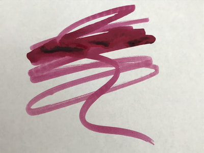
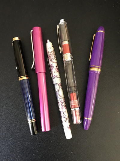
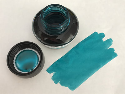
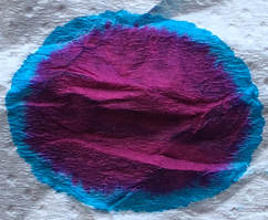
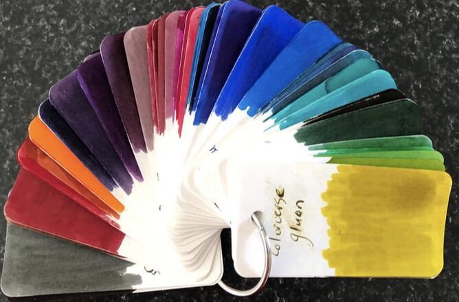
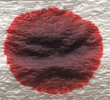
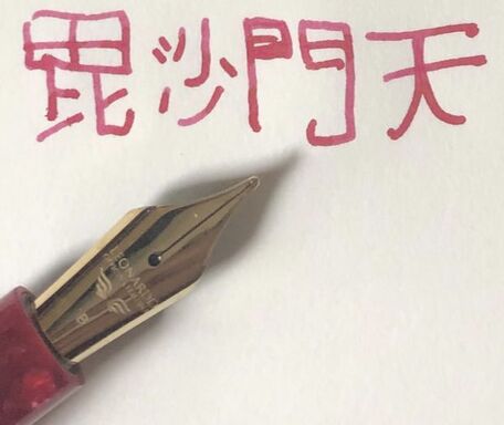
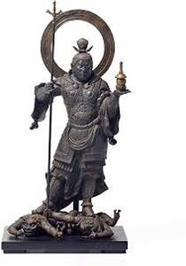
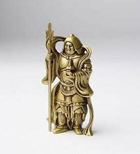
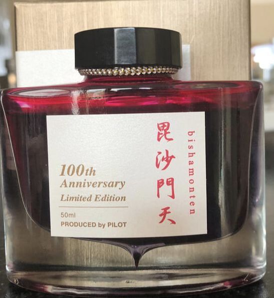
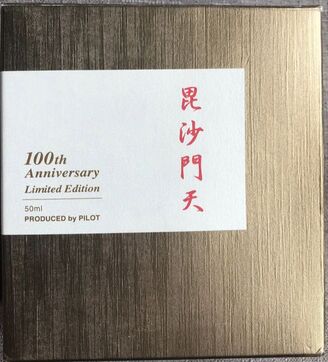
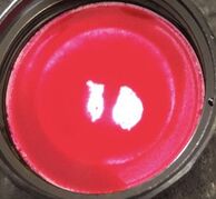
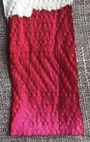
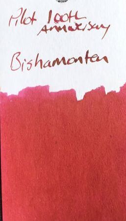
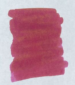
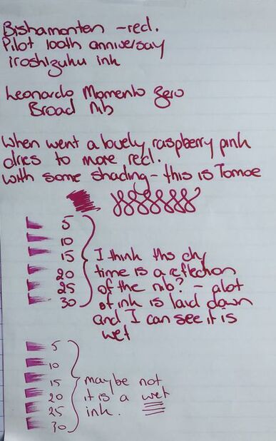
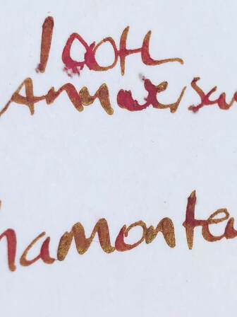
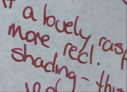
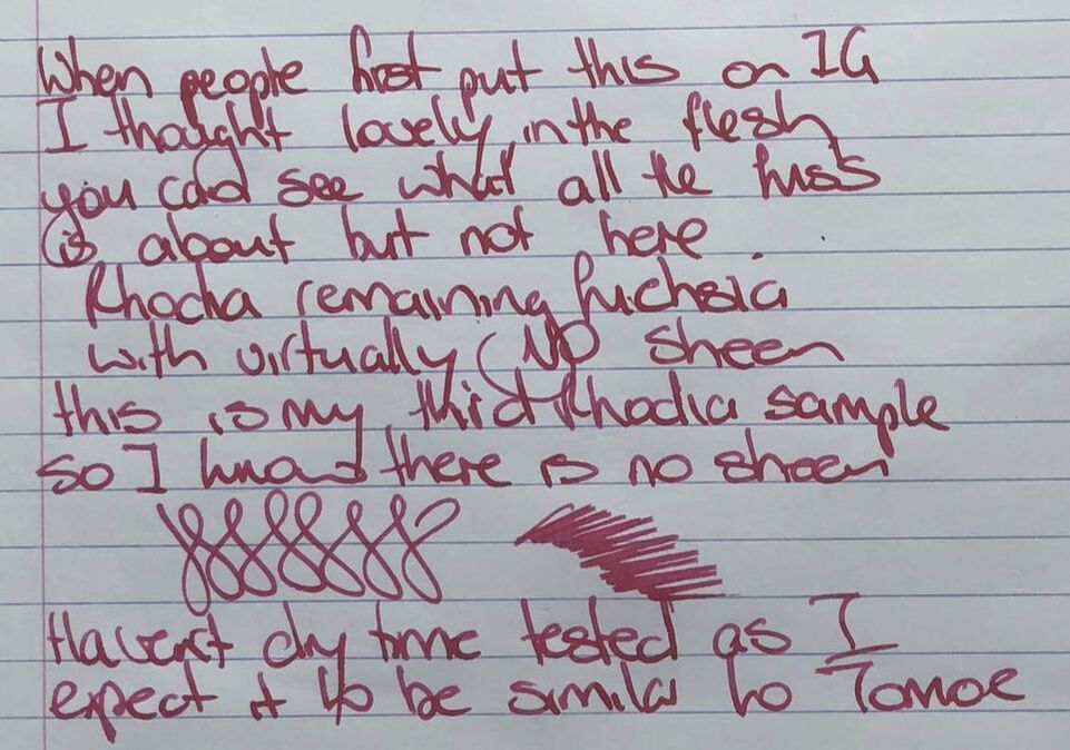
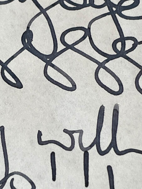
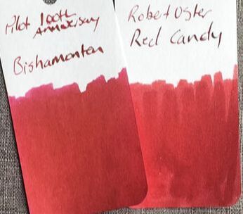
Some background on the seven Japanese Gods of good luck was included in my review of Fukurokuju. Also included in that review was some information on packaging and price. The 100th anniversary inks are becoming hard to find even online. A lot of retailers still have the 15ml sample packs left and occasionally you find the inks in the strangest of places. I bought this one in May in Melbourne, Australia and just recently in December I managed to find the inks still on sale at Dymocks in Sydney. When I wrote my first 100th Anniversary ink review I discovered through Pilot that Bishamonten was the god of dignity. He appears to be a little bit more than that. The origins of Bishamonten (aka Bishamon) are traced back to Hinduism, he is known as Vaisravana in Hindi. Apart from being the God of dignity he is also thought of as an armour wearing God of war and someone who punishes those who do evil deeds. He is usually imaged holding a spear in his right hand and a pagoda in the left. The spear is to fight against evil spirits in his role as protector of holy sites and important places. The pagoda symbolizes the divine treasure house whose contents he both protects and gives away. The ink is described as red and initially I wasn’t interested until I started seeing a lot of pictures of it being used and realised it is more than just a red ink. The ink comes in the usual Iroshizuku 50ml bottle, in the standard shaped box though as previously mentioned it is completely gold rather than silver. The colour on the box is a peachy red colour on opening the bottle it looks bright pink almost fluorescent. The col-o-ring swatch was virtually identical to the colour on the box – a peachy pinky red colour. However, the interesting to note here is the writing of the ink name – a greeny gold had become apparent. A swatch on Tomoe was different as the ink dried to fuchsia but that hint of gold sheen was making an appearance. I am trying to learn to love my Leonardo Momento Zero pens, probably sacrilege to say that as everyone raves about them. I think the problem with the first one was it was a limited edition on sale, I could only buy it with a broad nib and the broad nob is a bit too broad for my liking. I hate the way I have to prime the pens about 3 times before I can write and it’s not the ink as I have tried many different inks from different brands in them, always a hard start. Anyway, here I used a Momento Zero devils Kiss with a broad nib. I did my writing samples in a reverse order today starting with the best paper first. The photos are taken with natural lighting i.e. no LEDS / filter etc just sunlight. I was a bit disappointed at first, when the ink is wet it is very pink and I thought mmmm. It then dries to a deeper colour which was a bit more interesting as it started to show some shading. My photos don’t do the ink justice. When completely dry it is a peachy pink with a goldy-green sheen – just gorgeous and I am not a fan of pink and red inks. It just wasn’t that quick to dry and as you can see above I did try another pen just in case it was slow because the broad nib was too much for this ink. The next paper was Rhodia. Here it was just a pinky red shade – I would still call this fuchsia and no sheen. I was quite disappointed after the Tomoe writing, Rhodia is a quality paper. Last was cheap notepaper. I was surprised about how well it handled the cheap paper i.e. no feathering and though it is hard to see in the photo there was some sheen. Not as much as Tomoe but far superior to Rhodia. It also dried a little quicker but I would still call this a wet / juicy ink. The closest ink I could find to this was Robert Oster Red Candy. I will admit to buying this ink due to peer pressure ha ha, I got caught up with all the hype on IG. Initially I thought I had been suckered as I had paid for an ink I would not use however doing this review I have fallen in love with it, it is at its best with high quality fountain pen friendly paper such as Tomoe but was also pretty good on cheap paper. I am still not sure why there is such hype for Pilots Iroshizuku Yama-Budo but I now understand the hype for this ink. If you manage to find a bottle somewhere – buy it. I suspect at some point in the future the 100th anniversary inks will be released as part of the standard line-up.. In summary: Saturation – high Shading – minimal, only really apparent on Rhodia as there was no sheen Sheen – yes, but the paper determines how obvious it is Flow – good, wet ink Nib dry-out - none Nib creep – no Start-up – immediate but not in a Leonardo Momento Zero Feathering – no Drying – on the slow side, around 30 secs Cleaning – easy Water resistance – not sold as waterproof and its not. If I had left it any longer I think it would have been hard to see on the paper, you can see its really beginning to fade out at the edges.
0 Comments
Leave a Reply. |
Ink Brands
All
|
Proudly powered by Weebly
 RSS Feed