Ink at the Heart of a Fountain Pen
|
|
|
|
|
|
|
|
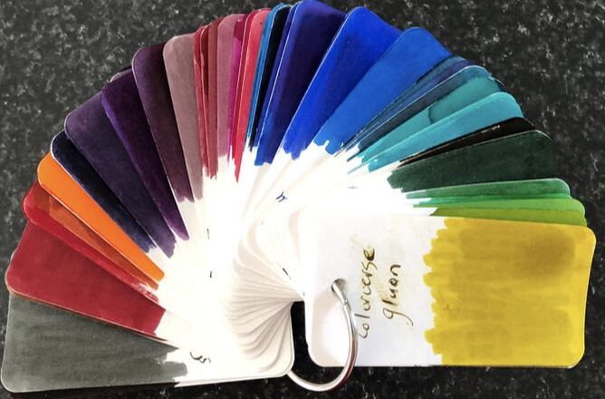
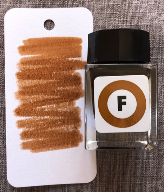
Here with are at review number two. The first two inks in the box on metro colours are red and orange and I feel I have reviewed similar recently in Nemosine inks (Aeolis Palus red and Solar Storm) so decided to start at the end and work backwards. Information about how I obtained these inks can be found here. The last ink in the box is the Fukutoshin Line. The Fukutoshin or number 13 line is the least used of all the Tokyo Metro lines. It is also the deepest of all the lines with an average depth of 27metres. It passes over the Shinjuku line with a clearance of just 11cm (4.3in), which would concern me if I was using this line on any regular basis. In rush hour the first carriage is for women only. It got its name as Fukutoshin means secondary city and this line connect three of Tokyos secondary city centres Ikebukiro, Shinjuku and Shibuya. No one is quite sure how this line got its colour, it is thought by default as no other line had used brown. I don't mind using brown inks, there is not a lot you can do with brown but it is an acceptable colour for most things you may want to do. So, as you would expect open the bottle = chocolate brown. 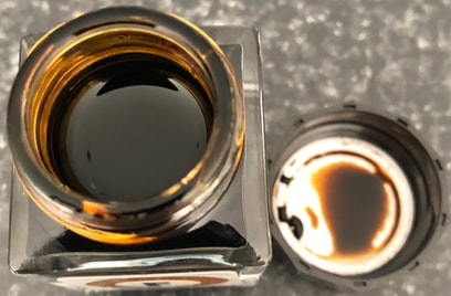
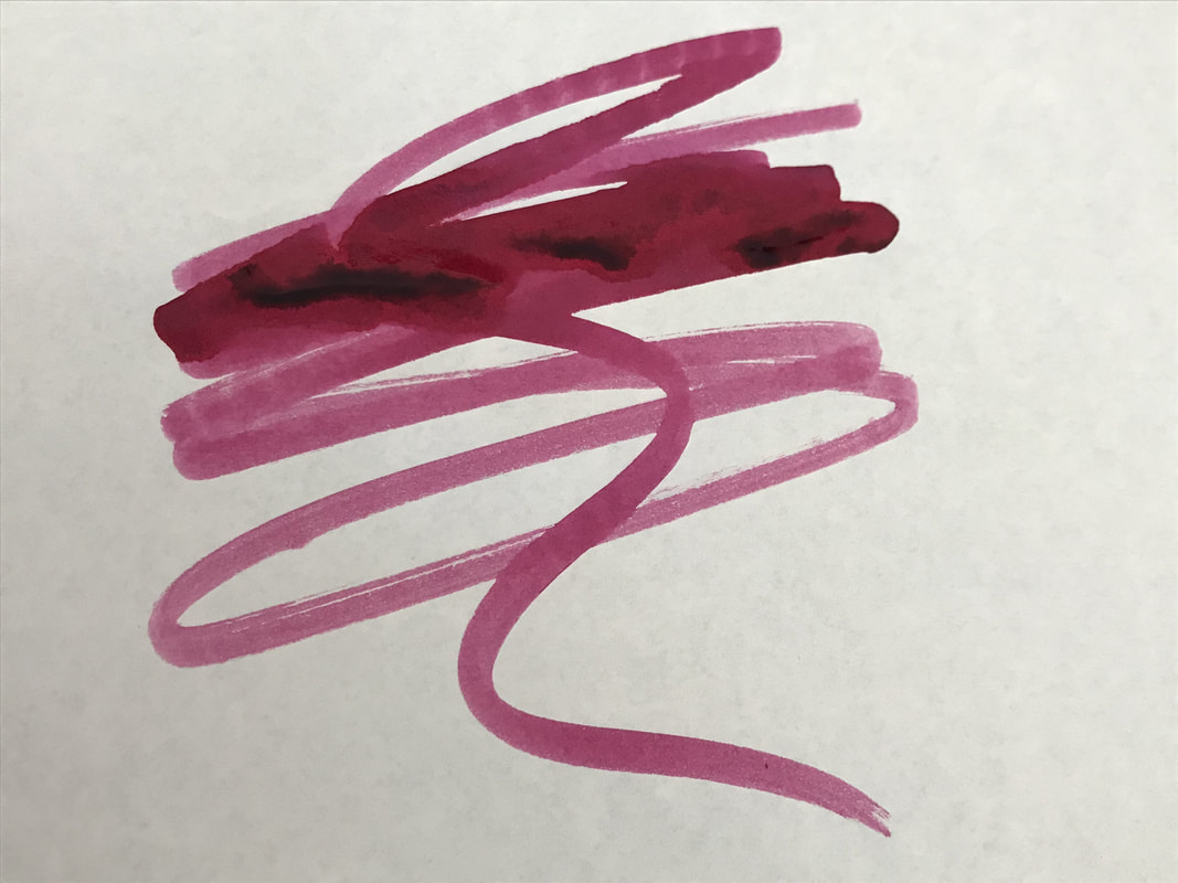
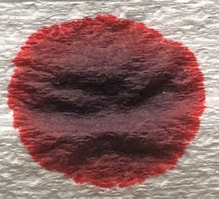
Its getting sort of predictable what I a going to do - yes col-o-ring and Tomoe River swatches!
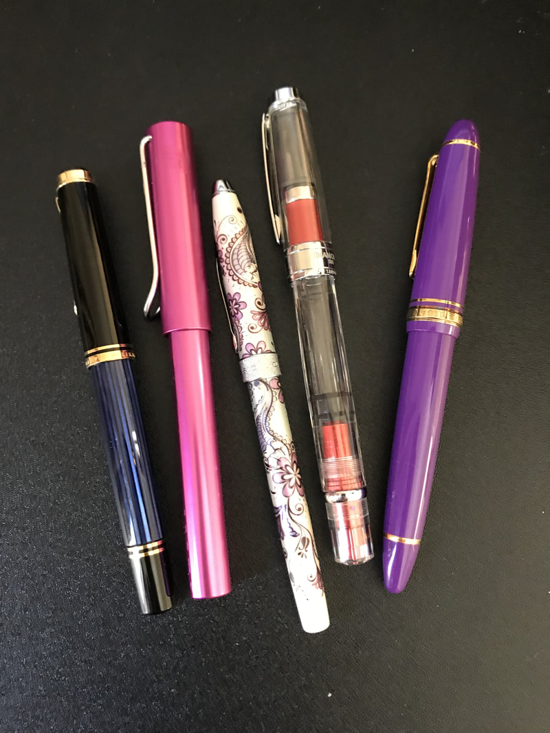
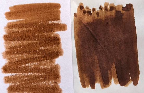
The last review I chose the the Chiyoda Line because it was green and I wanted something to go with my new pen. This time round I chose a Sailor 1911 because it was on the desk beside me but I think my subconscious is really wanting pens and ink to match well. 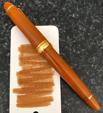 They do look rather nice together Writing tests knowing the ink will behave well - Clairefontaine, cheap paper, Tomoe river 52gm. 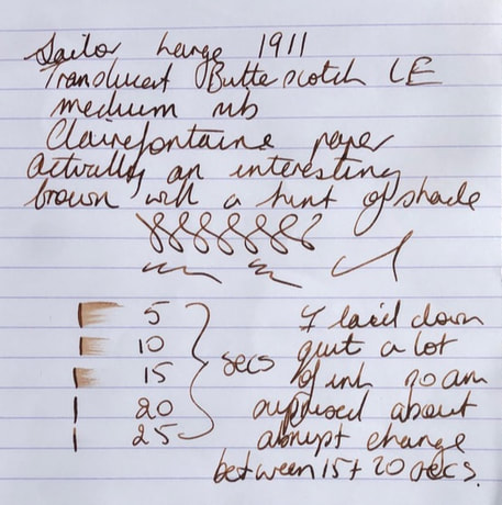 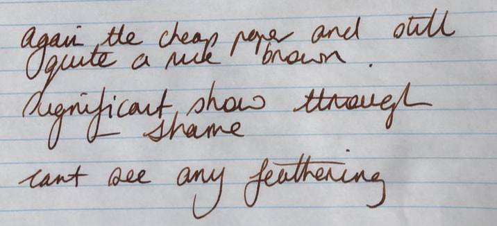 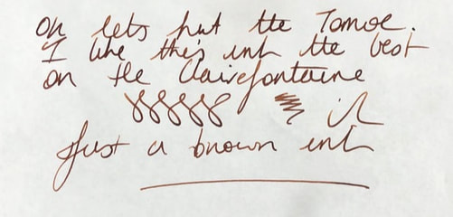 Surprisingly I liked this ink better on the Clairfontaine than the Tomoe River paper. I don't think the photo does it justice as to just what a nice brown this is.
0 Comments
Leave a Reply. |
Ink Brands
All
|

 RSS Feed